"When the small predominates, it gets through successfully.."
- I Ching, The Predominance of the Small
![]()
Above: an actual single pixel (look close):
Below: image of what a pixel looks like up close (made up of 36864 actual pixels):
![]()
Hello, my name is Rich and I make pixel art. I create graphics and animations for the retro-style games of Pixeljam.com, and also create other forms of pixel art that I may mention later on. This is a tutorial on drawing with pixels... of sorts. I don't really know what it is exactly, but what I do know is that I'm going to create, display and talk about making minimal pixel art, as well as provide some info about using Adobe Photoshop to help you make your own pixel art.
So, why Pixels? Well, I don't know why for anyone else, but I personally love playing with pixels. Big, blocky, colorful, fun, versatile; pixels are beautiful things. I grew up with the Atari 2600, Intellivision, Commodore 64, Nintendo (NES) & Sega Genesis, and so, pixels are embedded deep in my psyche. It always feels good to me to look at pixelly things of all resolutions and styles. The work I do is currently in the 8-bit style range, but I may eventually make games in the 16-bit Sega Genesis/Super Nintendo style, as well as a game in isometric pixel style. For the purposes of this tutorial, I'm going to stick to minimal pixel art styles. It's what I love and is what I'm most familiar working and playing with at present. You can take what you learn here though and make whatever you like. The fundamentals of working with pixels will be the same.
What I'm referring to as "minimal" pixel style is the art of using as few pixels as possible to create something, which inherently looks like old computer and video game graphics. The first example of this would be a game like Pong: Two rectangles, a square and large blocky numbers to keep score. Completely simple yet fun was had around the world, and the now thriving video game industry was born.
Before I start writing a bunch of words on how to do this or that, or specifics on Photoshop tools or techniques, I'd like to go right into showing some big pixels up close & in action! For your reference on the beginnings of this style, here are some re-creations of several of my favorite Atari 2600 graphics (also known as "sprites"):
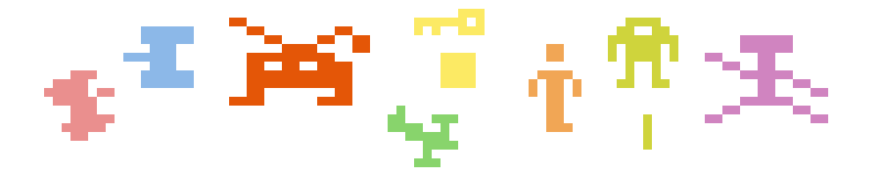
Ahhh... nice, right? I love seeing these broad areas of color & funky shapes attempting to look like something particular. It's somehow very gratifying for me to see. The examples here come from Combat, Space Invaders, Adventure, Berzerk and Circus Atari. These are enlarged, of course, from their original sizes.
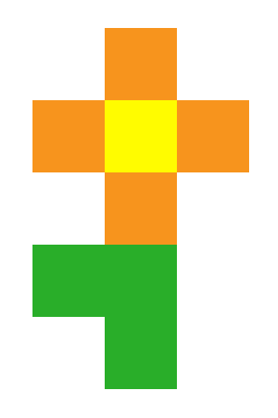
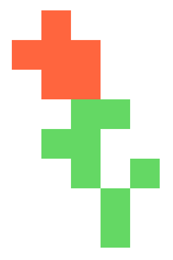
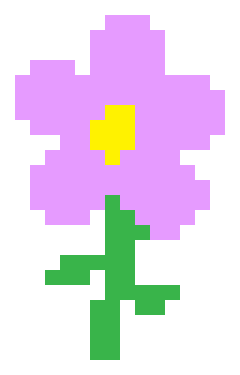
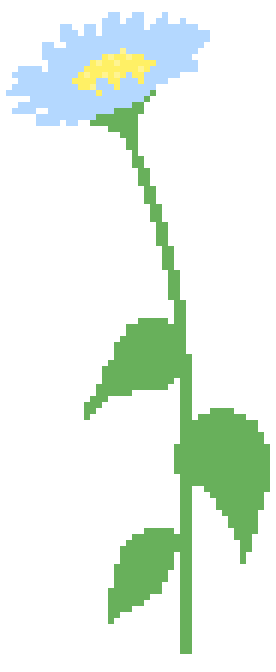
Below are some examples of my own minimal pixel art as flowers I've made for Pixeljam Games ranging from very simple and blocky to more organic and curvy.

Above: 100% scale. 1x1 - Pixels in their natural size
Below: 300% scale. 3x1 - The final resolution these were intended to be seen at

And here they are below, nice and large. This is how I like my pixels. I've also set them up as large time-lapse Gif animations to demonstrate roughly the process involved in making these. Just click each one to see it draw out.

Notes on Pixel Art
Before I get into Photoshop & drawing details, I'd like to share a few general tips & thoughts on making pixel art, with a few examples here & there.
 Play, experiment, have fun! What strange shapes you will make. Choose greater and lesser numbers of
pixels and colors to work with. Try some very limited color palettes. Some old Atari games (like Combat and Space Invaders) for example had only 4 colors total on the screen at once,
and still we got the idea of what we were looking at.
Play, experiment, have fun! What strange shapes you will make. Choose greater and lesser numbers of
pixels and colors to work with. Try some very limited color palettes. Some old Atari games (like Combat and Space Invaders) for example had only 4 colors total on the screen at once,
and still we got the idea of what we were looking at.
 As you can see, illustrating with pixels at this minimal level is a lot like a doing a puzzle. Put
pixels down, move them around, erase them, duplicate them, see what works and what doesn't.
As you can see, illustrating with pixels at this minimal level is a lot like a doing a puzzle. Put
pixels down, move them around, erase them, duplicate them, see what works and what doesn't.
 You don't have to be a great or even good illustrator to make great pixel art. It can help, but
what's most helpful is to practice & experiment on your own. It's fun to get in there and just start putting pixels on the screen.
You don't have to be a great or even good illustrator to make great pixel art. It can help, but
what's most helpful is to practice & experiment on your own. It's fun to get in there and just start putting pixels on the screen.
 Sometimes I'll Zoom in and start putting pixels down without any idea what I want to make. Shapes start
to happen, ideas start to form from seeing those, blocky messes begin to look like something and you can follow that. It's also fine to have an idea of what you want to make, but simply exploring and
seeing what happens is a great way to get started.
Sometimes I'll Zoom in and start putting pixels down without any idea what I want to make. Shapes start
to happen, ideas start to form from seeing those, blocky messes begin to look like something and you can follow that. It's also fine to have an idea of what you want to make, but simply exploring and
seeing what happens is a great way to get started.
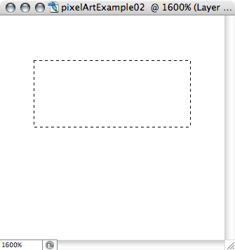
 When I work on something, I usually do a lot of zooming in and out of what I'm drawing or animating. I
usually draw zoomed in anywhere from 300% to 1600%. For example, I would probably work on the large flower above at about the level it appears here, and zoom out often to make sure what I'm doing is
actually looking good at the size it's intended to be seen at.
When I work on something, I usually do a lot of zooming in and out of what I'm drawing or animating. I
usually draw zoomed in anywhere from 300% to 1600%. For example, I would probably work on the large flower above at about the level it appears here, and zoom out often to make sure what I'm doing is
actually looking good at the size it's intended to be seen at.
 It's helpful to accept in advance that it's going to be somewhat abstract. Maybe downright ugly or
ridiculous looking, depending on what you're trying to draw. It's okay and it's part of big blocky pixel graphics charm. The beautiful thing is that even as bad as something looks, our brains and
eyes can usually interpret correctly what it is supposed to be. Our job here is to mostly suggest a form as best we can, and if it's just not looking like you had hoped, it's okay to simply enjoy the
nonsensical & ugly. It's also fun to see pixel art that doesn't really look like what it was intended to.
It's helpful to accept in advance that it's going to be somewhat abstract. Maybe downright ugly or
ridiculous looking, depending on what you're trying to draw. It's okay and it's part of big blocky pixel graphics charm. The beautiful thing is that even as bad as something looks, our brains and
eyes can usually interpret correctly what it is supposed to be. Our job here is to mostly suggest a form as best we can, and if it's just not looking like you had hoped, it's okay to simply enjoy the
nonsensical & ugly. It's also fun to see pixel art that doesn't really look like what it was intended to.
 Context will help brains make sense of what we're looking at. A single pixel can be interpreted as so
many different things, depending on what it's in relation to. A single pixel coming from a gun-like shape will appear as a bullet, from a cloud shape, snow or a raindrop.
Context will help brains make sense of what we're looking at. A single pixel can be interpreted as so
many different things, depending on what it's in relation to. A single pixel coming from a gun-like shape will appear as a bullet, from a cloud shape, snow or a raindrop.
 Don't be hesitant to abandon what you started if you feel like you're not getting anywhere. Start fresh.
I often leave a trail of abandoned files that I never go back to, but they were all necessary steps in the process of eventually arriving at something I am pleased with.
Don't be hesitant to abandon what you started if you feel like you're not getting anywhere. Start fresh.
I often leave a trail of abandoned files that I never go back to, but they were all necessary steps in the process of eventually arriving at something I am pleased with.
 With practice & and experimenting your sense of how the eye & brain interpret these blocky
shapes as this or that will naturally improve. I've been really amazed by how some of the objects I've made actually look like what I'm trying to create with so few pixels. Human eyes/brains resolve
shapes on their own. All you have to do is loosely suggest a form, and remove all possible distractions.
With practice & and experimenting your sense of how the eye & brain interpret these blocky
shapes as this or that will naturally improve. I've been really amazed by how some of the objects I've made actually look like what I'm trying to create with so few pixels. Human eyes/brains resolve
shapes on their own. All you have to do is loosely suggest a form, and remove all possible distractions.
 It's helpful to see pixels at work up close in other image files too. Here's an exercise you should try
at some point. Zoom into & out of a bunch of photos and other images in Photoshop. Zoom as far in as you can. Move the image in the window around, see different parts of it at different zoom
levels. Do this with many different styles of graphics and images, other people's pixel art, video game screenshots, etc.
It's helpful to see pixels at work up close in other image files too. Here's an exercise you should try
at some point. Zoom into & out of a bunch of photos and other images in Photoshop. Zoom as far in as you can. Move the image in the window around, see different parts of it at different zoom
levels. Do this with many different styles of graphics and images, other people's pixel art, video game screenshots, etc.
 If you set out to make a particular thing, make a few versions of it, using more or less numbers of
pixels, colors, etc. As an example, for our Bee game (still in development) it took me a few days of drawing pixel bees to arrive at the bee style I really liked for the game (#5). Below is a series
of concepts in chronological order.
If you set out to make a particular thing, make a few versions of it, using more or less numbers of
pixels, colors, etc. As an example, for our Bee game (still in development) it took me a few days of drawing pixel bees to arrive at the bee style I really liked for the game (#5). Below is a series
of concepts in chronological order.
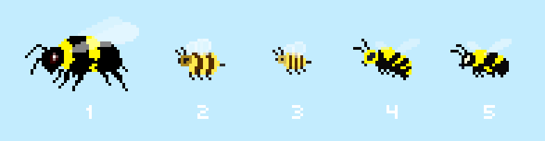
For the above designs, I started drawing freehand on the big bee #1, with ideas of what a bee is in my head, but felt it was too large, too detailed. It took me some trial and error to even arrive at this bee, but okay, I'll leave it behind and move on. I tried going much more basic and made #2, which I liked but still wanted to go even simpler, and made #3. I like this one very much, she's totally cute and I am glad to have her to use if I want in the future, but it presented problems for the gameplay mechanics, particularly how the bee will sting in front of herself while flying. Should she have to spin around every time? No, bees don't do that. I needed a bee that would have an abdomen that I could animate that would look more true to how a bee would sting forward. So at this point, I sought out some photos of bees online, and found a bunch including this one:

I shrank the original size of this photo way down to what you see above and used it as a guide for drawing bee #4. I like #4, but in my original idea for this game, the bee had a black head and I wanted to stick with that. With some creative license, I swapped colors around and spent some time streamlining the bee into #5, the bee design we're using for our Bee game. #4 can be used as a yellow jacket though. Lots of times what I leave behind are also useable as something else that I didn't expect.
 As in the above example, when you want to make something specific, do some research and find photos and
other image resources of what you're trying to create. You can grab and use these as reference or even to shrink down to the actual pixel size you want your piece to be at, and then do your best to
trace! I do this often to save time and get some results I've been very happy with. With minimal pixel style, most things you are tracing will look quite different so there is no worry of copyright
infringement. I have also taken digital photos of objects myself to use as a guide to trace, and have sketched on paper, scanned & traced shapes too. Whatever works. I'll show an example of this
in the next section on drawing in Photoshop.
As in the above example, when you want to make something specific, do some research and find photos and
other image resources of what you're trying to create. You can grab and use these as reference or even to shrink down to the actual pixel size you want your piece to be at, and then do your best to
trace! I do this often to save time and get some results I've been very happy with. With minimal pixel style, most things you are tracing will look quite different so there is no worry of copyright
infringement. I have also taken digital photos of objects myself to use as a guide to trace, and have sketched on paper, scanned & traced shapes too. Whatever works. I'll show an example of this
in the next section on drawing in Photoshop.
 Choosing colors is key. If it's possible to know what color the background of the objects you're
drawing will be, draw on top of that so you know your color choices will work. There are no outlines to be used in this minimal pixel style to separate shapes. The shapes themselves have to stand on
their own, and so the colors & values you choose will be very relevant to the color they are next to or are on top of. The same colors & values will look a lot different depending on what
they are against. Notice the same is true for lighter pixels against darker backgrounds & darker pixels against lighter backgrounds. You may have to change your object color if you change what it
is seen against.
Choosing colors is key. If it's possible to know what color the background of the objects you're
drawing will be, draw on top of that so you know your color choices will work. There are no outlines to be used in this minimal pixel style to separate shapes. The shapes themselves have to stand on
their own, and so the colors & values you choose will be very relevant to the color they are next to or are on top of. The same colors & values will look a lot different depending on what
they are against. Notice the same is true for lighter pixels against darker backgrounds & darker pixels against lighter backgrounds. You may have to change your object color if you change what it
is seen against.
Here is a sample of the same color orange used against different backgrounds. Notice how the orange square appears lighter, darker, more or less saturated.

The file below shows a variety of fruits and vegetables and stuff I designed for our first game, which we will never finish. These fruits & veggies will have a place in our future games though. Anyway, as you see I just got started and designed a whole family of these things. I didn't have a background color in particular in mind for them, but I figured it would be darker than the objects so I chose black to work on. I set up an animation of this file that cycles through background colors so you can see how some of these things would require their color and/or values adjusted in order to look right against different colored backgrounds. Click on the image below to see that animation.
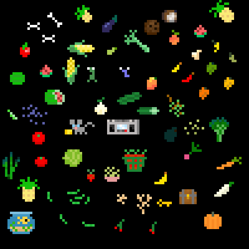
And in reference to the above file, it never ceases to amaze me how so few pixels can actually suggest a shape enough for our brains to see it. Like I mentioned earlier, context is very helpful for this. The Green Beans and those loose Grapes and Blueberries would probably be meaningless without the surrounding veggies to get your brain into the "I'm looking at fruits & vegetables" mode.
Alright, that's all I can think of right now to mention before moving on. Once you've gone through this entire tutorial, come back and read this section again as it will have increased relevance once you try making some things on your own.
Using Adobe Photoshop to Make Pixel Art
The most recent Photoshop I have is Adobe Photoshop CS2, and I work on a Mac. I'm referencing a windows version of Photoshop as well, but the most recent version I have access to for Windows is Photoshop CS. Hopefully things are mostly the same. If not, I'm not really using anything in my process that you couldn't also do in most earlier versions of Photoshop. If you do not own any versions of Adobe Photoshop, there are other applications that you can use, although I don't have experience with those. One robust, free application I hear good things about is Gimp: http://www.gimp.org. If you download it and enjoy using it, don't forget to donate some $$ to the Gimp team. It's my strong recommendation that we support that which we value in our lives. Otherwise it might just go away...
I also want to mention using a Wacom drawing tablet whenever possible. Especially for things like that big flower earlier on. I used to do all this on a laptop trackpad, and on my desktop with a mouse. Eventually I switched to using my Wacom tablet and it helps tremendously. I would highly recommend getting yourself a small one. They are not expensive.
I use keyboard shortcuts a LOT. For example, if I want to switch from the pencil tool to the eraser tool, I'll type "e" and the eraser tool will be active. I save loads of time this way and I will add the keyboard shortcut references whenever possible next to commands I'm using.
So, before we start drawing with Photoshop's tools, let's set up Photoshop's Preferences! We need to have the greatest amount of control possible for our pixel manipulations, so let's make some changes to Photoshop's default preferences. If you've got particular preferences set already, you should save them as presets wherever possible in order to easily switch between the setup for pixel art and whatever you usually use it for.
To get to the General Preferences
Mac: Command + k
or Photoshop > Preferences > General
Windows: Ctrl + k
or Edit > Preferences > General
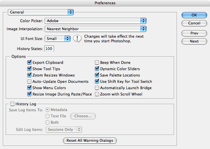
History States: it defaults to 20 on my Mac CS2 version. I'll increase that to 100. Set that to 50 at least. If your computer isn't tight on RAM or scratch disk space, the more the better. More options to go back and fix something you did earlier on.
Image Interpolation: Set to "Nearest Neighbor". This will make sure Photoshop keeps crisp pixels when doing any resizing or scaling of your artwork. Nearest Neighbor means when you do any re-sizing and scaling of your work, Photoshop will refer to the pixels around it and create more of those. If you go back and forth between pixel art and other smooth graphic or photo-editing, you should remember to change this back to the default "Bicubic" when finished.
If you're new to Photoshop, you might want to make sure that "Turn on Tool Tips" is checked. This is nice because when you hover the mouse over tools and other things, the name of the tool shows up, as well as the keyboard shortcut to make that tool active. I use keyboard shortcuts a LOT!! All the time. I mention this again because they are one of the greatest time saving devices you'll have at your disposal and will allow for more fluid image creation.
Preferences: Display & Cursors
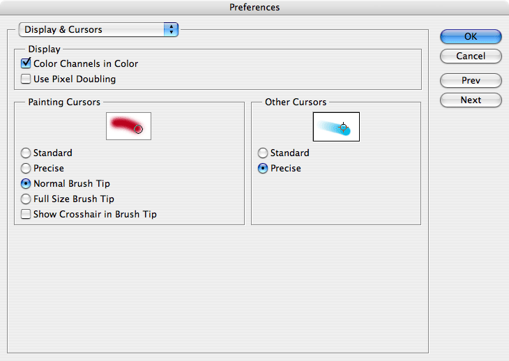
For "Painting Cursors" select "Normal Brush Tip"
For "Other Cursors" select "Precise"
Preferences: Transparency & Gamut
![]()
It's my personal preference to turn off that background grid that could show through transparent areas of layers.
Preferences: Units & Rulers
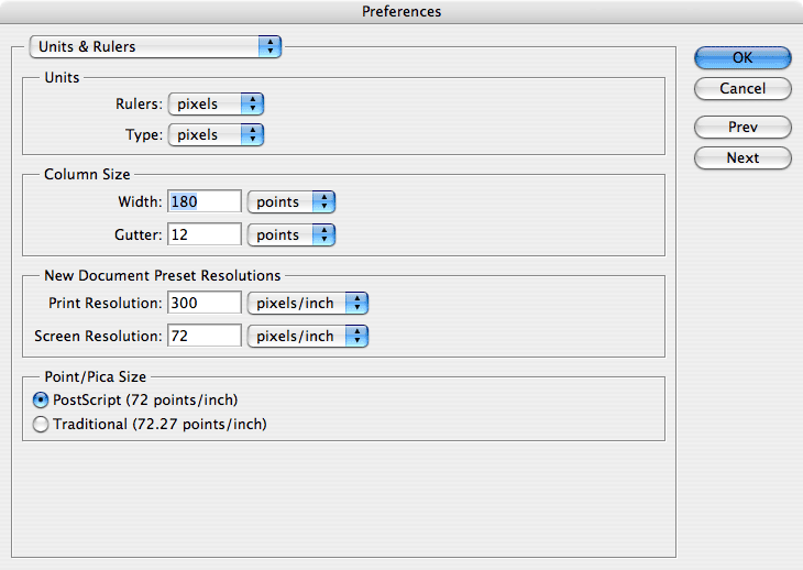
Units:
Change Rulers from "Inches" to "Pixels"
Change Type from "Points" to "Pixels"
Everything else in the main Prefs should be fine as is.
Now let's change some settings of some particular Tools themselves. First I'll list the tools I actually use when making pixel art:
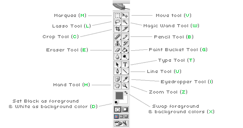
Below I'll describe what settings I have for each of these tools, if it's different from the default setting.
Marquee Selection Tool (M): set "Feather" to "0". This should be the default, but just in case...

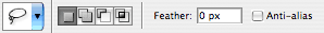
Lasso Tool (L): Deselect "Anti-alias" and make sure and "Feather" is set to "0".
(I'll describe below what the significance of Anti-aliasing is, after I get through these tool settings)
Magic Wand Tool (W): Set "Tolerance" to "0", Deselect "Anti-alias". You can check and uncheck "Contiguous" as needed, depends on the situation. Same with "Sample All Layers", but generally I leave that one unchecked

Pencil/Brush Tool (B): It's the "Brush" tool by default. Change this to the "Pencil" tool. Select a 1 Pixel Brush.

Also, go to the Brush Presets to the far right of the tool settings, (Brushes tab) and make sure to uncheck anything that's checked. Usually "Smoothing" is selected by default. "Shape Dynamics" may be checked as well. Uncheck these or you will/may experience a short delay with every single pixel you draw.
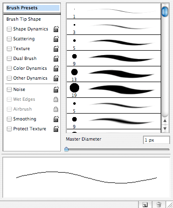
Eraser Tool (E): Set Brush Size to 1 pixel. Set Mode to "Pencil". Also, uncheck all Brush Presets, as you did for the Pencil tool earlier. (See above screenshot).

Paint Bucket/Gradient Tool (G): It's the Gradient tool by default; select the Paint Bucket tool instead. You may choose to use the gradient tool at times, but paint bucket seems to be much more useful in pixel art.

Type tool (T): Set the, um, smoothing? to "None". It's the menu item in the middle that is set to "Sharp" by default, in my Photoshop. Setting this to "none" will allow you to use any typeface as a pixel font. Try different point sizes for lots of different fonts.

Note: For a great resource with loads of great FREE pixel fonts, visit http://www.dafont.com/bitmap.php?page=1.webloc
Line Tool (U): Use the settings in the screenshot. Bitmap, not Vector, Line option, Weight 1 pixel. Deselect Anti-alias.

Whew! That's about all you should need to set. It sure would be great for Adobe to support Pixel Artists with a holistic "Pixel Art" setting, where all this could be set with one click. Some of this can be set with "Presets" that you can save yourself, so try experimenting with those to save time in the future.
Now that we've got Photoshop all prepared, let's try drawing something and learning a few things that make the process easier. If anyone has different or better ideas on how things are done, go with that. I only know what I know so far and Photoshop is a massive program. There's almost always more than one way to do the same thing in Photoshop, if not many ways. So, I'll show you the ways I do it, you do it how you like.
Also, I'm not going to reinvent the wheel here, so to speak. There are plenty of good Photoshop tutorials and resources & books out there. If I mention, "Just do this" without too much direction, please know that whatever time I spend here is time I am not spending on making our next game! So, if I leave out something you'd like to know more about, just do a little searching online and I'm sure you will be able to find answers quickly. I'll add some resources and links at the end of this tutorial that may be helpful.
Anti-aliasing: Before we draw anything, let me quickly describe the difference between aliased & anti-aliased graphics. All the graphics I used above are "aliased". That is, hard edged. They are all using only the primary colors you see in them, and the edges of the graphic are blocky as they should be in pixel art. Anti-aliasing is a method of adding semi-transparent pixels to the edges of graphics in order to give the illusion of smoothness, to eliminate the pixelly appearance. It's like a slightly feathered edge to graphics. Text is often anti-aliased on computer screens to make the curves smoother and easier to read. I've set up this sample file below to help illustrate the difference.
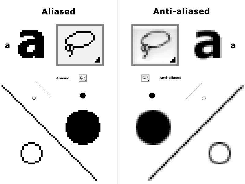
See all those extra pixels added to the edges of graphics on the right? It sure does work though, for what it's intended to do. Brilliant! Note: I custom created that lasso tool on the left myself to show an example of something familiar as aliased & anti-aliased. The lasso tool won't actually look aliased like that if you deselect the anti-aliasing option.
So, let's get to some drawing now!
Exercise #1: Draw something simple
Let's start by opening a new document.
Mac: COMMAND + N, or "File" > "New"
PC: CTRL + N, or "File" > "New"
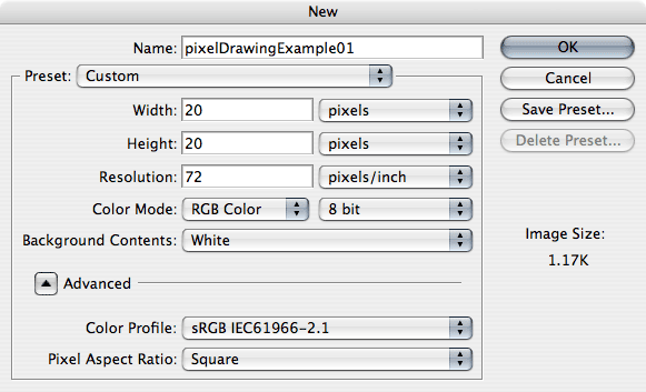
Choose a small number of pixels for the window dimensions, like 20x20, and zoom all the way into the window. My Photoshop CS2 still only zooms in as far as 1600%. I'd very much like to see Photoshop increase this zoom capacity. Maybe CS3 has this?
Okay, now let's select the Pencil tool (B). It should be set to Pencil, not Paintbrush, so change it to pencil if it's not already. Select the smallest brush size, 1pixel. For this example, let's just stick with the default foreground color, Black. Now, click and put pixels on the page. It doesn't matter what you draw, I'm just trying to take you through using the tools. Here's what I did:
![]()
Ack! It's funny looking and it's winking! But, still kind of charming being made of big pixels and all. The left is the 1x1 size, the right is 10x1 size for your viewing pleasure. That was easy, right? Well, let's try making some changes to what we've drawn. Let's add a new color to the scene.
Choosing colors: There are lots of options in Photoshop involving color, but let's keep it simple for now. Click on the foreground color in the tools palette, it will bring up the color chooser. You can choose a color from here and that will be the color you will be drawing with next. There's also a "Colors" palette I keep open. For Mac & PC, hit F6 or choose "Window" > "Color". You can select colors here, or click on the "Swatches" tab in that palette, which is another good place to find colors. You can use the default color palette or load new ones in, which I do. Photoshop comes with additional palettes that you can load and you can find more custom palettes online to download.
So, choose a color and use the Pencil tool to draw more pixels to your artwork. Here's what I did:
![]()
Man, that's ugly. It's okay though. I don't want anyone getting hung up on making something detailed and amazing for these exercises, myself included. Let's move on. You can close your first example now or save it if you like. "Photoshop" format is fine for now (.PSD).
Undo: What a useful feature! If you do anything you'd like to Undo, just press "COMMAND" + "Z" (Mac) and "CTRL"+"Z" (PC). Or choose "Edit">"Undo". Keep in mind, however, it only works on the very last thing you did. The same command is for Undo & Redo. If you want to go back further in your process, that's what the History Palette is for.
History Palette: Remember we set the History States preferences in the beginning to 50? Well, this is what that relates to. In the top menu, select "Window" > "History". It's pretty self explanatory as each change you make is listed in order and you can click each command you did to go back in time. Careful though, making a change from a previous state will effectively wipe out all that you have done beyond that point. What you can do to help this is use the little Camera Icon button at the bottom right of the History Palette before going back in time. This takes a "Snapshot" of the last state the image was at, and posts it at the top of the palette. Note: The History Palette is cleared upon closing your file. That info is not saved. For more information on using the History palette, do some research! Haha, sorry, I mean, it's beyond the scope of this tutorial to get any more detailed on that.
I mentioned Zooming a few paragraphs ago. Let me take a moment to describe a bit about methods of zooming in and out of your windows. This will be helpful in all Photshop use. To Zoom in and out, I bounce between different methods depending on what I'm doing. In this example, I just used the keyboard to zoom in by holding COMMAND and pressing "+" a number of times until it won't zoom any more. "COMMAND" + "-" would zoom out. In Windows, it's "CTRL" + "=" to zoom in & "CTRL" + "-" to zoom out.
You can also use the Zoom Tool (Z) itself and play with that. Click a bunch & zoom straight in, or click and drag a box around a specific area you want to zoom to. By default, the zoom tool will have a "+", meaning it's set to zoom in. Again, hold "OPTION" on Mac or "ALT" in Windows to change it to zoom out. You can also click the little toggle in the tool options themselves, but that is too much work since I zoom in & out so often.
My favorite method is to simply activate the zoom tool temporarily or transiently if you like that word better, no matter what tool you're using. Say you're on the pencil tool and want to zoom in to a specific spot quickly. On Mac, hold "SPACE BAR " + "COMMAND", on PC it's "SPACE BAR" + "CNTRL", and the cursor should turn into the Zoom-in tool until you let go of these keys. To make it the Zoom-out tool instead, on Mac hold "SPACE" + "COMMAND" + "OPTION". On PC Hold "SPACE" + "ALT". When you let go of these keys it will return to the tool you had selected originally. Very convenient. I can move around quickly without breaking much stride with this method. I also use the keyboard method a lot, since it resizes the window as well, where using the zoom too leaves the window borders themselves at the same size. You can change preferences on this if you want to.
That's more than enough on Zooming. Let's make a new file to work on now.
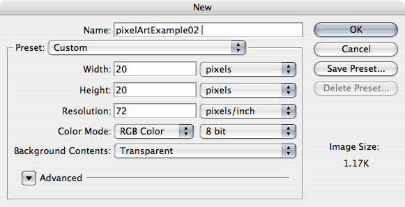
Exercise #2: Use selections, Fill them in
Open a new document. Make it 20x20 pixels again. This time though, in the "New Document" dialogue box, choose "Transparent" for the "Background Contents". This will open your document without any color present, not even white. It lacks a "Background Layer". What your file consists of is one transparent "Layer" which is the more accurate way to refer to it. It'll probably look white, or have a checkered pattern if you haven't turned off the grid in the preferences as I suggested earlier.
Zoom in all the way and choose the Rectangular Marquee Tool. The Rectangular Marquee tool is a means of selecting rectangular areas. Its alternate form is the Elliptical Marquee Tool, which you can toggle to by pressing "SHIFT" + "M". This will toggle back and forth between the two. Or you can click and hold on the Marquee tool icon in the tool palette and it will give you choices.
So, click somewhere near the upper left of the window & make a rectangle, but make it smaller than the window so there's some room around it. Something like this:
(Sometimes selections are referred to as "marching ants")
Now that you have this selection, choose a foreground color and "Fill" it with a color using the keyboard only. On a Mac, to fill an entire Layer or a selected area, press "OPTION" + "DELETE". On PC it's "ALT" + "BACKSPACE". This will fill this marquee in with the foreground color. Mine turned out like this:

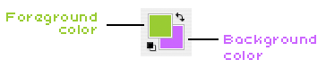
You can also fill selections and Layers using the current Background color as well using "OPTION" + "DELETE" on Mac, "CNTRL" + "BACKSPACE/DELETE" on PC. Try choosing a Background color (click on it in the "Tools" palette or the "Colors" palette) and filling a new Marquee selection with the background color now. I make selections and fill them these ways quite often. Using Selection tools are very helpful in making pixel art in many ways. I could have used the Paint Bucket tool to fill that selected area, but I'll get to better uses for that tool later. You don't really need to see a screenshot of the Foreground/Background selectors, do you? Ookay... it's this thing:
Filling a layer without a selection: If you have nothing selected and while Filling like I just described, you will just fill the entire layer with one color. This is good for making background layers. try it out some time.
Okay, now let's Delete what we've created on this Layer. I do this often by using the keyboard alone to "Select All", and deleting the contents of that Layer. "Select All" by pressing "COMMAND" + "A" on Mac, "CTRL" + "A" on PC. Or, you can choose "Select" > "All" in the menu up top. This will create a selection lining the edges of the layer. You can use this selection to Delete what is on this layer by pressing the "DELETE" key & on PC, you can hit "BACKSPACE" or "DELETE". I don't think I need to show a screenshot of any of this. :)
Note: If you want to keep your examples, and don't like to throw anything away, you can save each example and open a new file for each new example OR just make new Layers to work on in your Photoshop document & hide the previous ones if you have experience with Layers already. Otherwise do some research or wait. I'm not going to get into working with and managing Layers and the Layers Palette in detail until Part II of this tutorial.
Deselecting: The graphic contents of the layer may now be gone, but the Selection remains! A fast way to "Deselect" an active selection is to press "COMMAND" + "D" on Mac, and "CTRL" + "D" on PC. Poof! It's gone. You can also Deselect a selection by clicking outside of it when a Selection tool is active (Marquee, Lasso, Magic Wand). In this case, that is an option. If you have the entire layer selected, clicking outside of it isn't really an option.
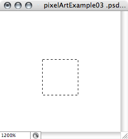
Constraining Proportions: Let's use the Rectangular Marquee tool now to easily create a perfect square using the "SHIFT" key. Shift is a modifier for a number of tools, but in the case of selections, it can "Constrains Proportions" when used in the way I'll describe. In the case of the Rectangular Marquee tool this means it will create a square. Try making a square and then fill it with a color of your choice.
Try clicking towards the upper left of your window and drag the Marquee to the lower right area holding SHIFT. it's a Square!

Elliptical Marquee tool: You should also play with the Elliptical Marquee tool in the same way. Choose that tool ("SHIFT" + "M") to make it active. If you haven't done this already, uncheck "Anti-alias" in the tool options. It may still be checked, even if you unchecked it for the Rectangular Marquee tool. So, Delete your square, and draw an ellipse now. Fill that in. Pat yourself on the back. Also try holding SHIFT when dragging the ellipse to constrain it to a circle. I made these selections myself and filled them all the same ways as before. Here's how mine look:


Mmm... colors... Okay, so there you have the basics of the Marquee tool.
Exercise #3: Making more complex selections
So, we've used "SHIFT" to constrain proportions with the Marquee Tools. SHIFT can also be used to Add to Selections. That is, to select more than what you've already got selected. Let's open a new file, same as before: 20x20 with a transparent background layer. Now, zoom in & select a portion of that window with any method you've learned so far. Now, hold SHIFT down, click and drag the Marquee to add new selections to the existing selection. Outside of it, preferably. For example, here's a selection, and then the same selection with more areas selected:
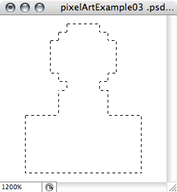
I used both Marquee tools. Do that as much as you like.
What about using SHIFT for making perfect squares and circles? In order to Constrain Proportions while adding to a selection, since you need SHIFT to do both, here's what you do. Make a selection. Hold SHIFT and start adding a new selection to it. While holding the mouse button down (or keep holding the pen to the drawing tablet), you can actually let go of SHIFT at any time after you begin adding to your selection. SHIFT is only necessary to initiate adding to a selection. If you press and hold it again, you will now be constraining the proportions. Let go of it again and you'll be back to the normal mode. Just don't let go of that mouse button or you'll have to start over.
You can also Subtract from selections. Basically it's the same thing, except instead of holding SHIFT, you hold OPTION on Mac, and ALT on PC. So, using the existing selection you just made, (or deselect & make a new selection), hold OPTION (or ALT on PC) and drag a new selection over a portion of the existing selection. Viola! It's been subtracted from. Here's what mine looks like now, along with the selection filled in to show you what it looks like.
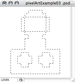
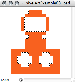
Inverse Selections: And finally (for now) you can Invert existing selections. To invert a selection is to select the opposite space that is currently selected. Use your existing selection if it's still active, or you can make a new one to try this out. To do this on Mac, press "SHIFT" + "COMMAND" + "I", and on PC press "SHIFT" + "CTRL" + "I". Or you can choose "Select" > "Inverse". I will fill my image in to show you the results.
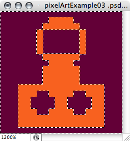
Um, don't ask me what that is. Maybe a race car & a driver?
Conclusion
Well, that's about all the time I've got for this week! Next week I'll complete part 2 of this pixel drawing tutorial with the rest of what I think you should know, including using the Lasso tool, The Magic Wand, the Hand tool, the Move Tool & the Navigator, the Line tool, the Paint Bucket tool, and more keyboard shortcuts. I'll also finally be able to get into more advanced things like working with Layers, Resizing images while retaining the pixel purity, Saving .GIF files & indexing colors, Dithering colors, working with Pixel Type, plus I'll lead you through some examples of using existing photos or graphics as a guide to create your own pixel art, AND I'll touch on bringing pixel graphics into Flash and autotracing them perfectly for use in your own independent video games! And whatever else I can think of. For now, I have to get back to working on our latest game, Dino Run! We're almost finished but still have a whole lot of work to do in the next month.
After Dino Run is complete and released, (some time in March '08 I hope) I might just put together an article on how I make frame-by-frame animations using current versions of Photshop (CS2 and later).
If anyone has any questions: You can email me at rich@pixeljam.com or comment here on Gamedev.net and I can write an article specifically answering the most relevant or most frequently asked questions in a Q&A format. This will also have to wait until Dino Run is finished. I will probably not be able to answer all questions I receive simply due to time constraints, but will try to include the big ones in that article.
So, check back next week to learn some more. In the meantime check out our games Gamma Bros and Ratmaze 2 at http://pixeljam.com/.