Feedback on Character Select Screen

Started by
2 comments, last by Dreamluigi 4 years, 9 months ago

Hi everyone!

I'm a GMS2 programmer at King Crow Studios. I'm currently working on a game called Necroball. To give a short description of the game, it's a 2-4 competitive sports game that combines soccer and tower defense. The objective of the game is to hit the Necroball skull into the goal or spawn minions to traverse to the mausoleum to earn points. Earn 50 points to win the game. Necroball is available on Steam, but I'm rebuilding the game from the ground-up in a different game engine. 

Here's a link to the original Necroballhttps://store.steampowered.com/app/563410/Necroball/


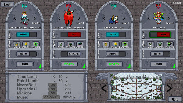
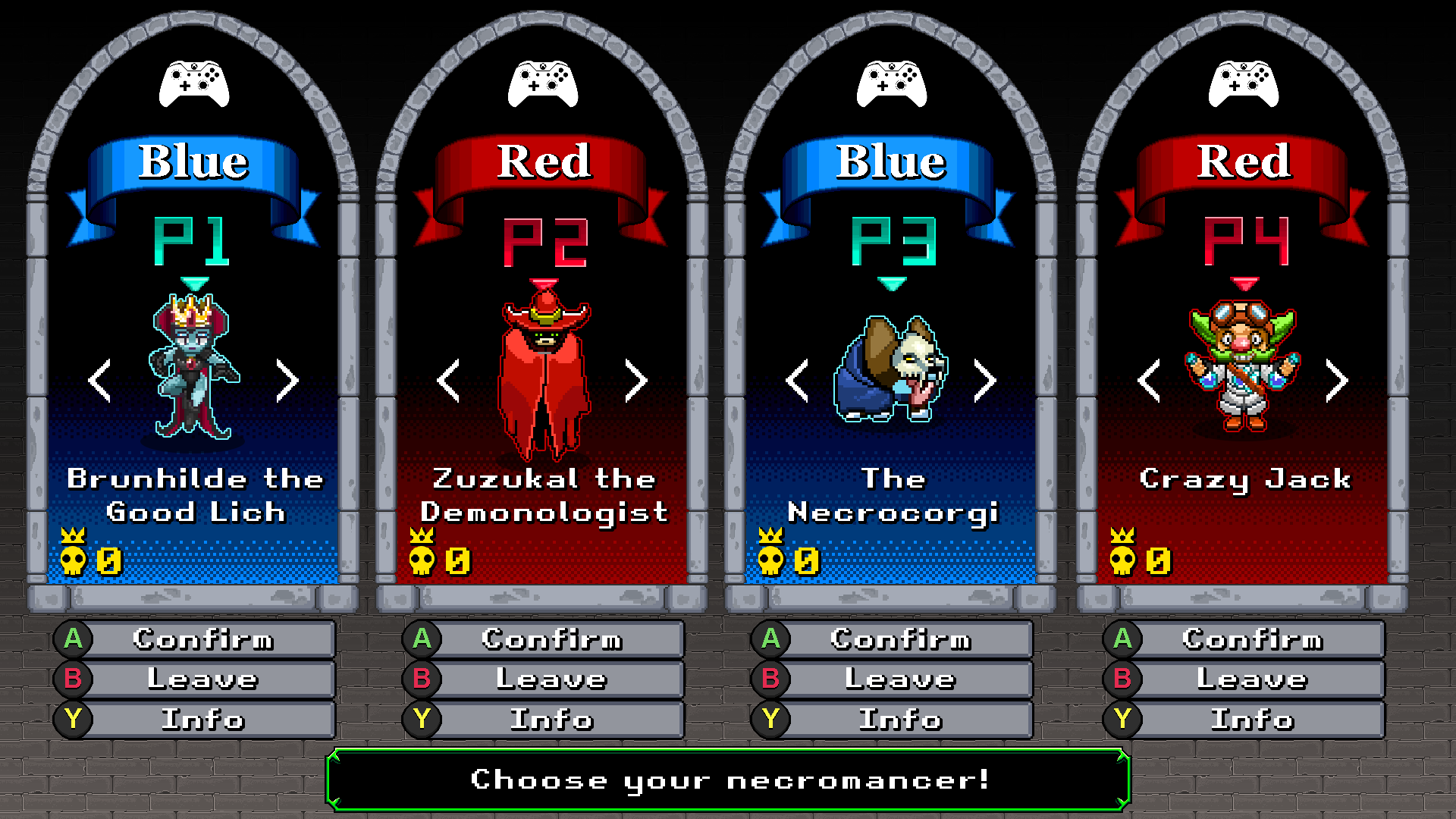
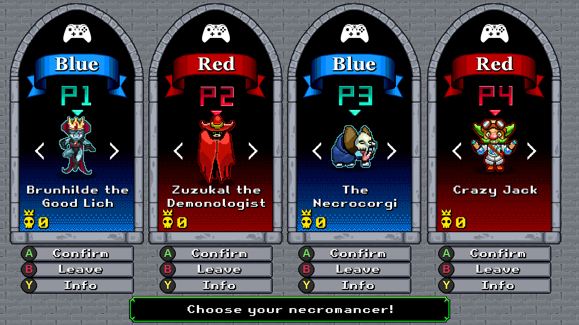
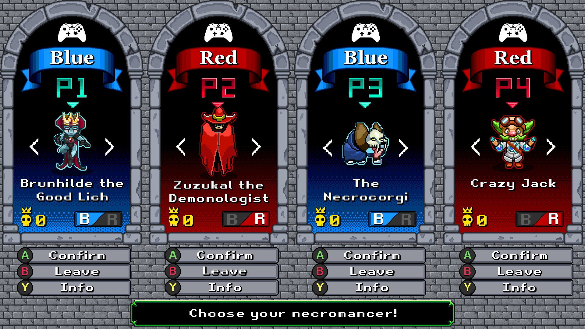
I made several mockups of the character select screen. The first image of the character select screen is the one from the original Necroball. The other images are our mockups for the revised game. The last image is the newest mockup and probably the one we're going to use. Our mission is to design a sharp, readable interface (i.e. typography, layout, content, coloration, etc.).

Note: The controllers at the top of each archway are just stock images of an XBOX One controller used for concept purposes. We'll make a new one down the line.

Any suggestions, feedback, and/or pixel art issues are appreciated!?

Original_character_select_screen.jpg

Character_Select_mockupB.png

Character_Select_mockupC.png

Character_Select_mockupD.png

Character_Select_mockupE.png

Advertisement

Looks like you really, really want people to know who is on which team.  I assume that the reason why you need spell out which is the red team and which is the blue team is so that you can accommodate colour-blind players.  If that's the case, have you considered making the teams black and white instead?

42 minutes ago, a light breeze said:

Looks like you really, really want people to know who is on which team.  I assume that the reason why you need spell out which is the red team and which is the blue team is so that you can accommodate colour-blind players.  If that's the case, have you considered making the teams black and white instead?

You definitely read my mind. I watched some videos related to video game accessibility (mostly colorblindness) to understand how people who have disabilities experience video games. I did a few experiments where I changed the saturation to 0 (black & white) to see if each team's color is still distinguishable from one another. I'll definitely look into that.

Thank you for your suggestion.

This topic is closed to new replies.

Advertisement