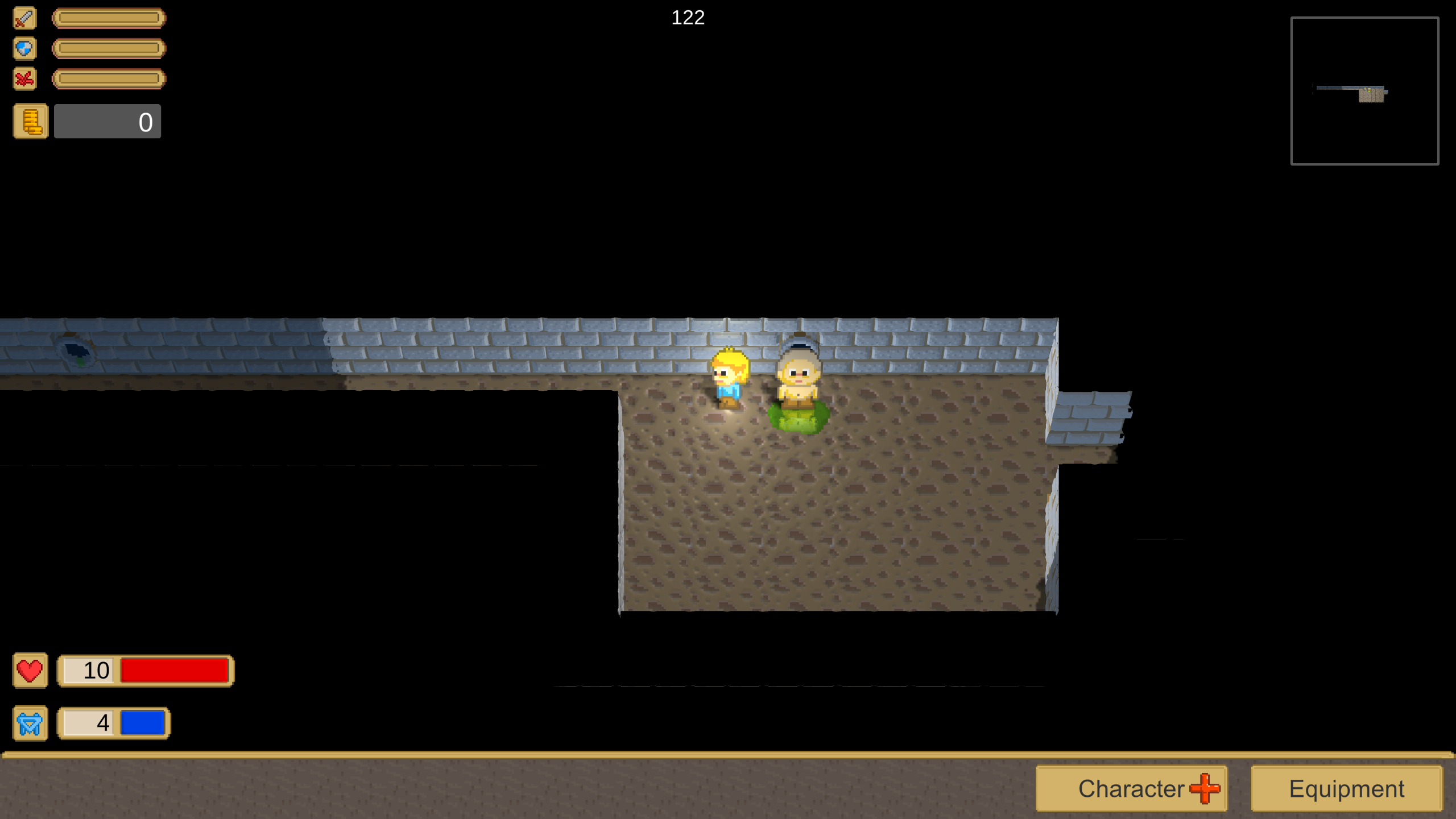
I also like the first 2D screenshot the most. But adding the lighting effects from the 2.5d version would be nice to add some color gradient to the backgrounds.
The 2.5D perspective projection is no win, but reveals we use flat sprites fro smoke and mirrors. So i'd keep at ortho projection.
Zurtan said:
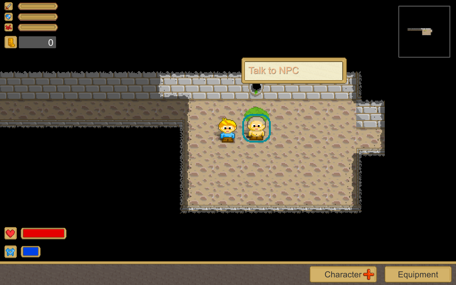
How do you suggest to further improve the level's visuals?
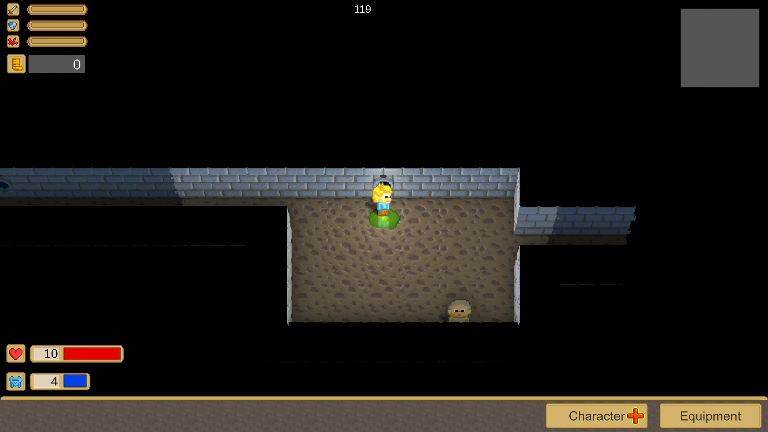
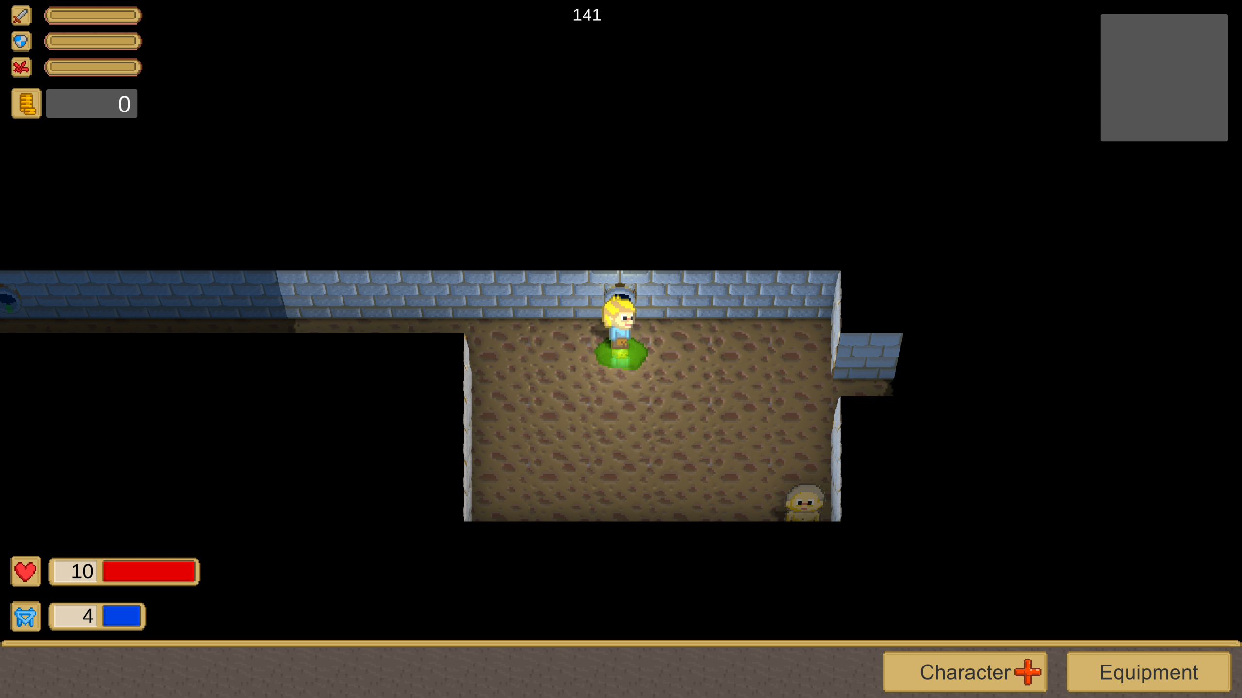
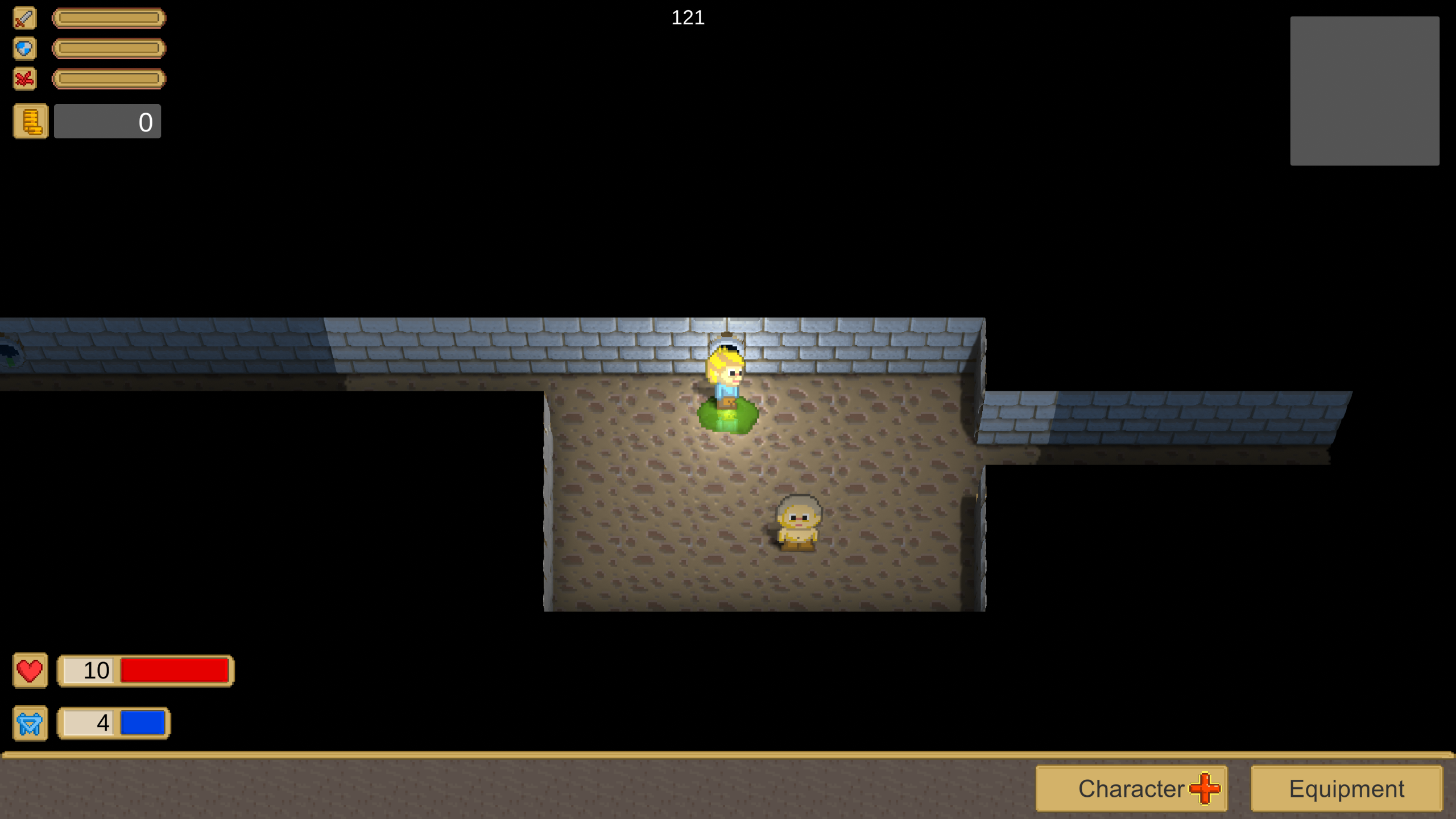
Some flaws bothering me: Text is not pixel art like the rest. textbox might profit from having a shadow. The yellow background color of textbox is too saturated, conflicting with the other gfx.
Health and blue bars also are too primary / saturated colors. Picking colors from character mouth and blue shirt would do better, for example.
Beside those minor issues, the background lacks variation. Texture is tiling over the whole screen, color is widely constant, result isn't looking that interesting.
Though, improving this would be some work ofc. Maybe the gradual lighting from 2.5d is enough to help it.
Otherwise looks pretty nice.
One subtle issue i see is characters looking like being lit from below, not from above. This is because the dark ‘shadow’ on the nose (which is an interesting style, btw), and also the yellow shadows in the faces. The yellow is darker than the skin, but it also is more saturated. This it looks a bit like a light, not so much like a shadow. Maybe making this skin shadow color more reddish and less saturated would look better.