MarkS said:
The 256x256 image looks halfway decent. However, when I render it at the correct 64x64 pixel size, all definition is lost.
Then you work at the wrong scale. Classical art mistake.
Mostly art is made with just one scale in mind. Everybody looks at a picture from a similar distance. They do not press their nose against it to study individual pencil strokes, nor are they 50m away and say there is nothing to see. They set their distance so they can see the whole picture, and judge from there.
In games we are not always so lucky, especially in 3D. Content may be visible an any scale, so we need to make it look at any scale.
But you say top down and 64px tiles, so your scale seems constant.
They you should author your content at this scale! :P
You say that's a bit hard, editing stuff in Blender, in a 100px viewport?
Sure, but you can set your render preview to the proper size, keep it open, and update it often.
It's also very helpful to scale it down for a moment. At half the size, you should be still able to see everything that matters instantly and clearly. If not, you focus too much on high frequency detail, another classical art mistake.
MarkS said:
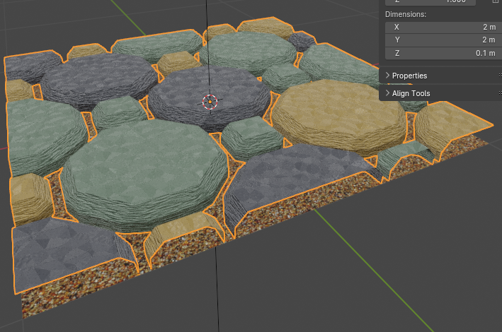
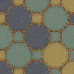
Hmmm…. That DOES look better! I didn't realize just how much a lighter grout would make it look so washed out.
Does it really look better?
Personally i guess not, but to be sure, we could do some things:
You work on tiles. Then look at many tiles, NOT at a single tile! Make a 10 x 10 grid of the tile, and look at that. The periodic tiling impressions become only visible with periods, NOT when looking at a single tile.
After we have our grid, place some NPC sprites over it, ideally. Or some placeholders. What do you see? The background or the foreground?
You have increase the contrast and you think it looks better. But high contrast steals the show for anything else. Your NPCs might vanish in the noise of high frequency, high contrast backgrounds. One more classical art mistake.
Keep in mind: To make a tiled game look good, your main tool is the arrangement / composition of the tiles, not so much the tiles themselves. The tiles are like colors on a palette of a painter, not more.
That's not said to downplay good artwork on the tiles ofc, but it's mostly about subtlety for practical reasons. You usually want low contrast to serve background needs and to hide repetition. High contrast and very decorative tiles are better used sparsely.
In general you want higher contrast in the lower frequencies, and lower contrast in the higher frequencies. That's also the secret of making content look good at any scale.
MarkS said:
I decided to bump up the tiles to 128x128. 64x64 is just too small on modern screens and there is virtually no good way to get the detail that I want.
The higher the resolution, the harder it becomes to make tiling look good. The more detail and realism, the lesser acceptable the unnatural tiling constraint.
That's the hard truth, and the reason why tiling went out of fashion for a decade or two. It comes back recently because it turned out people actually like blocky pixel art, not only for nostalgic reasons.
But this, and anything else i've said, is not meant to convince you about doing something else or differently. I don't see anything wrong here, but i assume you may overlook some things, and having heard about them in advance can't be bad.