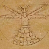
It's sort of grim, if you really look at it. Those are goblin heads. Severed goblin heads, sitting on wooden shelves. The life/energy bars are something I have thought of before, nothing really innovative there, but it's unlikely I will go with that unless I can figure out a better way of doing a glass bottle overlay in Blender. Anyone have any tips?
I have been putting some thought into fleshing out the graphics sets, as you can see by that experimental brick block. Mostly, I've been thinking and playing around in Blender.
In a way, I've made my life a bit harder by switching to hex, at least as far as graphics are concerned. When doing standard isometric graphics, you only have to worry about making them tile in 4 directions, at least as far as walls and such are concerned. Hex adds the additional complexity of two more directions, and makes it more difficult to do squares. So I'm thinking about taking the hex idea and just running with it, making every architectural structure based upon hexes. Hexagon or triangular rooms and buildings, hexagonal towers, hexagonal mountains, etc... I've got decent templates for isometric graphics, as well as plenty of scripts for doing processing, but I'll have to rewrite all that stuff for the hex basis.
I also need to think about lighting and shadows. Right now, I'm using a generic shadow texture for just about everything, which is adequate for the mobs but not so much for the architectural pieces. Also, I want to have caves/dungeons, and those need to be dark and torch-lit, and the new backend doesn't have any of the lighting code installed. In fact, the switch to a hex basis has complicated that aspect of it, as well.
Anyway, that's what I'm up to. Procrastinating the task of fleshing out the combat and character stats system some more, mostly. You know. The usual.


I would suggest seeing how Diablo 2 made use of bottles for HP/MP. Maybe you can merge something together?