Week Of Awesome IV - Day 6

Published August 13, 2016
Advertisement

End of day 6 for me now.
I've managed to get some good progress done.

Some things done:


  • Added sound effects for: Shadow mode, walking, taking damage.
  • Added some music for ingame and the menus.
  • I've done the menu's, Just need to go back and scrutinize the credits screen to make sure I got everything right.
  • I've got a "hard" level done, bringing the level count to two.

Some things to do:


  • Build a bunch more levels :D
  • Save game support so some stuff can persist
  • Using the points for something

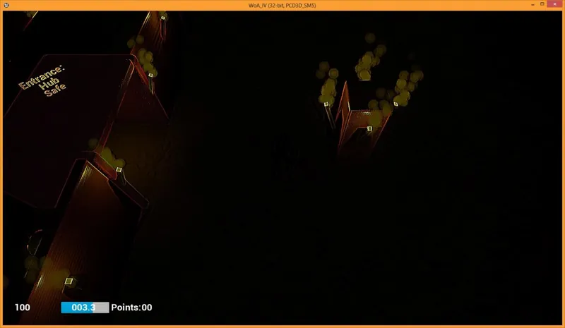
    A quick screenshot showing what the game looks like right now:
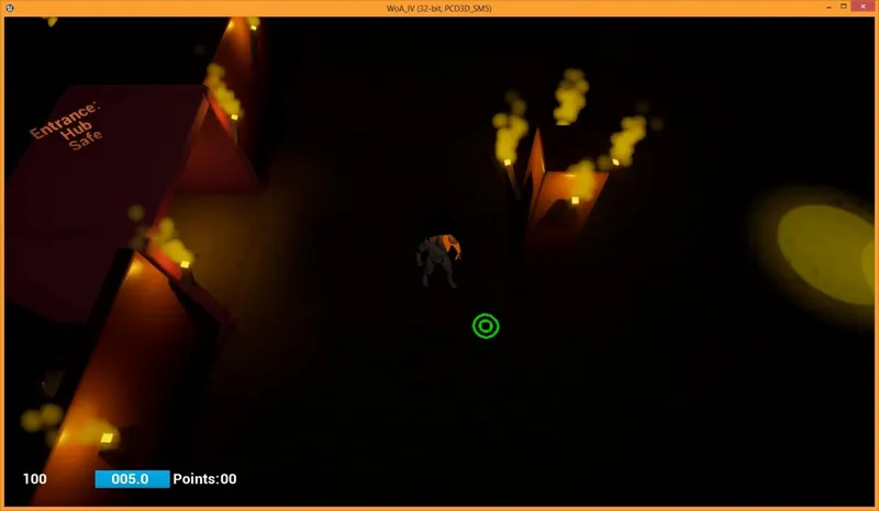
    Screen shot 0_Day6_Norm.jpg
    And then in shadow mode
    Screen shot 0_Day6_Cloak.jpg

That's all I've got for now.

To my fellow competitors: Keep up the good work!

Thank's for reading,
Ryan.

4 likes 6 comments

Comments

SilviuShader

Great shadows (y)

August 13, 2016 08:19 PM
ryan20fun

Great shadows (y)

Thanks!

Unfortunetly the only credit I can take for that is the placement of the lights, I am using UE4.

I would probably have something super basic if I was still using my WIP engine.

August 13, 2016 08:20 PM
Thaumaturge

It looks as though it's shaping up. ^_^

A suggestion, if I may: Perhaps in "shadow mode" render the world in grey-scale (or perhaps shades of blue), to make the two states more visually distinct.

August 14, 2016 02:04 AM
aletheia_games

Thanks for the encouragement. I love the erie look you have got there.

August 14, 2016 03:19 AM
riuthamus

@thaumaturge This is exactly what I did with my game. The entire scene is rendered in a grey/blue overtone and only key parts have color. It does wonders to convey the message you are looking for.

August 14, 2016 06:06 AM
ryan20fun

It looks as though it's shaping up. ^_^

A suggestion, if I may: Perhaps in "shadow mode" render the world in grey-scale (or perhaps shades of blue), to make the two states more visually distinct.

Good suggestion, I'll see if I can get this done in time.

Thanks for the encouragement. I love the erie look you have got there.

Your welcome, And thanks.

@thaumaturge This is exactly what I did with my game. The entire scene is rendered in a grey/blue overtone and only key parts have color. It does wonders to convey the message you are looking for.

I am going to have to see if I can implement this too, I can do the occlused colouring ease(I just have tn enable the custom depth on the items and set a appropriate stencil value).

August 14, 2016 09:20 AM
You must log in to join the conversation.
Don't have a GameDev.net account? Sign up!
Profile
Author
Advertisement
Advertisement