GameDev Doctor
Well, I'll be describing at least part of the jack of spades.
The Jack is facing to the right, so only half of his face is visible. His yellow hair comes down to the level of his mustache, with three curls going right, and 3 coming from under the first three, but curling to the left. His chin slopes down shortly and becomes flat. He is wearing a red crown with a black border, thin on the sides and thick at the bottom. The top of the crown is not visible. There is also a black zig-zagging line inside the crown that dips down and returns 3 times. He has a red collar with spades going to the left side across it. And hand sticks out above his suit that appears to be his, but comes from behind him. His fingers are facing inward, clutching a gold twisting scepter. However, at no point can you actually see the scepter pass through his fist.
It gets pretty complicated and hard to describe after that unfortunately.
I mean, why would you get your medical advice anywhere else?
Well, I dont have the actual assignment, because I drew stuff over it, and am too lazy to redo it. However, I have several drawings, most of which are assignments from the book.
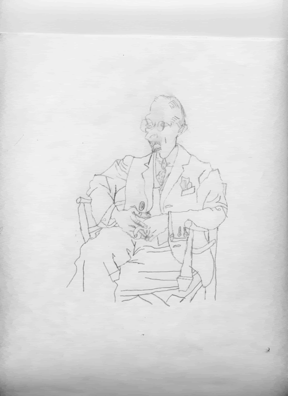
Upside down copied drawing (flipped of course)
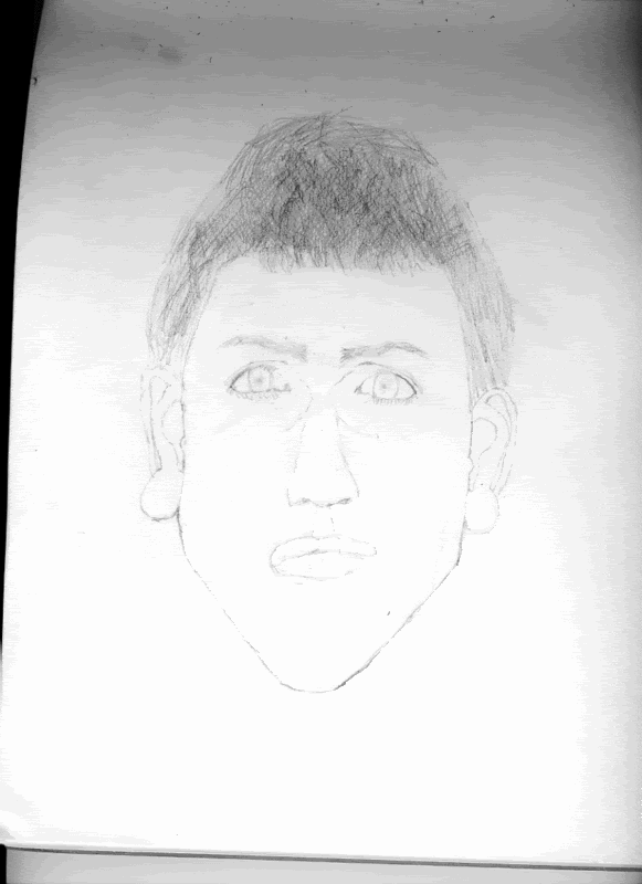
Self portrait attempt
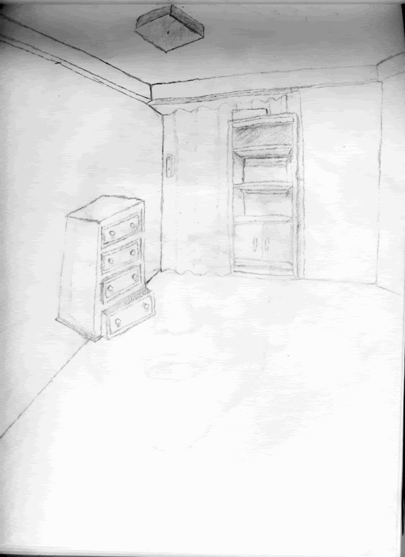
My room
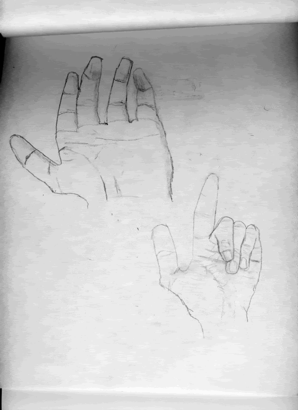
Hands
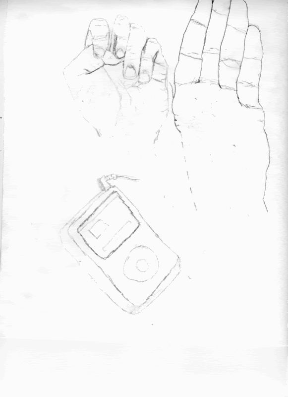
Hand, most of a hand, and an Ipod :P
I'm having a lot of trouble getting shading right whenever I try it. The mouth / eyes (the iris) seem really hard as well.
Upside down copied drawing (flipped of course)

Self portrait attempt

My room

Hands

Hand, most of a hand, and an Ipod :P

I'm having a lot of trouble getting shading right whenever I try it. The mouth / eyes (the iris) seem really hard as well.
I mean, why would you get your medical advice anywhere else?
Upside Down Drawing and Self Portrait
I think it's interesting how much better the upside down drawing is, in terms of fidelity to the original, than the self portrait. Part of the problem with the self portrait, of course, is that you basically use a symbol for the eye. The pupil is placed precisely in the middle of the open eye, with both the upper and lower eyelids open by the same amount. In reality, your upper eyelid is much larger than your lower one, and consequently only about half as "open."
Try this: take a picture of yourself, then turn it upside down and draw that. Post the result here when you get a chance.
Room
Your basic problem with your room is the lack of perspective. Also, the dresser is either floating above the floor, nailed to the wall, or somehow magically warping the wall into transparency while jutting out from it. This effect is created because of your lack of consistent projection lines.
Read this for some quick notes on perspective.
Hands (various)
Your hand drawings are not bad. A knowledge of anatomy will strengthen the structure, because you make certain choices that turn the hand from a potentially good drawing into a bit of a caricature, especially where the thumb leads into the wrist.
I also want you to be more measured in observing the way your skin works. The folds around your knuckles, the radial and axial lines that define the way your skin contracts as you flex your hand. The thicker, often darker lines that define how your palm and fingers fold in to form a fist and other expressions.
iPod
The iPod proportions are wrong (there is no iPod which is as wide as it is tall, much less wider). Also, you can see both the top and the bottom of the iPod at the same time. That's a case of drawing what you know rather than drawing what you see. Place your iPod on your desk, pick a spot (any spot) and look at it. It's basically a cuboid. You can only ever see a maximum of three faces of a cuboid while in 3D space (from directly above, in front or beside you'll only see one, and from a collection of perspectives you'll see two, but never, ever four). Use that knowledge to help you plan your drawing. Again, refer to the perspective post I linked above.
Shading
At this stage, don't worry too much about shading. There are two aspects to shading: perception and rendering technique. After perceiving shadows, many people try to just blacken in the area, yielding an unsatisfying result. A first step improvement is to outline the shadows. Once you're happy with the outline, hatch them.
Later on, once you become proficient at this method, you can explore the use of a kneaded rubber eraser to "paint in light."
This topic is closed to new replies.
Advertisement
Popular Topics
Advertisement
