Original Post

Which of these two design looks better?
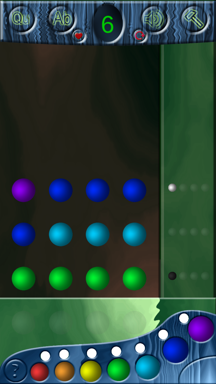
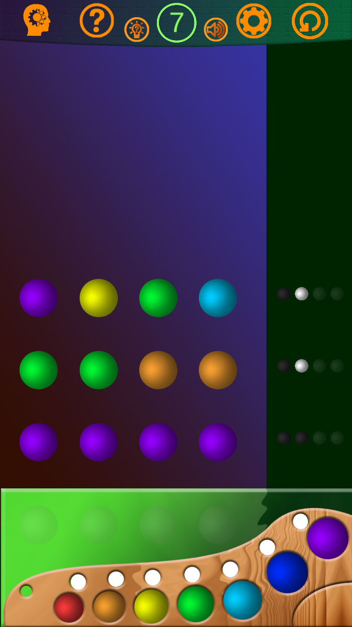
Which of these two design looks better?
Second one looks simpler
second one
The second one, looks more refined.
0:3. Clear enough.I'll take the second as a base. Thanks.
A little late...but make that 0:4. The "wood" waves at the top of the first one kinda ruin it. Generally the style itself doesn't matter as long as it is consistent(and it fits the game), and that wavy thing is different from everything else I see.
I hope I fix style problem to next week, and publish a new version. Thanks a lot to all)
I mean no offense and I'm truly sorry I have to say this but none of the other comments have been remotely helpful: both look absolutely terrible. In your shoes I would find a designer friend to teach me, read up on some basic color theory and read up on some basic rules of composition. I estimate 6 months of hard work until you get to a market-ready level.
I prefer the 2nd design concept. The trend today is simplistic, flat, metro look The very top colour scheme, green against the orange does not feel right. The green at the bottom with the palette is lovely. My suggestion for the top is use the same colour as the green at the bottom and make the accent icons Monochromatic. For the middle maybe bright it up abit as well. Try a straight 90* degrees gradient for the middle. Other than that excellent work! I'll keep eyes open for future posts.
Great tips! In some kind way both
10 hours ago, zarloo said:look absolutely terrible
but I hope I'll can change it to pretty look with your help, friends.
11 hours ago, mmk0102 said:Great tips! In some kind way both
but I hope I'll can change it to pretty look with your help, friends.
Listen, every comment on this thread except mine is useless to you. If you want to improve, you need to do the following: find a book on basic color theory and read it.
48 minutes ago, zarloo said:a book on basic color theory and read it.
Color theory is not a magic bullet. It takes months of practices to get color working, it's a dangerous thing to tell someone to use and because of it's limits some art schools refuse to teach it.
Instead of just telling the developer to use it, why not show how color theory can improve the look?
23 hours ago, zarloo said:both look absolutely terrible.
Art for games need to support the game before it concerns it'self with looks. In a game art takes the same role as sound, it's just user feedback.
In this case the second image made things more clear and it is easy to look at the style and know what kind of game this will be. So the question "Which is better" is easy to answer.
Sometimes we have not enough time for project, even 6 months. But read up on art styling books is good tip. So, I little improve the game. Which of these two looks better now?
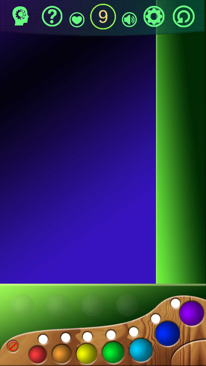
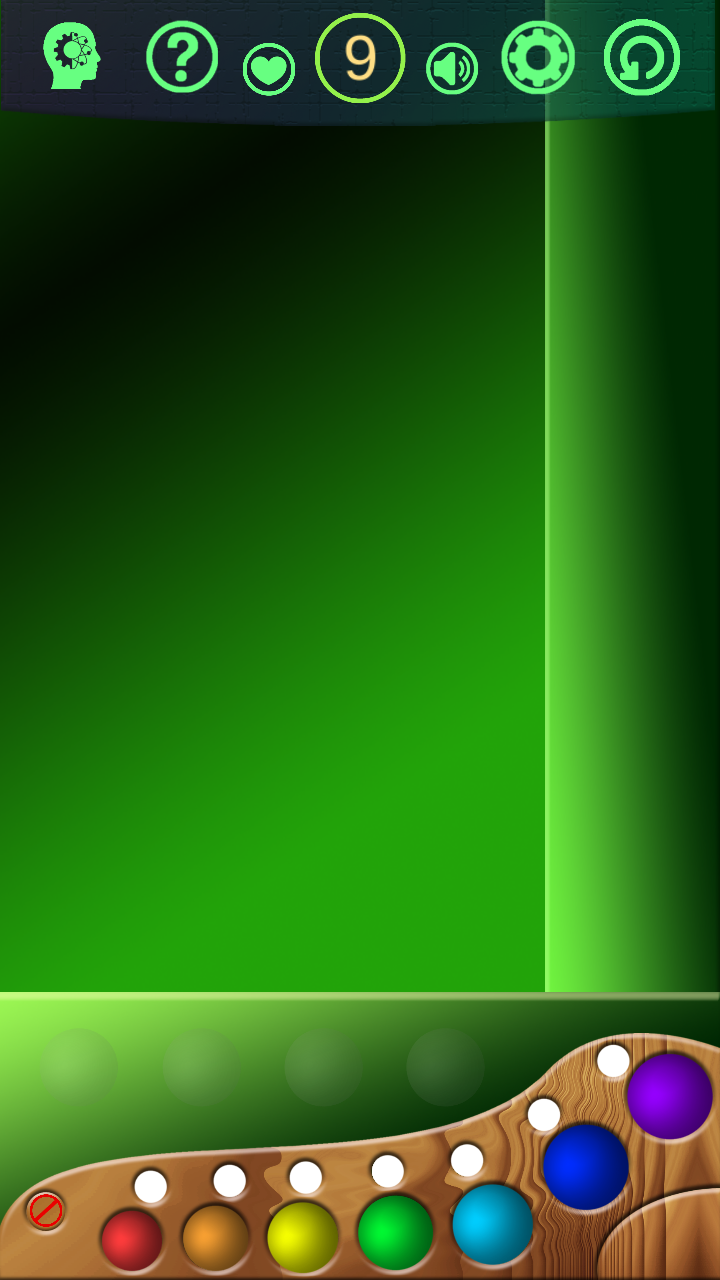
The top looks better sweetie. That tealish-green colour though for the icons looks a bit off, everything has a strong saturation except that element. it's pale... seems weird for myself. You are making great progress, stay strong! Awesome work xoxoxo
Second one, but that thing which hold a balls is better looking on the first one
If it was me, I'd use a neutral color for your background. I'm assuming the game is something similar to the old board game 'Master-Mind' ? It's a tough call as to which one I think looks better. I like certain elements from each. I Iike the top and bottom of the second one, and middle of the first one. The third and forth are similar to the second one. just different middles.
The second pic gets my vote also.
Hi friends! Thanks a lot! So many man, so many minds. I hope I complete the project very soon.
You are right - it mastermind . Kind of. I name it intellMind, the rules are little different.
And white circles are marks for colors- just for convenience.
This is pathetic -- you guys are doing nothing but giving this developer a false sense of self-confidence which will sooner or later vanish in the face of the reality of the market -- aka when nobody plays his game. You are just doing useless A/B testing. How about helping this developer improve upon their understanding of art fundamentals instead of lathering his ego?
Start with this:
On 11/15/2017 at 11:08 AM, mmk0102 said:Which of these two looks better now?
The second one again.
if you want to change the look of the spheres I have a little quick trick for you, click on the spoiler if you want to see it:
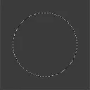
1.) So you start by making a circle using the circle tool of your 2D software.
By having a zone selected you can brush as wild as you want on the inside and will still always get a circle.
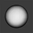
2.)Follow that up by shading the basic sphere, just fill it with black and use a white brush in the center. If it isn't smooth, you can blur it.
How it's shaded will impact the final material. For a glossy look use a strict contrast between black and white.

3.) Add a specular point on a new layer. The specular is just a large white spot.
Spheres are smooth and round, so there speculars should be near the center. The exact point will depend on where you decide the light is coming from.
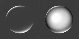
4.)On a new layer add Fresnel to the sphere. You do this with a large white brush, painting half way out of your zone so that only a bit of white enters the circle. Erase the center part so that it is only on the edges.
Fresnel's law explains how we see more reflective light when looking from a angle.

5.) Last you add reflections. This is very easy, just do a few white brush strokes with a white brush. Then use the eraser with a very sharp brush and erase parts of your strokes.
Erasing with a sharp brush is how we get sharp edges in shading.
You are done. A easy sphere in 5 very easy steps. This took just over 8 minutes to make. Your first time will be a bit slower.
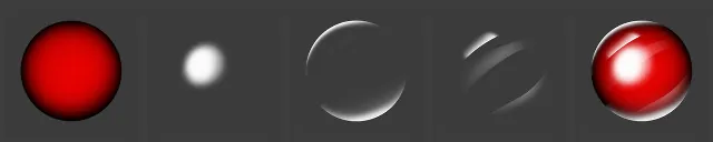
To color a sphere you just color the first layer. Playing with the layers will help you achieve other looks. Having a photo reference also helps.
If you want to be fancy you can add color theory, but the exact amount will change depending on what you change in the other layers.
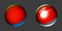
Because this is so fast to do, it is a easy way to practice shading and other concepts. Using only these layers and changing things around will help you understand materials.
For tutorials and other art related things, checkout Pinterest.
That is if you are interested in learning about 2D art. If you are more of a developer then you are free to leave this to the artists.
12 hours ago, zarloo said:How about helping this developer improve upon their understanding of art fundamentals
Good question why did you start with color theory and not a fundamental of art?
12 hours ago, zarloo said:Start with this:
Please don't start with this! Unless you plan on diving into the deep end of art and learning the frustrating way.
Learning monochromic first, before moving to color theory is a better idea. Before that shape and form should be well known and before that silhouettes. Basics on lights and reflections also helps with color theory.
Reasons color theory doesn't always work:
1.)A large amount of people are color blind.
2.)Men and woman don't see the same colors.
3.)No two people see the same colors, some people don't even see the same colors with both there eyes.
4.)Devices don't show the same colors. Players don't use the same settings.
5.)Color theory works best with minimalist art styles. With more complex art styles it creates noisy scenes because of the complexity.
6.)Color theory works best with limited color pallets.
7.)Unless the artist knows monochromic colors, color volume principles and saturation principles your going to do more harm than good. It makes for fun learning though.
8.)Most color combinations are similar, making the game look washed out.
I am not saying color theory is bad. I am saying that it's a bad place to start. Please don't go around the web spreading color theory like it is some kind of magic way of making things look good.
On the other hand if people wish to research color theory here is a good tool: https://color.adobe.com/create/color-wheel
12 hours ago, zarloo said:You are just doing useless A/B testing.
Learning this way will be harder but worth more in the end.
@zarloo you have the critical mindset needed for art. However not everyone wants to be a artist, forcing art principles on someone will only frustrate them.
Hope to see more of you around, the forum could do with more artists.

This topic has been locked by a moderator. New replies are not allowed.
GameDev.net uses cookies to ensure you have the best experience on our platform. Learn more