Looking for feedback for my 2D character

Started by
12 comments, last by Thaumaturge 2 years, 8 months ago

Hi!

I'm trying to make a top-down shooter in the style of Enter The Gungeon or Nuclear Throne. My main character is a lab assistant who is forced into picking up guns to defend against the attackers who invade her workplace.

I have started with 4 simple animations:

Idle without weapon
Walking without weapon
Idle with weapon
Walking with weapon

I have never done pixel art before but I watched some tutorials and tried to apply it in my first work. Any feedback will be much appreciated!

Advertisement

Hmm… It's not really “my style”, so my critique is limited, but I do have a few thoughts:

First of all, it fundamentally looks fine, I think. The tone seems to me to be cartoony and light--if that's your intention, then well and good! ^_^

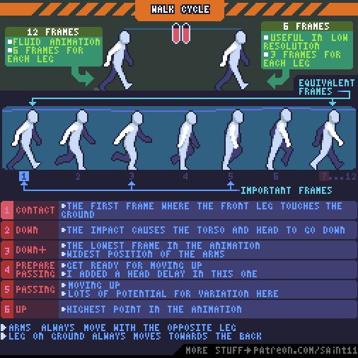
In terms of potential improvement, I feel like I want one more frame in the walk-cycle, primarily for the movement of the character's legs. At the moment, with only two frames, there's no real sense that the character's legs are moving, I find--it just feels like they're clicking back and forth. With a third frame (or, even better, a fourth), the motion of the legs might be better conveyed.

I also feel like the animation of the character's arm in the walk-cycle is perhaps a little jarring: in pretty much all other respects, the character's lines are rounded; they have an almost rubbery feel to them. It's thus a little jarring to suddenly see a sharp bend at the elbow.

I would suggest either sharpening the angles of the sprite elsewhere, or--perhaps better for the style otherwise being used--curving the character's arm in motion, rounding off that angle.

MWAHAHAHAHAHAHA!!!

My Twitter Account: @EbornIan

A good labcoat needs good pockets!

Although I admit that would be really hard to do at that resolution. I also wholeheartedly agree with more frames of animation. Animation is the stuff of life.

I don't like the walking without weapon animation. The right arm seems thicker than the left arm, the upper left arm is too stiff while the lower left arm moves too much. Try to get the extremes right before you add too many in-between frames.

The walking with weapon animation looks better, but the left arm bends like a rubber hose. Which is a perfectly valid artistic choice if you're going for that very-early-animation look, but perhaps not what you're going for.

I dont do pixel art very often but I recommend using pictures like that as orientation

Thank you all for your feedback! It's kinda unfortunate though, because I realized that the proportions where not quite what I needed for my game. I ended up reworking her quite a bit: making her smaller as a whole, and making the torso smaller especially. My characters don't need to be that expressive in-game, so I can scale them down quite a bit. This makes some things easier, but some things harder as well :D

Right now I'm working with these sprites:

Idle
Idle with gun
Walking
Walking with gun

I am not exactly happy with the way the arms look in both “without gun” versions. Since her coat is white I ended up making some grey outlines, but they do look… awkward? :D

The walking animation for the legs is also very simplified, since you they are very small and you can't really see them very well.

Tell me what you think ?

She looks incredibly stiff and mechanical now. Almost like she's trying to mockingly imitate a robot, because even a real robot wouldn't be that stiff and mechanical.

@a light breeze Yeah I think you put it best! I'm just not sure on how to improve it at the moment. I'm also having a hard time searching for reference as I'm new to pixel art, so I don't know the correct terms to google for ^^". I'd say my game will be a top-down shooter, but there seem to be 2 kinds of them: the “Enter the Gungeon” style top-down shooters, where you still see the characters from the side kinda and the complete top-down shooters (like GTA 1 and 2) where you only see the top of the heads of the characters and not their faces.

I also found this “3 / 4 top down” style (like Pokemon Red for instance), but that doesn't seem to fit what I'm going for here. Any advice would be much appreciated ?

For the arms, I'd mainly suggest bending them at the elbows--even if only by a pixel or two--and doing so primarily on the up-swing.

For the legs, I feel that what you have could work, in concept. I'd primarily suggest adding some lateral movement--so that they look like they're moving the character forward--and another frame or two--for fluidity.

MWAHAHAHAHAHAHA!!!

My Twitter Account: @EbornIan

This topic is closed to new replies.

Advertisement