Good day guys. I want to improve my skills and eliminate as many mistakes as possible. Could you provide feedback on any work in my portfolio? Or about the portfolio in general? Any criticism is welcome.
one of my works
here's the link: https://www.artstation.com/arkady
a light breeze said: A lot of your big attack animations feel jerky. You should either add more in-between frames or add more motion blur.
There is pixel art with motion blur? Where can i see this?
I would not criticize the jankyness. A matter of budget.
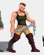
But there are some aliasing issues. For example, on the girl example above, the bending knees generate too much left right motion of the calves. This motion causes some aliasing which conflicts with the simpler up down motion of the upper body. It's not wrong, but the aliasing generates an exaggerated wobbling effect on the calves due to pixel quantization constraints. I saw similar issues on the portfolio. Minor issues, but some room for improvement.
Initially my first thought was as well that the breast jiggle is too much, for modern times at least. I mean, if you ask me, i'd like every game looking like coming out of the Heavy Metal magazine, yes! But modern time political correctness seemingly dictates every woman should look average but not hot, among other things like mixing all covers of skin ideally. While it's still ok all males look like Arnold Schwarzenegger. Not sure if that makes sense at all. But if you want to confirm, probably less jiggle… : )
But then i saw this:
That's really unique and interesting. The whole image wobbles, just the breasts do not, or even slightly the other way. That's an interesting way to guide focus, and i have never seen such thing before. Maybe it's better you don't conform, but rather do what you want, which is the only way to generate ‘true’ art anyway. : )
Aliasing issues here too: The shoes are static. Only the shoes, so they pop out. Animating the shading, but also the contours(!) a bit would help.
Anatomy nitpick: I miss the thumbs. The fists could be a little bit larger, to generate the impression they are actual dangerous weapons.
This guy also has a breast issue: Due to the dark shadow below and the narrow upper body, the guy feels too feminine or even a bit gay to me (maybe also because of the boots). Probably not intended.
That's a lot of breasts, but you asked for it. xD
Overall it's good work. Facial expression is great.
Maybe you should show some more environments too, to attract small indies which can't hire many artists.
That's really unique and interesting. The whole image wobbles, just the breasts do not, or even slightly the other way. That's an interesting way to guide focus, and i have never seen such thing before.
I think I used “follow through and overlapping action” here - one of the 12 principles of animation
Kiriyama_gdv said: I think I used “follow through and overlapping action” here - one of the 12 principles of animation
But you did the opposite of that. The principle means, in physical terms, that the artist should attempt to preserve momentum. Hair or cloth still keeps flowing after the character stops, for some time until the energy dissipates. Basically an attempt to increase realism.
But you violate the laws of physics. The chest moves left and right, so the breasts should follow this motion although with some lag. But your's go right to left, contradicting the chests momentum. (We could argue they are so heavy they won't start moving, but that's not my point.) Eventually we should notice this feels wrong, but something better happens: We realize the artist drives attention to a certain spot, we follow and stare at it, and instead complaining about physics we start thinking about what you might want to tell us.
That's ideal, and you could use this more often, and even create some unique signature artstyle out of it. I also see practical use for games: E.g. character running with a gun. The character hops up and down, but the guns stays in place vertically, helping the player to aim accurately. That's nothing new i guess, but there surely are many ways to apply this to more things, or even to all things.
You know, first you try to obey the rules. Learn proper anatomy and composition, etc. But then, after mastering those basic skills, artists often violate the rules on purpose. And that's what gives distinct new art styles ideally. Like Cubism, when artists began to draw faces both from the front and the side, or the usual exaggerations in comics and animations… things like that.
Hmm, you know, at first I wanted to delay the chest so that it would catch up with the movement of the body after a while. But given that the movement is very fast, the opposite effect actually occurs. Thanks for pointing this out and it really can be used in interesting situations.