Just to be clear, this is NOT a marketing ploy. I won't mention the name of my game or anything more about it than necessary, out of good faith.
I've been working on a 2D game in Unity for about 8 months now. My game is essentially throwback to classic horror that doesn't take itself too seriously, with action-packed gunplay and stealth elements and some unique features and a full narrative story. Horror films old and new are my passion, and I haven't quite seen the true spirit of horror captured in modern gaming the way I want to.
So, despite being a top-down game, I'm hopeful there is a target audience out there for that. Games like Intravenous, Zero Sievert, and even 2Dark found players within the last few years. The thing about those games is, they look complete and whole, but screenshots of my game feel like they are missing something.
I come from a programming background, so I've managed to build/integrate most of the features. However, I have no idea what I'm doing when it comes to art, and it probably shows, and I hope it can be rectified.
My analytical "programming" brain got me this far on the art, but I feel like I'm starting to run into my limits and I truly need help.
I'm struggling to put a bunch of sprites together, and make it look like MORE than just a bunch of sprites stuck together. I can't put my finger on where to go with it. I want it to come off as a whole greater than the sum of its parts, if that makes sense.
I've tried everything I can come up with, adding baked-in lighting in addition to real-time and decals and things like that, but I'm stuck now.
The game has some fairly advanced particle effects, animations, spatial UI, etc. The environment is pretty reactive with muzzle flashes, ricochets, flickering lights, blood, fire, etc. I'm really, really trying to deliver, if I can just get the environmental art figured out.
Truthfully, I'm doing this because I'm terrified about the game not doing well. My career has been impacted by the bloodbath happening in the tech industry right now, and I'm trying as hard as I can to jump into game dev and make it work because of my passion for games and horror and programming. If the game is not going to sell because of the way it looks, I have to know now instead of pouring water into a leaky bucket.
ashrzr said: I'm doing this because I'm terrified about the game not doing well. My career has been impacted by the bloodbath happening in the tech industry right now, and I'm trying as hard as I can to jump into game dev and make it work because of my passion for games and horror and programming. If the game is not going to sell because of the way it looks, I have to know now instead of pouring water into a leaky bucket.
I'm not an art director and I have no feedback for you on your graphics.
Stop being terrified. Assume your first attempt at a game is not going to sell well enough to substitute for being laid off. Just consider the nature of the indie games market. It's a minuscule percentage of first-time indie games that catch on and make money. Getting rich as a first-time solo game maker is unlikely in the extreme. And by all means, continue applying for jobs doing what you were doing before. The first thing that happens after mass layoffs is those companies start creating new business units and need to hire. Stay in touch with your former coworkers (that's good networking).
You could keep working on your own game while applying for a new job. But stop dreaming about pie-in-the-sky outcomes, and stop being terrified about likely outcomes.
Hi, thank you for taking the time to reply.
I probably should have been more specific. I'm not expecting to get rich. Am I still aiming too high if I shoot for selling just a few hundred units, if I can manage to get substantial feedback beforehand? That would be enough. If, say, expecting to get even a few people to play the game is pie-in-the-sky, I hear where you're coming from. But I personally wouldn't have thought that with decent feedback and marketing, unless it's just a bad game, which would come out in the feedback.
I've been applying for jobs for over a year, but nothing by the time I get to final round of interviews despite 7+ YOE, so software engineering appears to be pretty dead. The chances of success there don't seem much higher.
Also, for what it's worth, I've made many games in the past and learned a lot, though never completely finished or released them, if that makes it any more likely the first actually released game will be decent.
Completely clueless about pixels, but what I am missing in the description is the goal you're aiming for in graphics. What's the message that the graphics should tell the user?
Everything looks dark, so “not enjoyable” seems a message, but not enjoyable in what way?
One thing I picked up in the little I read here, pictures are very uniform. There is nothing worth looking at, it's all very empty. Nothing in particular draws the attention. Corridors and streets look very much the same wrt light, they seem interchangeable.
ashrzr said: My analytical "programming" brain got me this far on the art, but I feel like I'm starting to run into my limits and I truly need help.
Then i'll talk about frequency analysis and composition again. Because personally i came up with this kind of thinking long before knowing about the underlying math, while working as an artist attempting to figure out why some images look bad.
Here's random screenshot from the game Signalis, a kind of top down Resident Evil with many puzzles. I really liked it, and the reason i got it was because they achieved a pixel art style from rendering characters as 3D models. So basically i tried it only because it looked good to me, bet then i kept it because the game was good too.
Lighting and scenery is pretty similar to yous.
But in your case, the highest frequencies dominate the lower frequencies, which btw is THE classical beginner / programmer art mistake:
You have very detailed structures everywhere. On the walls, on the floor. Everywhere i see tiling patterns, which do not contribute to anything, and even amplify the tiling effect we want to hide. The lower frequency lighting gets lost below those details. That's your main problem without doubt.
You want to reduce the contrast of your higher frequencies, so your lower frequencies - which are always more important - have a chance to been seen, and ideally dominating the image.
And every frequency band should be sparse. Meaning it should be partially empty, having details only in some places. Less is not just more, it is essential. Compare the floor patterns. The Signalis game has light grid and a darker spot in corners. Yours has dense detail of a wood texture, which in the end is no content at all but just uniform noise. Notice, due to sparsity, the Signalis game can even use higher contrast here, and they get more detail although they use only half of resolution. Looking at their desk and wall textures. those have almost no detail with very low and subtle contrast. This is needed so the high contrast floor texture becomes a valid option at all. If all texturing would have as much contrast as the floor, the whole image would look bad. So this concept of sparsity does not just apply to one floor tile in isolation, it also applies to having variance across multiple tiles and textures. It is required to avoid the boredom of uniform and constant detail everywhere. It is needed to see a difference across different things.
Fight the noise with sparsity! : )
Another topic: Pixel art only works at low resolution. You use high resolution, and even professional artists would struggle a bit with that. Opposed to the above, that's not something you must change. But you can consider to half resolution. It really makes everything much easier, looking better (curiously), and may be worth the time eventually.
Your shadows are a bit lacking as well, but that's surely hard to fix. In Signalis they used 3D models for everything, so proper shadows are easy. It's probably not that important, but for a Horror game shadows could contribute a lot to atmosphere, and maybe you can come up with something. (I don't know much about 2D shadowing tricks so can't propose anything.)
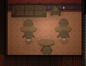
The furniture here shows your art skill limitations. You have problems with perspective and composition. It's hard to see that's desks with two chairs, not just a single merged blob of something. It might help to use a different color for the chairs. But in general that's just difficult, and probably you can't fix such issues on your own. So either you accept it looks a bit amateurish, or you consider to hire an artist at some point. (Good news: After the recent round of layoffs is over, awesome generative AI will ensure there's still a constant stream of fired artists hungry for work and easy to find, i guess… : / What a great time to be alive!)
To sum it up, i think you can get most improvements from focusing on the frequency thing. You can also experiment with some colder (blueish) lighting for variance in atmosphere. Currently you use warm colors everywhere.
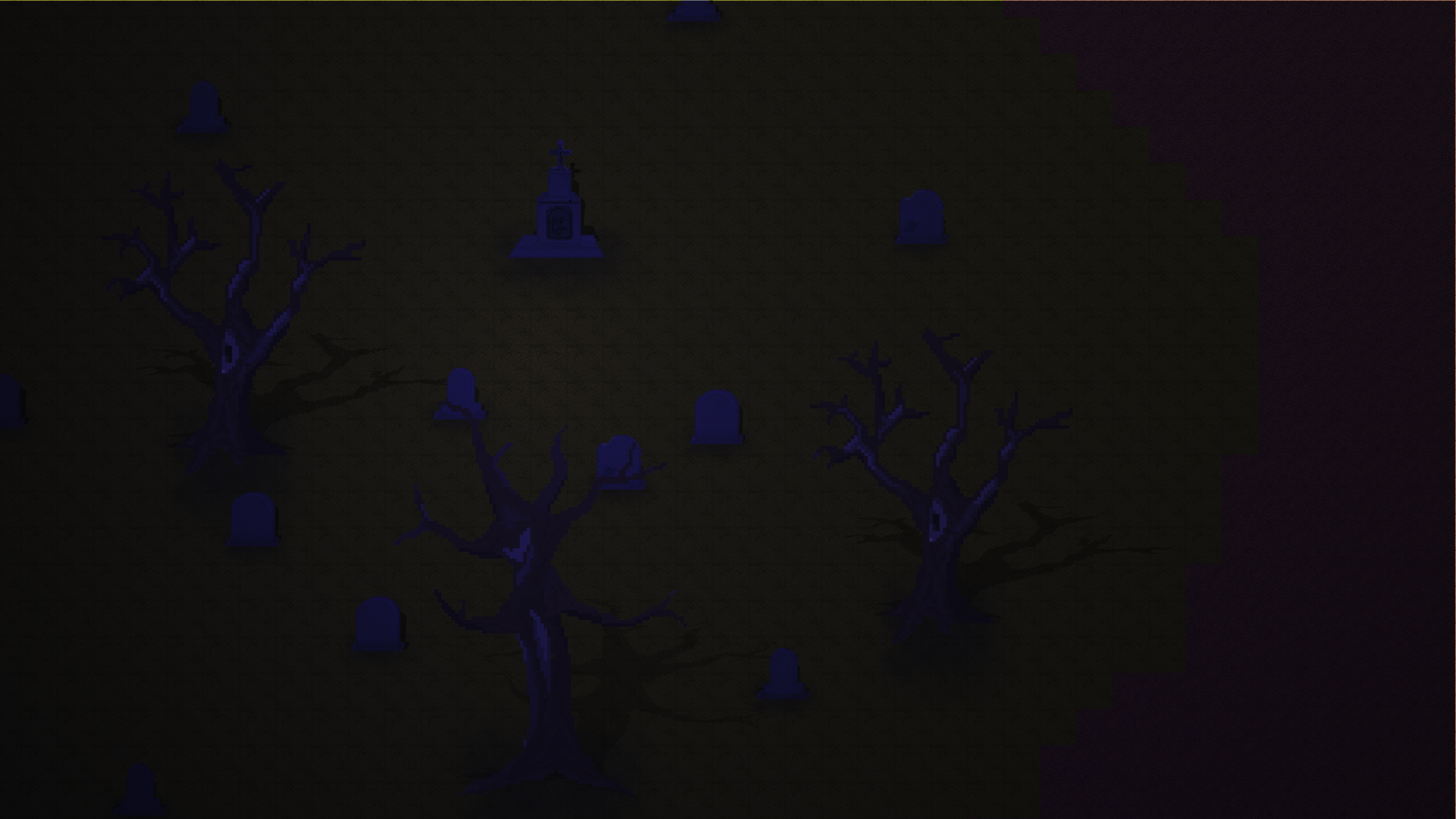
Finally, this one is not acceptable. I can't see anything. And the ground should not be brighter than the trees, which looks like a bug. You need more light, and probably you need to genreate background scenery even if it's meant to be very dark.
One thing I picked up in the little I read here, pictures are very uniform. There is nothing worth looking at, it's all very empty. Nothing in particular draws the attention. Corridors and streets look very much the same wrt light, they seem interchangeable.
This is exactly the issue I'm having. I'm not sure how to fix the emptiness and uniformity. (JoeJ addressed the uniformity, more on that below.)
I feel that the environments in Signalis aren't much different in that regard and don't really have anything interesting to look at, either. Don't its environments also look generic and interchangeable and roughly the same as each other? It looks like it all may as well be the same level.
Here's random screenshot from the game Signalis, a kind of top down Resident Evil with many puzzles. I really liked it, and the reason i got it was because they achieved a pixel art style from rendering characters as 3D models. So basically i tried it only because it looked good to me, bet then i kept it because the game was good too.
Personally, I don't care for the way Signalis looks, which is disconcerting, since other people do, and so I'm not picking up on something. It looks kind of smoothed over and lacks "crunchiness" and contrast, it's hard to differentiate between some objects, and there aren't any interesting colors to look at. It kind of lacks charm, doesn't embrace ugliness. It doesn't really scream horror. If I didn't read anything about the game, and just saw the title and most screenshots, I would think Signalis is more of a stealth-action Splinter Cell type game.
My opinion on Signalis doesn't matter, but maybe it shows an error in my thought process somewhere.
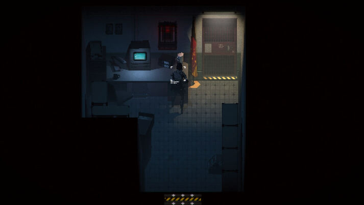
Take the picture of the subway in my game, on the other hand. It's trying to be raw and gritty in a way that Signalis isn't, and my hope was a certain kind of charm could be communicated through that. On top of that, one more cue in the subway such as blood would communicate horror in a split second, whereas the only way Signalis can "signal" that is showing enemies that are clearly monsters, and all of the screenshots look like a single level from an espionage stealth game.
In a way, it seems like Signalis and I are going for different ends of the spectrum. Where Signalis looks kind of watered down with a flat color palette and unvaried environments, I'm trying - key word trying - to go for a raw/gritty style with vibrant colors and a wide variety of environments. Like the horror movies of the 70s, 80s, 90s that were shot on film.
Not to say I really have any clue what I'm doing. I have intentionality, but that doesn't mean anything if it's misguided. My execution is clearly lacking, but I hope I'm making sense.
You have very detailed structures everywhere. On the walls, on the floor. Everywhere i see tiling patterns, which do not contribute to anything, and even amplify the tiling effect we want to hide. The lower frequency lighting gets lost below those details. That's your main problem without doubt.
Would it look differently in real life, though? A lot of subways do have that tiling pattern on the floor and walls, wood panels are wood panels, etc. Does that really have to do with the art style itself?
You want to reduce the contrast of your higher frequencies, so your lower frequencies - which are always more important - have a chance to been seen, and ideally dominating the image.
---
To sum it up, i think you can get most improvements from focusing on the frequency thing.
You can also experiment with some colder (blueish) lighting for variance in atmosphere. Currently you use warm colors everywhere.
The lighting is real-time and independent of the sprites. So if the lighting is an issue, does that mean the sprites are not and that this is more of a level-building problem than art style problem? (though at least some of the sprites are a liability, like the "chairs")
Compare the floor patterns. The Signalis game has light grid and a darker spot in corners. Yours has dense detail of a wood texture, which in the end is no content at all but just uniform noise. Notice, due to sparsity, the Signalis game can even use higher contrast here, and they get more detail although they use only half of resolution.
Looking at their desk and wall textures. those have almost no detail with very low and subtle contrast. This is needed so the high contrast floor texture becomes a valid option at all. If all texturing would have as much contrast as the floor, the whole image would look bad. So this concept of sparsity does not just apply to one floor tile in isolation, it also applies to having variance across multiple tiles and textures. It is required to avoid the boredom of uniform and constant detail everywhere. It is needed to see a difference across different things.
Thanks, that seems actionable, although counter-intuitive.
I think going for rawness and grittiness is what resulted in the hyper-detail and lack of sparsity. I'm not knowledgeable on composition, so I can't pinpoint the scientific differences between film and digital, but film definitely has a "busier" and less clean look. It's really important for me to have that inviting grit in the game, so I have to figure out a way to retain it without violating the principles you mentioned.
TLDR:
1) It sounds like what isn't appealing about my game, is precisely its deliberate focus on grittiness and raw detail and high contrast, and embracing the ugliness of pixelation and detail in places.
2) The screenshots received feedback being too empty, but also looking too detailed. I'm not totally sure how to reconcile the two.
3) Signalis doesn't look particularly interesting to me, but to others it is interesting to look at, so I must be missing something objectively.
This feedback is super helpful. I hope I'm not writing too much, just genuinely trying to work it out.
EDIT: FWIW, you gave me a good idea idea to try rendering 3D models down to 2D sprites (so I can do things like rotate them askew as Signalis did.) That would address the blockiness and maybe emptiness, but not necessarily composition.
(Sorry for only quoting the first two words of the sentence, but I can't be bothered to work around this horrendeous forum software anymore. Yes, this is what happens when I try to quote a sentence now, great. ANYWAY)
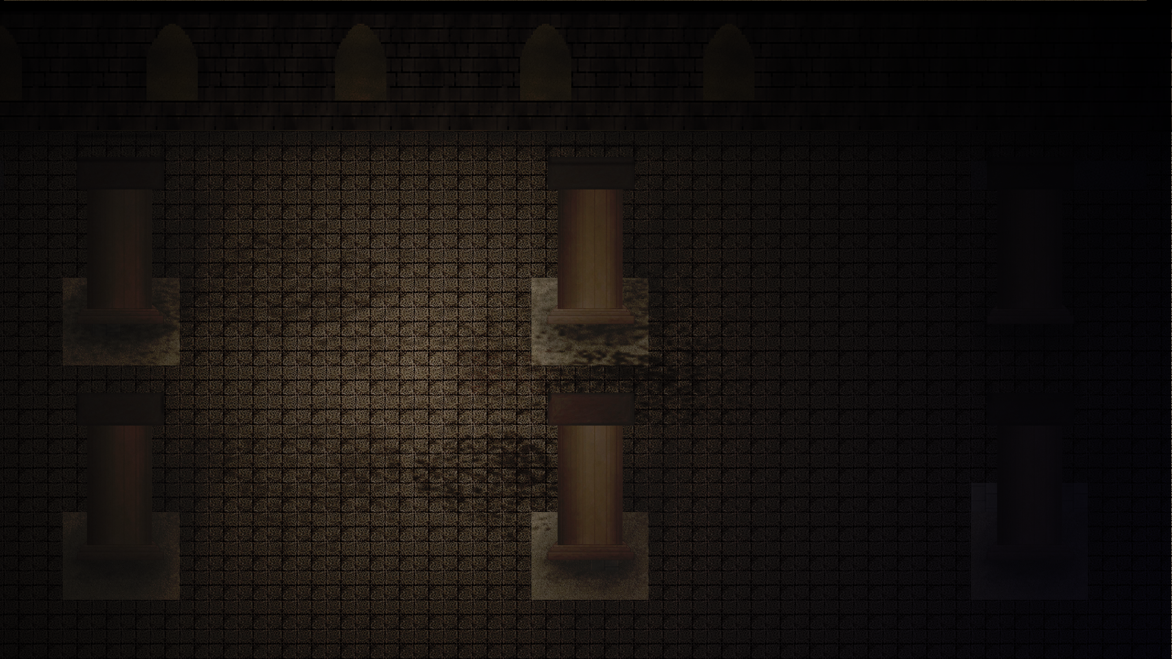
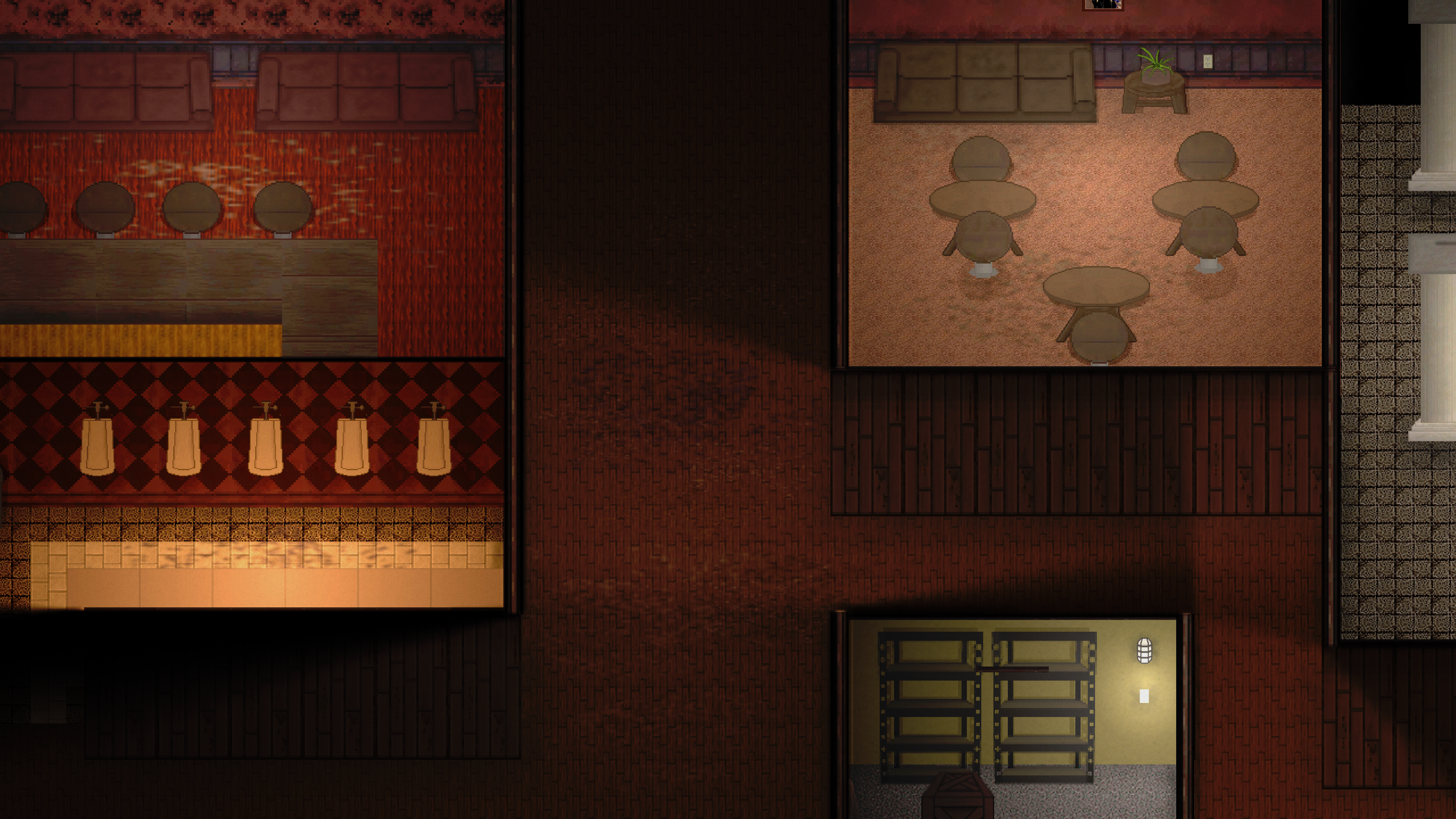
I feel you. I'm also mostly a programmer, but do mapping/small graphics for my own game. Personally, I see most problems just with the mapping itself. Your maps are large and empty. The map inside the old building is just 6 columns on the screen, one wall with a few windows and the rest a repeating tile floor. I think the question “what's missing” in itself is pretty obvious - variation, first of all. Think of what objects such a building would contain. It doesn't have to be big objects like the column, but small obejcts here and there to make it all a bit more varied.
My second advice was, try to scale down the size of the mapping. As a beginner in mapping, it seems tempting to make large-scale maps with huge corridors, open spaces and so on. I've come to learn over the years that it's way easier, and more visually pleasing to making everything more concise. Unless your game requires large spaces gameplay-wise, in which case you do have to come up with a lot of variety, as mentioned above.
Thirdly, it's a matter of practice. It took me many years to get somewhat good at mapping,. If I look back at what I mapped back then, I could barf. But there is no silver bullet here. We can all give you certain tips, but in the end, you just have to practice, the same way you did for programming.
Fourthly, don't assume that suboptimal/bad graphics mean the game won't be successful. Look at something like “Vampire Survivors", whose maps arguably don't look any better or worse than yours, and it was a big hit. How likely is that? Not very, unfortunately, but neigther is a perfect looking game guaranteed to succeed eigther. A lot of people prefer gameplay over graphics. Good gameplay will elevate any game, as long as the looks are tolerable. And a gorgeous looking game without any substance will not be able to keep players around.
@Juliean You are totally right, thank you. I should focus on tighter spaces with more stuff rather than open space with less (while having an eye for sparsity in visual noise like JoeJ mentioned.)
Thank you so much all for the feedback here, and you were all very nice about it, too. This gives me a lot to work with between trying rendering 3D to 2D, looking too uniform, lack of variation, issues with composition and detail, and empty open spaces in map design. (To be honest, I think the frequency banding went over my head a little.) I think this game will turn out a lot better because of what you guys had to say.
ashrzr said: My opinion on Signalis doesn't matter, but maybe it shows an error in my thought process somewhere.
Your error is very common. You put gritty detail everywhere, densely, and thus it collapses down to just uniform noise. The whole western games industry did this mistake when 3D graphics came up. They could do textured walls, and because it was a new feature, they used high contrast everywhere to show this new feature off. Every wall had cracks and graffiti on it. No wall was actually white. It took them a decade to learn how to do better, and in modern games, we finally see walls which are white and only have subtle textures.
This is not a matter of taste and personal preference. If you want to generate good art which exaggerates gritty detail, that's possible. But you must understand which rules you break by doing such exaggeration. You must have even higher contrast in the lower frequencies, so you can still guide attention and focus to a certain point of interest. There can be more points of interest than one, but you can not spread it evenly across the whole picture.
ashrzr said: Take the picture of the subway in my game, on the other hand. It's trying to be raw and gritty in a way that Signalis isn't, and my hope was a certain kind of charm could be communicated through that.
I think i understand what you want, but much more work is needed for that. Your subway looks like new. The geometry is abstract, perfect, and intact. For a gritty, abandoned, dystopian look, you need to add imperfections. Parts of the geometry should be broken off, eroded, cracked. Texturing should also add more cracks, graffity, dirt and noise. There should be junk, rubble and debris. Some newspapers, ripped ads on the walls, etc. But you can't achieve such impression from a uniform distribution of tiling high frequency detail, as you currently do. It does not work. Maybe the game Stasis shows an artstyle you'd like? That's much more work than Signalis then, and there is no way around spending lots of time on it. (Well, ignoring the new option of AI content ofc.)
ashrzr said: In a way, it seems like Signalis and I are going for different ends of the spectrum. Where Signalis looks kind of watered down with a flat color palette and unvaried environments, I'm trying - key word trying - to go for a raw/gritty style with vibrant colors and a wide variety of environments. Like the horror movies of the 70s, 80s, 90s that were shot on film.
Signalis uses a lot of smooth materials, but it does not lack grittyness or variety either. Variety is subtle in the space station sections, but it's good enough i can distinct one place from the other. That's important to me because i have a bad orientation. But the game has unique landmarks easy to memorize everywhere, so i do not get lost. It also has a gritty and rotten underground flesh pit section for example. And it's full of little details such as imperfections and environmental storytelling. It was made from just two people afaict.
However, the things i've said about frequencies, distribution, composition etc., that's all general rules, and they apply independent from any desired style. They always apply, no matter what. Don't dismiss it just because maybe Signalis is not what you personally like. It's about what you do wrong, not about what some other game does right. To many people it is easy to fix and improve once they become aware of it. And this improvement doe snot require some given art talent. It is something technical or even mathematical. If you would lack a sense for color competition for example, i could not help you. But actually it's just that your floor tiles are too repetitive, uniform, with too much contrast in the high frequencies. I don't say remove the patterns completely, but currently they suck up all attention, although they don't - and are not meant to - show anything interesting. It's just planks of wood. No point to star at this. I want to look at the whole scene instead, but you don't allow me to do so.
ashrzr said: Would it look differently in real life, though? A lot of subways do have that tiling pattern on the floor and walls, wood panels are wood panels, etc. Does that really have to do with the art style itself?
In the real world the subtle gradients of indirect lighting can be already stronger to the perception than patterns, eventually even if the pattern is black and white squares.
But if you paint black squares or lines into your tiles because you want gritty detail, the lighting can not make them a brown where needed. They remain black. So you loose the contribution from lighting to your image.
This loss happens because you already exhausted the whole range of brightness you have, by using high contrast details at high frequencies. Consequently, you also loose a lot from the ability to express the larger picture of the whole scene. Because for that you need the lower frequencies describing walls, tables, rails etc., but you have already used the whole range for something else: ‘gritty detail’.
In other words: You can only use a range of 0 to 1 to express your image. This is what you have for the sum of all frequencies. Your mistake is that you spend too much from this range for the higher frequencies expressing detail, and not enough on the lower frequencies expressing the actual scene.
I call it a mistake because the details you actually have are not worth it. Your tiles are too repetitive and uniform, so they are not worth the big range they take.
So i see two options of improvement: Reduce the high frequency contrast, so you have more range to work on a better representation of the scene. Or improve the quality of your hf detail, so it's worth the range.
Both works, a combination of both works, anything works if you know how. But this is how you gain more insight about the problem in a very rational and general sense, not requiring artistic skill directly. Once realized, you can observe artworks, confirm assumptions and even improve your artistic skill. It's the whole picture that matters, of course, but this means you have to distribute image range to frequencies, by controlling their amplitudes. The concept applies in art as much as in math.
Just let it sink and keep it in mind. It takes time to realize… : )
ashrzr said: The lighting is real-time and independent of the sprites. So if the lighting is an issue, does that mean the sprites are not and that this is more of a level-building problem than art style problem? (though at least some of the sprites are a liability, like the
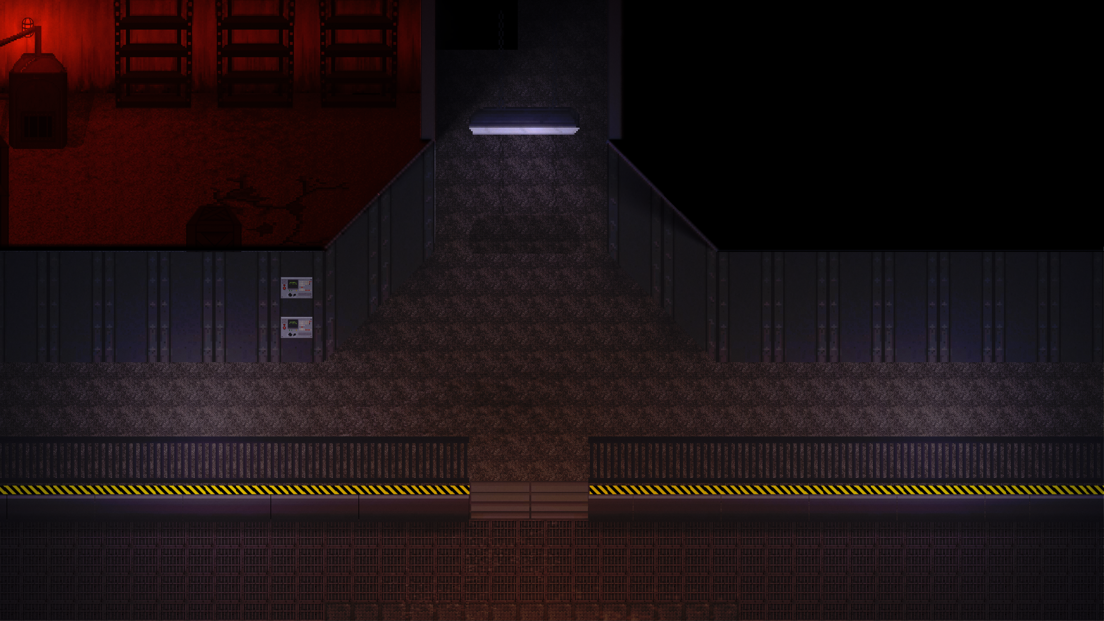
Hmm, i fail to get what you mean. And i lack experience with this kind of 2D lighting, failing to realize how it works. One thing i notice is if you paint brighter textures, the lighting fails to make them dark, e.g. here:
The room on the top right pops out, and it feels uniformly too bright compared to other rooms. The lighting in this room also is much flatter than elsewhere, like having a large constant ambient term. It's an inconsistent impression, and it breaks immersion.
I don't think that's a major problem, but if you can fix it by tweaking lighting, surely worth it.
ashrzr said: I think going for rawness and grittiness is what resulted in the hyper-detail and lack of sparsity.
Yes! That's exactly what i've meant.
ashrzr said: I'm not knowledgeable on composition, so I can't pinpoint the scientific differences between film and digital, but film definitely has a "busier" and less clean look. It's really important for me to have that inviting grit in the game, so I have to figure out a way to retain it without violating the principles you mentioned.
Composition can mean many things, but your composition of the scene id fine imo. You have a lot of empty space though, and the repetitive tiles fail to fill it. That's a form of undesired sparsity, actually. Artistically, you could make the corridors less wide. But ofc. it matters much more how it feels for gameplay.
Idk what's your inspiration regarding gritty 80s horror movies, although i'm on the same page and watched them too. What we can learn from movies is mainly lighting setup. Composition too maybe, but here pictures is already a much better source. However, we are both limited and gifted in the sense of realism. We can no paint lighting however we want, because we try to simulate physics. On the other hand we don't have to paint, and can try out lighting setups quickly without effort. We also model complex mesh data structures to define shape. We can not just draw it. But we can deform it, without effort. Thus, because it's all so different to us, the best template of art remains other games. You get inspiration from everywhere, but other games show how we can depict this or that within our options.
ashrzr said: It sounds like what isn't appealing about my game, is precisely its deliberate focus on grittiness and raw detail and high contrast, and embracing the ugliness of pixelation and detail in places.
Somehow yes, but there is nothing wrong about your love on gritty detail. You just lack the skill to achieve it at the moment. And there is no problem with pixelation, but with grid. Defying the grit with tiled pixel art is not easy, it requires skill and experience. Some tips on improvement: Improve the variation of your tiles, and place variants randomly to brake the grid. That's the least thing you can do. If you get better, you can alternate and design variations consciously, and you can even use the grid on purpose instead defying it. In this sense it's important that lower resolutions are more forgiving to discontinuities across tiles, since larger pixels show the same form of discontinuity / quantization anywhere anyway.
ashrzr said: 2) The screenshots received feedback being too empty, but also looking too detailed. I'm not totally sure how to reconcile the two.
It's two very different topics.
It's true your world feels empty. It does not yet invite to explore. I guess that's because it's wip, and you want to fill in some details to get some environmental storytelling. This is not a critique about art imo, but rather about world building.
My critique about hf detail is only about artwork at a technical level.
ashrzr said: 3) Signalis doesn't look particularly interesting to me, but to others it is interesting to look at, so I must be missing something objectively.
Nah, it's just a matter of taste then. But you can learn much more about art if you ignore your personal preference. Signalis as a very artsy game, if that's a word. Kinda high brow anime, maybe. Which is itself a choice of artstyle. However, i'm sure i can objectively say that the artwork in this game is exceptionally good. But this applies to many games these days, and it's not a requirement for a game to be good as a whole.
Your error is very common. You put gritty detail everywhere, densely, and thus it collapses down to just uniform noise.
The whole western games industry did this mistake when 3D graphics came up. They could do textured walls, and because it was a new feature, they used high contrast everywhere to show this new feature off. Every wall had cracks and graffiti on it. No wall was actually white.
When you put it that way, it clicked. It reminds me of those amateur total conversion mods aimed at making a game look higher resolution, but it's really just a bunch of ugly high-contrast textures that don't go together or match the original game feel. So I'm trying to unlearn that inclination now.
If you would lack a sense for color competition for example, i could not help you. But actually it's just that your floor tiles are too repetitive, uniform, with too much contrast in the high frequencies. I don't say remove the patterns completely, but currently they suck up all attention, although they don't - and are not meant to - show anything interesting. It's just planks of wood. No point to star at this. I want to look at the whole scene instead, but you don't allow me to do so.
I started trying to look at existing games keeping in mind the things you've said, and noticed how most 2D games do have a texture filter and/or low-contrast on their tiles relative to the rest of the scene. It makes total sense, since the ground isn't very important and you can still convey exactly what the ground is without hogging more of the higher frequencies than necessary (if I understand correctly.)
In the real world the subtle gradients of indirect lighting can be already stronger to the perception than patterns, eventually even if the pattern is black and white squares.
But if you paint black squares or lines into your tiles because you want gritty detail, the lighting can not make them a brown where needed. They remain black. So you loose the contribution from lighting to your image.
This loss happens because you already exhausted the whole range of brightness you have, by using high contrast details at high frequencies.
Consequently, you also loose a lot from the ability to express the larger picture of the whole scene. Because for that you need the lower frequencies describing walls, tables, rails etc., but you have already used the whole range for something else: ‘gritty detail’.
I think I was looking at each sprite including floor tiles too individually, getting it to look good on its own, instead of focusing on how all the sprites come together and can limit each other especially if they all try to individually do the same thing (like have high contrast and dominate higher frequencies.)
I think i understand what you want, but much more work is needed for that.
Your subway looks like new. The geometry is abstract, perfect, and intact.
For a gritty, abandoned, dystopian look, you need to add imperfections. Parts of the geometry should be broken off, eroded, cracked. Texturing should also add more cracks, graffity, dirt and noise. There should be junk, rubble and debris. Some newspapers, ripped ads on the walls, etc.
But you can't achieve such impression from a uniform distribution of tiling high frequency detail, as you currently do. It does not work.
Here's a comparison of before and after, trying to incorporate some of the feedback. Is it heading in the right direction, hopefully?