
Original Post
🔒 Locked
Any tips to make this UI look better? (the skulls next to the characters' names are to be their statuses)
Advertisement

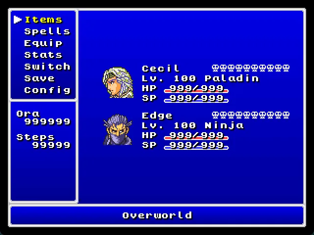

I have no idea what I am looking at.
It has no indication of its purpose (eg a title, or a name). Similarly, what are these persons? Are they my group, or are they opponents?
At the top-left, I am not sure what the difference between “Items” and “Equip” is. Doesn't the latter need the former? “Switch” is also meaningless without context. Likely much of the things will make more sense if you know what the game is about.
No idea what the bottom left names and numbers are about. My first guess would be the enemy, but it doesn't say so anywhere.
Adding some more colour may improve things. Now it's a mass of white text on a blue background. The white is very much SHOUTING I think. Use some darker colours to ‘hide’ the less interesting parts such as the standard “Lv”, “HP” and “SP”. Maybe the non-selected items at the top left could be darker as well. Use a light colour for things that should jump out, like the selected items at the top left, but I'd also give the names a different colour, to ‘unhide’ them from all the white.

Regarding visuals, i think the skulls should have a shadow too, like the font has. But maybe a simple number would look better actually.

The left menu bar is too cramped. It needs some more padding on its right side, and potentially also some vertical padding, to make the padding on the left not stick out weirdly. Another thing you can do is remove the padding on the left and instead shift the selected text to the right by one column by prepending the → to the text. The “overworld” bar looks weird. Is it a clickable thing? Or is it a title/descriptor? I recommend differentiating things you can click from things that are supposed to be flavour texts, etc. Or if all labels that you can interact with are in the top left box, then give that box a different style, to make clear that it is a command box and that everything else is not a command box. For example by giving it a different background from the rest of the UI elements.
And if the bottom left box is supposed to be an enemy box, then I would also style it that way. It's not strictly necessary for readability, but it can still reduce the visual load on the player's mind if enemy information is in an enemy-flavoured box.

Trying to copy FF4? They made those choices because of the 256x224 screen resolution. It was not a good look, it was functional for the constraints.
Look at what the remakes did for the menus. Better, more readable fonts, lines between characters, borders indicating presence and black borders on absence, better use of white space, better use of color, more consistent shadows, better distinction and subtle animations and the big hand pointer that distinctly works as a cursor.
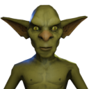
Perhaps lean towards a consistent style as with hit points and skill points.
The rainbow bar next to the names sucks. It should only have one solid colour, not three colours, and then change the colour based on fill level. I don't know what exactly it is supposed to represent, though. Number of allowed deaths/respawns? Then you could make it into a list of 10 hearts, with deaths turning a heart into a skull.
RmbRT said:
I don't know what exactly it is supposed to represent, though.
It's a rough approximation to the UI in Final Fantasy 4 on SNES. The skulls are described in the title: “the skulls next to the characters' names are to be their statuses”. In FF4 they were a set of icons representing any status flags on the character, such as KO, petrified, silence, poison, curse, sleep, regen, barrier, etc., and a player could potentially have multiple status buffs applied.
On the remakes they had far more screen pixels and made a better UI that was true to the spirit of the original but looked much better.
Agreed about the color. If you're changing the color of the bar, make the entire bar the same color. All green when healthy, all yellow, all red.
Okay. I couldn't deduce the intended meaning from the text and the skulls. I thought it was a language barrier issue, instead of placeholders. Turning status flags into a bar is just as confusing.
RmbRT said:
I couldn't deduce the intended meaning from the text and the skulls. I thought it was a language barrier issue
Yes, that's what it is. RPG status screens are a barrier. Big reason i can't get warm with the genre.
No matter how well it's design is done, to me it's like the debug output window, showing variable names and values from code i don't know.
In a better world, players would feel if they are strong or weak from playing the game, not from a table of numbers.
Topic Locked
This topic has been locked by a moderator. New replies are not allowed.
Sign in to reply to this topic.
Advertisement