I already gave tons of feedback through the feedback button. I'm putting this into a dedicated thread because the feedback box doesn't do it justice, and I also want to start a conversation around this, not just write into the void with a small textbox.
Looking at the new page makes me feel uncomfortable. It's completely cluttered with lots of random stuff that I'm just supposed to consume mindlessly, I assume, because at least I cannot see the order and intent behind the new design. So if it's chaotic, it seems like it's made to put me in a mindless and confused mental state.
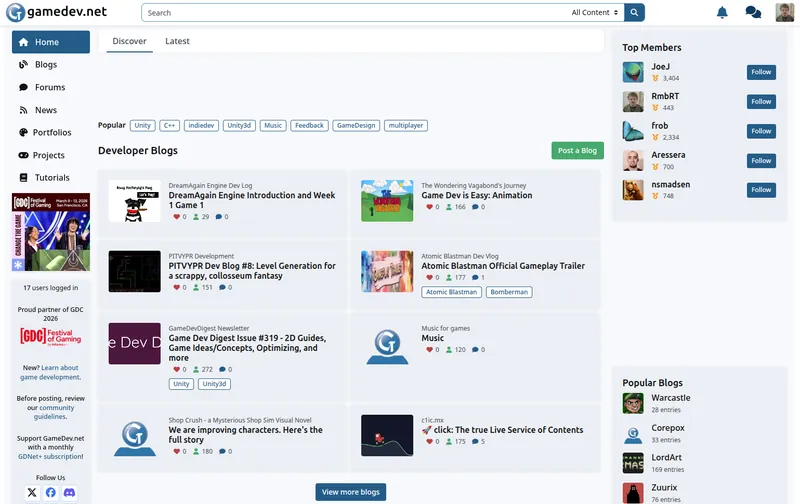
This is what I see when I visit the old site: I see what personal / dev blogs people posted recently.
Then I press page-down, and I see this: I immediately see all the latest topics, latest posts, who replied, etc.. This is what I look at when visiting the page, and what I want to see, too. I come here to engage in a forum about gamedev. I can immediately see all relevant information within 2 screens, that's one press of a page-down button.

The only thing I find unfortunate is that you have to scroll all the way to the bottom of the page to see the portfolios. I think it's a shame that this site doesn't highlight those in a prominent spot, encouraging people to show off their stuff to foster inspiration and maybe a bit of competition.
Here's the first thing I see when I visit the new page: A third of the screen is some vague “welcome back” and “you've been visiting 17 days in a row” and “post a status”. The next 2/3rds are basically news articles that I don't care about. I don't read news. Puts me in a bad headspace. I came here to talk about development, not get bombarded with distracting little factoids about the PR circus out there. Like most of the news there are about the same topic anyway. I don't need half my screen being about some Phil Spencer guy when I come here to discuss.

Now let's get to the second screen's worth of content I see: a wopping 15–20% is about recent discussions. Also in a weird layout. Also, I can no longer see who even the OP of a thread is, unless for the most prominent item. Yes, it's more compact, but having a weird heterogeneously-sized grid does not make it readable. It takes effort to take in the information, due to the inconsistent placing and sizing (the first item is way larger and takes up two rows, and the others have a smaller top row and bigger bottom row). And apparently just as important as ongoing discussions, space-wise, is that I visited 17 days in a row. Even though I already saw that on the first screen.
As I already wrote in the feedback box, the “Catch up” section is a nice gimmick that actually might improve my ability to use this forum easily. Though currently it doesn't show me stuff that I actually missed.
The “Featured” section is also weird because it shows me lots of things with no context. Like how recent is the thing there? Lots of stuff on this site is from decades ago. This here presents freshly posted stuff with years old stuff side-by-side without any indicator to differentiate them.

Now getting to the third screen and I still haven't seen what I visited the page for: “Expand your horizons”. All I can see are some weird huge, mostly blank boxes. Also I get a mix of blog posts, stale projects, and (as we will see on the next screen, actual threads).

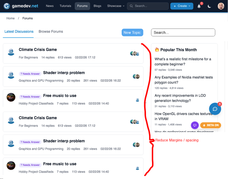
We're now on page 4 and I get to see 3 entire forum topics. The entire row “X replies” could be moved into the thread title row, or into the row above that (where it tells you when the last post was), so that it takes less vertical space. Also, funnily enough, directly below that row is another row showing how many posts (replies+1) the thread has, and how many views the topic has. So that's another row of vertical space wasted. The view count could also be put into the top row next to the “last post at” time. That would already give us another 1-2 threads per screen. The row showing the OP could also be jammed into a higher row alongside other content. Essentially, the entire thread could be compressed by 50% vertically without losing any legibility, which would make it much more pleasant to look at that list.

I'll refrain from more screenshots, but the more I scroll down, the more incoherent that doomscroll section gets. Suddenly it's a mix of news posts about racist AI ads, blog posts, discussions, etc.. That's not what I came here for. Though there is an occasional portfolio getting a highlight there, which I appreciate.
Anyway, seeing only 3 threads per entire screen, and then also getting the threads diluted with lots of news posts and other stuff that I didn't come here for, I wonder who this main page is trying to appeal to. It certainly does not appeal to me, as my expectation of this site is to use it like a forum, and to quickly get an overview of what other users are discussing (not what some external news site pumped out). But even if my intent was to see a lot of diverse content and get a quick overview of news, forum engagement, blogs, projects, etc., then the current beta design is still way too bloated for that.
It feels like the only thing this accomplishes is bait people into doomscrolling mindlessly and turning this site into an unproductive timesink for people who got a few minutes of boredom to kill as they ride the train or something, and can't sit still without their phones out. Doomscrolling destroys the brain and forms a strong habit of mindlessness and lowers the attention span.
The old site design quickly gives you everything you want to see in a legible format, without the need to scroll more than one screen. It does not show me anything useless. I think it is acceptable to expect that a user will stare at an unmoving page for half a minute to parse through its contents, rather than constantly scrolling for 1 second worth of information per third of a screen. And the old site is calming to look at, for me, while this new style is somehow very grating and makes me restless. I don't understand the psychology of UI design enough to tell you why it is that way. But I think copying the github style of UI design also copies a lot of nefarious psychological mechanisms that Microsoft intentionally employs against their users.