Hi everyone,
We are Ditag Games, and we are currently developing Gearomancer, an indie bullet hell action-roguelite game for PC / Steam.
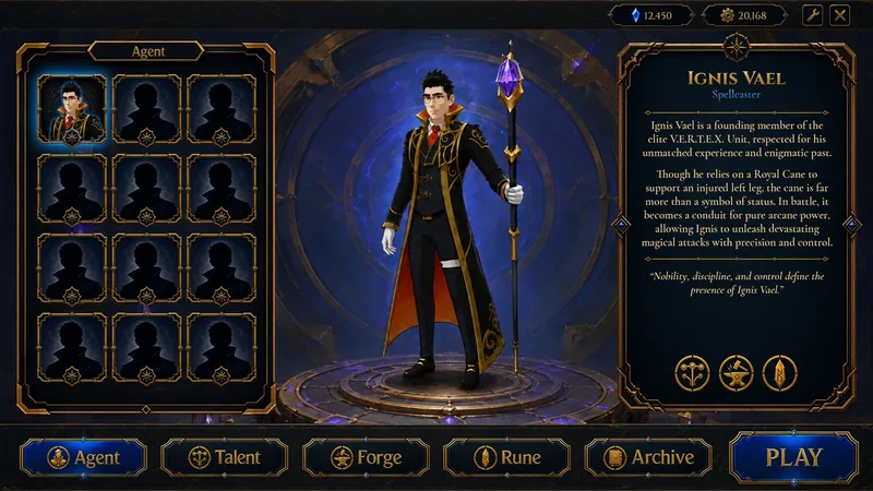
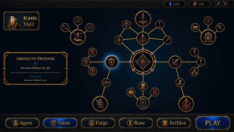
While working on the UI side of the game, we wanted to share two screens with you. One is the character / Agent screen, and the other is the talent tree screen.
Before Bullet Fest on June 8, we would like to get some outside feedback on these screens. After looking at the same screen for a long time, it can become harder to notice certain things, so feedback from both developers and players would be really valuable for us.
How do these screens look at first glance?
We are especially curious about your thoughts on these points:
Does the character screen feel clear and understandable?
Is the talent tree readable at first glance?
Does the UI feel too busy, or does it look balanced?
What do you think about the gold, blue, and dark color balance?
Would these screenshots create a good first impression on a Steam page?
What would you change if you were working on these screens?
We are open to any constructive feedback. Comments about readability, visual hierarchy, and first impressions would be especially helpful for us.
Thank you for taking the time to check it out.