Hello, everyone! SunStrike Studio creates graphics for mobile and computer games. Below you will find detailed feedback on one of the tasks performed as part of our open test assignment. The author of the work has given us permission to publish this information.
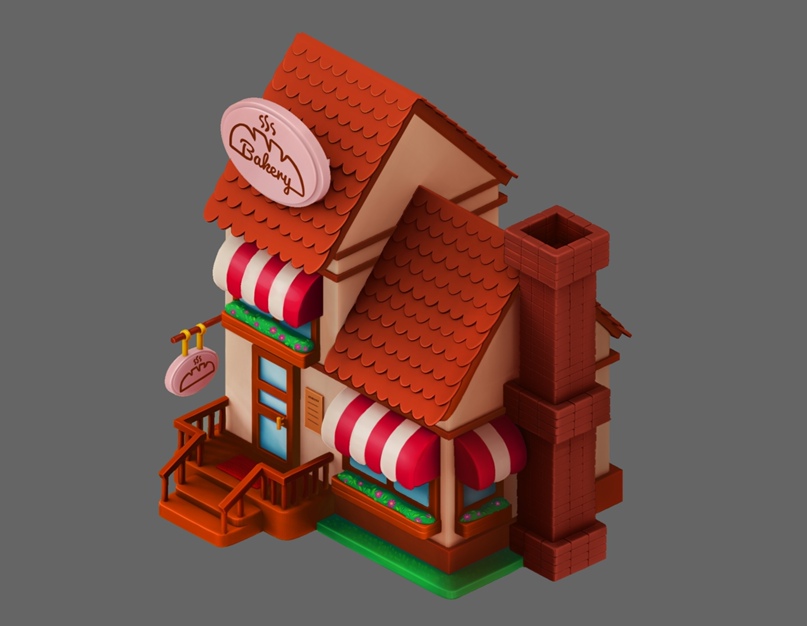
This house turned out well, but there are many things that can be improved. Below we will analyze the basic approach to work and rendering.
Basic errors:
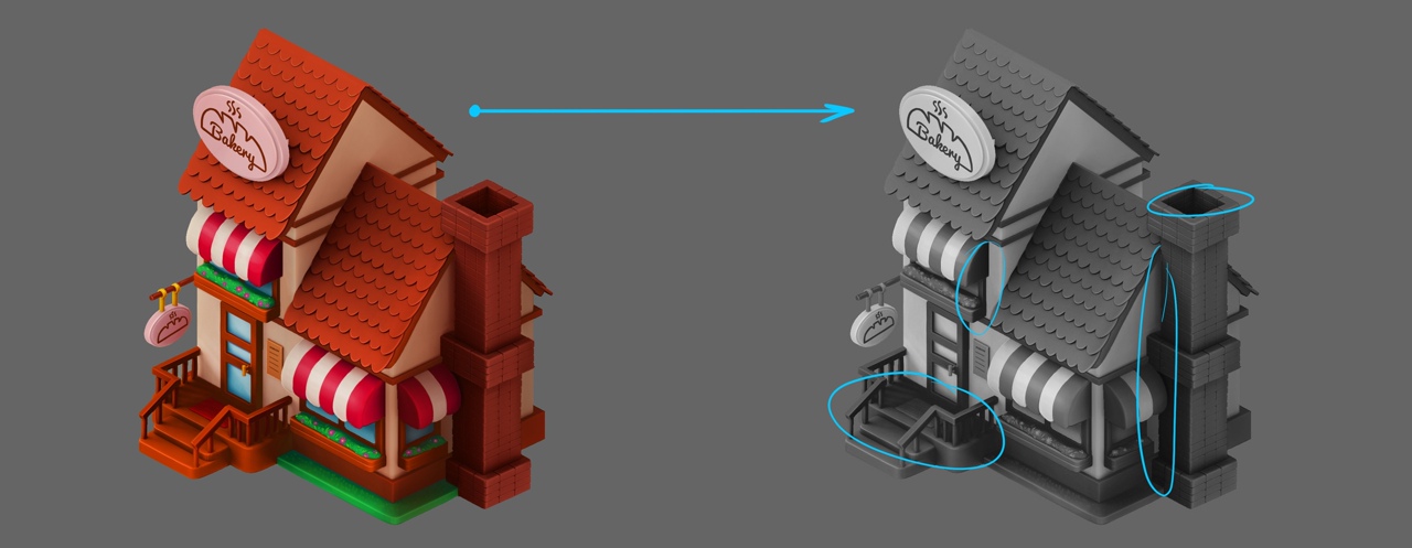
● The house is very dark. If we switch it to black and white, the details in some of the areas become very difficult to read.
● There's no clear light direction.
● There are many horizontal points of connection that prevent the viewer from reading the details (e.g. roofs touch window frames).
● Some patterns do not support scaling (flowers).
● There is no work with materials.
What can be done to make it better?
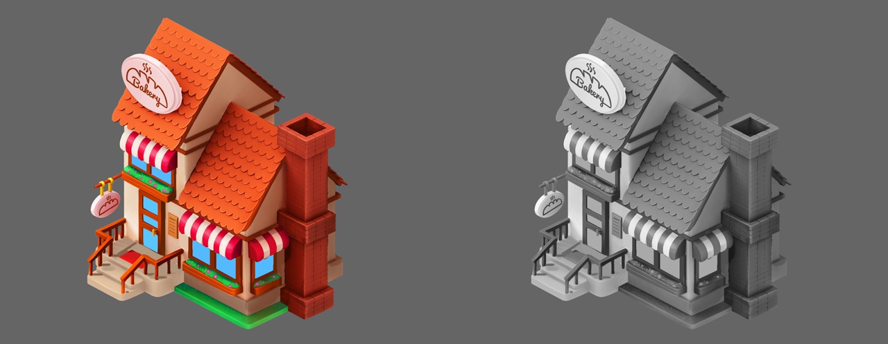
Convert the object to black and white. We recommend that you do this often as you work. You could even set a hotkey for convenience:
We see black gaps, indistinguishable light, and tonal adhesions. We raise the brightness for the whole object and manually go through the edges that are exposed to light (on the top left) making them even brighter.
Since a 3D model was used here, we can avoid having to light the edges manually by correctly setting light parameters in 3D. It is possible to use a combination of a light source (for the shadows) and the light of the sky (global lighting, to avoid black color in the shadows), or use an additional rim light to lighten the shadows instead.
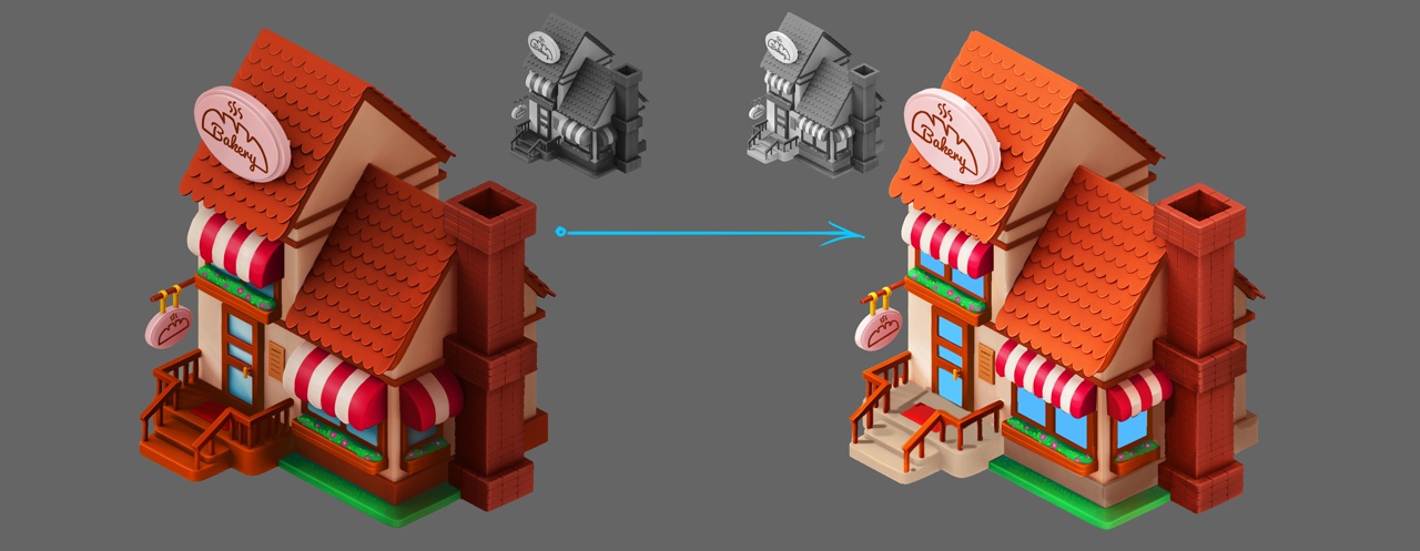
Next, lets "lift" the striped visors to reveal the windows, and change the color of the porch to tonally separate it from the railing. As an added bonus, this will make the mat stand out as well:
Let’s reduce the number of posts on the railing so that the distance between them coincides with the distance between the posts on the stairs. In the picture above, we only did it on the right side to compare it to the left side of the railing and see the difference.
Things are starting to make a bit more sense. Let’s switch to black and white once more and check things over:
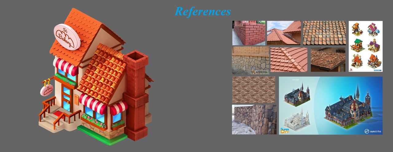
Work with materials
Some projects define the style even more simply than what was provided for this task. For example, all objects in the game are made of paper and differ only in color. But then there must be a stylization of design and volume for the corresponding paper product. In this house the form and design are quite ordinary. The question arises, why do roofs, walls and even grass have the same texture?
We all think we know what brickwork looks like. But if you study a few reference images on the first page of Google image search, you can find completely different combinations of bricks, types of joints, colors of joints, types of connections and corners of bricks. The artists should therefore ask themselves a few relevant questions before starting to work. For example, how are bricks laid? What is the roof supposed to look like? What is the foundation supposed to look like? How have other artists depicted these or similar materials?
All these questions make us keep Google open, taking a look not only at photos of real objects, but also examples of how other specialists solve similar problems.
For the chimney we could add joints between bricks and make an effort to differentiate the different bricks in color and brightness a little. This will make the chimney look more lively. We draw the individual stones, add details to the vegetation, and make the flowers bigger. Flowers do not work well at smaller scale and are likely to look like individual pixels. You can make them bigger and the flower bed fluffier. Always keep a small window of the canvas nearby (see in Photoshop Window->Arrange->New window for ...), so that you do not have to constantly scale the canvas and are able to see the work as a whole.
Now we are getting to the roof. In this case, it is enough to draw just one tile and repeat it across the surface. Try to duplicate the layer (hotkey in Photoshop ctrl+j) and move it to the desired place (hotkey in Photoshop ctrl+t). After that the replication function will take care of the rest (with default Photoshop settings - hotkey shift+ctrl+alt+t). Next, let’s once again diversify the individual elements by color and brightness (see references), add detail to the roof and cornice (again, see references) and the object starts to look much more convincing!
If you want to make dimensional tiles with a 3D package, you can prepare a seamless texture (see Photoshop Filter->Other->Offset) and texture the roof right in the 3D model at an early stage of work, saving even more time.
Keeping in mind that the materials can be matte or glossy, we add details to the other objects (add glare on the glass). We keep using the same approach to work on metal, grass, porch, and wood. What type of material is the sign made of? The artist must come up with the answer to this question on his or her own.
Adding variety and realism, even a simple bakery house can be made to look very interesting! Optimize your workflow to save time needed to renderer the image. This time will be better spent designing the object and coming up with ways to make it interesting and unique. Good luck!
Look for more test task reviews from us in the near future!