In 1998, at the school where I studied, there was only one computer, which belonged to the principal. Our biology teacher, a wonderful guy who worked as an admin at a computer club across the street at night, was the only person who knew how that box even worked. I used to hang out there occasionally, so at some point, I gained access to the principal's computer, under the guise of cleaning and tuning it up. Every attempt to get me interested in programming ended with firing up SimCity, Caesar, or Settlers and a couple of hours of intense monster battles. Later, after finishing university, I worked in various companies, writing code for projects unrelated to game development, but I constantly dreamed of creating games. I tried working on small games for myself, but in 2006, free engines like Unity and Unreal didn't exist yet. So I mostly ended up writing my own engines from scratch and making various demos, which were promptly forgotten.
I got to start my career in the gaming industry at EA as a game engine programmer, that very Unity, but mostly dealt with low-level optimizations. Quickly, I realized that I liked game design more than programming (I still like both directions, so at some point, I switched to AI). Although programmers weren't trusted with creating levels or game design, during work hours, you could peacefully study how both of them functioned, and you even got paid for it. And not just studying from the outside but also from within. I didn't become a professional game designer, but I still enjoy dissecting how game design is done even now.
I haven't had the chance to work on open worlds, except maybe for Cuisine Royale, which, in a way, isn't quite an honest open world. But tasks like analyzing technical solutions in other games and engines, reading relevant lectures and articles, help understand what decisions designers made during development, and most importantly, why they were made. When immersing myself in a new game, these decisions aren't always so obvious, but after spending close to a hundred hours in Witcher 3 or Zelda, these patterns become visible and easily catch the eye. I want to note that neither of these games makes exploration its main goal. The quests in Witcher tell unique stories, while Zelda, oddly enough, focuses on combat and crafting systems. And what's noticeable is that in these games, it's not necessary to extensively explore the surrounding world. Level design and golden path layout are structured in a way that the games guide the player by the hand, and they still end up near important areas or story quests. And when the opportunity arose to delve into the engine and levels of Metro: Exodus, of course, I started dissecting the available materials with interest.
Landmarks
Witcher 3 with its realistic open world, landscapes, forests, and bandit camps, which are mostly uniform and often obscure orientation, along with numerous landmarks, often requires frequent map checking to understand where to go next. Compared to The Witcher, Zelda's levels seem somewhat barren, and it may seem easy to get lost (especially in the desert), but you have to open the map much less often. This is achieved by the placement of objects at the level, special landmarks, and points of interest that can be seen from a distance. Wherever you find yourself, you'll have at least one landmark and a couple of points of interest, and on the way to them, you'll encounter mobs several times, even if they weren't there before (the "five-minute rule"). Have you ever wondered why characters point at something in the distance? Usually, this is accompanied by comments or even a separate cutscene with unique animations, although they will only be seen once throughout the game. This is because landmarks are a great way to orient the player in the world, advance the plot, solidify a final moment, and tie up non-storyline quests or activities.
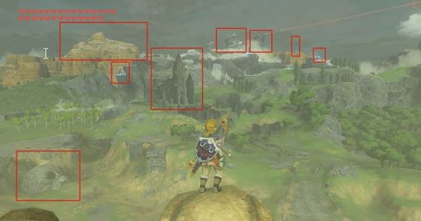
Do you know what else such landmarks are called? (Weenies) "Weenie" - this term was coined by Walt Disney; he noticed that his dog's head always followed his hand when he held a hot dog. Cinderella Castle in the center of Disneyland is the main "weenie." Two others are Matterhorn Mountain and Big Thunder Mountain. He wanted guests to always know where they were in the park just by looking at the "weenies."

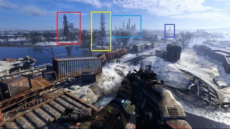
This rule is also used in M:E; from any point in the level, you'll see at least one landmark that catches the eye. It becomes especially interesting to play if you disable the navigation aids in the game. Try it out – both The Witcher and Zelda, as well as Metro, become completely different games when you don't have the option to peek at the map.
Golden path (Story)
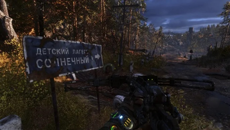
I don't like just following the story. The plot, spread out at the level, takes up no more than a third of all content, or even less (these are quite subjective observations, I don't claim to be conducting research here). Maybe that's why I never got past half of Morrowind, even though I started playing it four times, got lost somewhere in the mountains, and suddenly it was already five in the morning. But some people enjoy simply following the yellow point on the compass, map, or whatever else, especially if there are still a dozen games in the backlog that they also want to complete. It heavily depends on the type of player or even their current mood. I prefer immersing completely into the game, exploring different corners, reading level-scattered notes, and finding items, discovering interesting details. The best thing designers can do is create an interesting world that naturally leads you to such places, showing signs of the world to those who have turned off the quest marker or even the entire UI. You know what's funny – such signs usually remain from the very early stages of game development when the designer didn't have final textures and objects yet, and instead, there were placeholders to speed up testing and iterations. Then they become enriched with lore, designers try to integrate them into the game world, and the floating text in the air turns into a sign or a pointer.

In the context of the golden path, returning to landmarks, it's important to note that simply placing a huge tower far away in the level would be uninteresting; its sight would quickly become tiresome. Therefore, designers use an architectural term called "hide and reveal," where the landmark is periodically hidden from view and then revealed again from different angles as you progress through the level. This principle is not new; the Romans used it when building their temples.
Breadcrumbs (Hints)
Above were screenshots of explicit indicators of where the player should move to progress the plot, but this is uninteresting, breaks the game's immersion, and quickly becomes tedious. Therefore, explicit indicators are rarely used or are reserved for special places, like peaceful locations, level entrances and exits, or areas with obvious biome changes. It's much more interesting when designers can work with light and shadow, interactive elements such as crates, diaries, or collectibles. In M:E, the "go where it's brighter" principle is used almost everywhere in indoor locations, starting from placing lamps on walls and ending with glowing mushrooms. Even the placement of enemies in the level can be done in a way to guide the player to the next plot element. How many times have glowing mushrooms led you to a checkpoint?
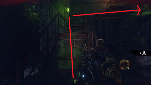
Ideally, of course, the level should be designed in a way that naturally guides the player through the plot, and mushrooms here, as well as yellow stairs, are more like a "crutch" when other visual solutions aren't found. But in the early stages of level construction, such breadcrumbs are used as a support for building more complex plot mechanics. Highlighting certain elements of the game with color is also one of the options for hints.
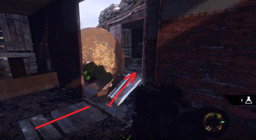
If we continue the idea of hints, they can be divided into positive and negative ones. For example, you can teach the player that blue doors don't open, and always follow this rule to maintain consistency. However, this also provides opportunities for different puzzles and plot twists when there's no choice other than the blue door, as long as it's justified; otherwise, it would break the atmosphere. Negative hints allow for clear limitations in the level where the player cannot go, such as poisonous areas, burning objects, radiation zones, etc.
Walls
I believe that in most modern games, designers have become a bit lazy and often use invisible walls, but I may be mistaken. This thought came to me when I tried to explore levels not related to the plot, which often led to such limitations that, of course, broke the atmosphere. Yes, I understand that it's a game, but I hope that in modern games, there will be fewer invisible walls. For the sake of fairness, I want to say that old games like Quake or Unreal didn't have such a problem because they were more enclosed, with corridors and rooms that almost always had visible boundaries from all sides, i.e., walls were physical and visible, and this didn't cause irritation. Even the open spaces in Unreal had natural limitations such as cliffs or mountains where I physically couldn't go. But when I can't pass through a partially destroyed door, even though I broke down a wall before and opened exactly the same door as part of the plot, it's certainly irritating. And this is despite the fact that many modern games are open-world exploration, but designers have been lazy to incorporate limitations into the gameplay. In this place, I can't jump on the boxes, although I easily did it a bit to the side.
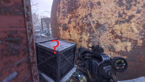
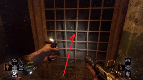
The key here is to incorporate, to clearly explain why the player cannot go somewhere. Placing a car, a ravine, a toxic puddle, or even a fence made of barbed wire in the way would work! Anything that fits the game world. A fence made of barbed wire or an iron-barred door is perfect if you need to show the place where the player should go through. At least through it, everything is visible.
Another way to restrict players from exploring certain areas is by using gates that open after solving a puzzle. Shooters have become adept at incorporating simple puzzles, like reaching point B, killing everyone along the way, pressing a button there, then returning and defeating everyone behind the door.
Affordance
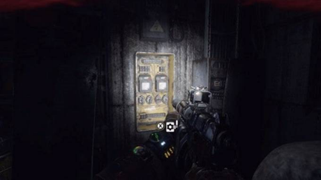
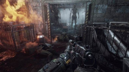
Natural level constraints such as walls and cliffs create excellent enclosed spaces that can be broken down into areas of accessibility using doors, stairs, crawl spaces, and places that significantly change the player's vertical position. Enclosed spaces are great because they allow you to tell and show the player a memorable little story, introduce new characters, give them the opportunity to save, and better remember the impressions of the last minutes of the game. At the same time, designers consider the appearance of these elements, making and placing them in the level so that their appearance corresponds to their function. If it's a ladder, you should be able to climb it; if it's a hole, you should be able to crawl through it; if it's a door, you should be able to unlock it; if it's a cabinet, you should be able to open it, and so on. Therefore, when one door opens while the one next to it does not, it causes irritation and confusion. Affordance (Accessibility) is one of the most commonly used methods of storytelling and perhaps the simplest.
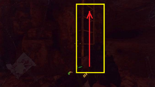
Visual shapes
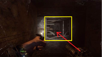
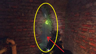
Expanding on the idea of accessibility, one can consider that not only active objects have clearly distinguishable features, but the shape itself can serve as a signifier. For example, for shelters (rectangular objects at waist level), which the player will learn to recognize. After crouching behind such objects several times and realizing that this shape provides safety during combat, the player will continue to apply this knowledge throughout the game. This is related to the characteristics of human perception of shapes; round objects are perceived as soft and fragile, while square ones are perceived as solid and reliable. Triangular-shaped objects are perceived as dangerous.
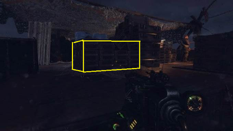
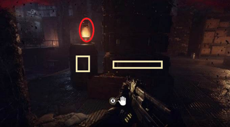
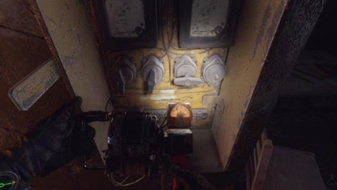
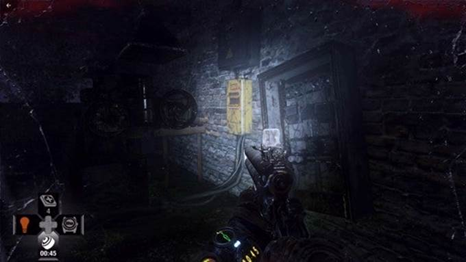
In addition to shape, as with hints, color can also be used. Then the purpose of items will be determined without hints, as is done, for example, for electrical boxes (yellow) and canisters (red). Generally, the use of contrasting colors to draw attention to where to go is widely used in games. In M:E, bright yellow boxes, interactable ladders, and objects of red color if they need some part for activation are used. This subtly hints to the player what is expected of them to solve the puzzle. And most people won't question what to do once they've already solved a similar puzzle before.

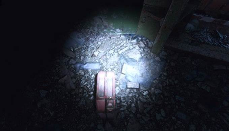
By the way, if you didn't notice, the color of the dynamo's lighting is also yellow. The game uses various combinations of contrasting colors, flashing lights, glowing mushrooms, moving water, additional lighting of objects, etc. All of this attracts the player's attention to the required direction.
Device lock
Another natural limitation is device locks or special items. Players are free to explore the world but cannot progress through the story or enter another location until they acquire the necessary item. Designers widely apply this pattern to restrict access to locations at specific times. Moreover, if the item uses consumables, it significantly expands the player's time management options. This also enhances non-linearity, as we all love non-linear games, or presents the game as non-linear. If the designer adds the ability to explore locations without the necessary item, albeit with limitations, they deserve top marks. In Metro: Exodus, the device lock on the Caspian Sea becomes the van. While players can bypass the entire level on foot, story conversations and progressions occur through the "car". In the Valley level, it's the crossbow that serves as the device lock. While you can certainly try to progress without it, the designers have left that possibility open. However, you won't be able to solve some of the puzzles without it.

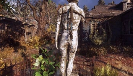
Another type of device lock is crafting locations where you can obtain new items and abilities. It's not entirely fair to the players because it disrupts the pace of the game, but it allows for dividing levels into locations and logical zones. Usually, entering such places suspends the global time in the game, triggers NPC respawns, switches story states, and quests.

Opennings attracts
Openings like caves, doors, basements, and the like seem to attract people to explore them. While we're not cats, we still love to explore our surroundings just as much. Such spaces also possess an aura of mystery, and people want to find out what lies inside. This attraction also occurs in the real world; for example, urban explorers are fascinated by exploring underground tunnels. Part of this is also due to the fact that open spaces often host combat encounters, while rooms are designated as safe zones, psychologically perceived as secure. Doors and arches also attract attention, even if there's no roof behind them. The folks at Ubisoft shared an interesting experiment at GDC regarding Far Cry 3. They randomly placed arches and door frames throughout a level. A group of testers, who weren't informed about these elements, passed under the arches and door frames twice as often as those who were told they were just test objects. This demonstrates how knowledge of psychology can assist in creating engaging level designs. Skillful application of this knowledge allows designers to draw players' attention to points of interest by shaping the geometry of buildings or objects appropriately.
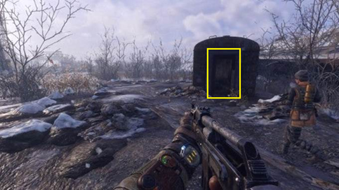
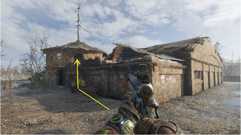
Another important aspect when creating points of interest is highlighting the transition between spaces, such as moving from outdoor to indoor areas. Typically, different colors are used for interior and exterior walls. The exterior color tends to be cooler, while warm yellow tones are often used indoors. This helps the player understand that the game environment has changed. If both indoor and outdoor areas share the same color scheme, this distinction is lost. For example, in the image below, although the building appears to be constructed from bricks of the same color, they appear warmer inside and cooler outside.
Gates & Valves
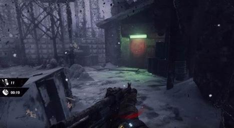
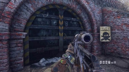
Gates, doors, and various types of puzzles designed for their opening are one of the cheapest ways to pause the plot until certain conditions are met: kill all enemies, move debris from the road, turn on electricity, etc. It also allows the designer to close the door behind the player, preventing them from returning and unloading the room, tunnel, station, or even half of the level, without worrying about how NPCs will behave in the completed location. Entering this door unloads the entire remaining level, allowing for the use of twice as many NPCs in combat inside and a highly detailed model of a locomotive. And even though they don't show it to you, you still understand that a certain milestone in the plot has been reached, and you need to keep less in mind and focus more on the current task. At first, this may seem useful only for linear games, but open-world games also actively use this approach, for example, unloading the entire or most of the rest of the level while you are passing through a cave or another enclosed space. This approach is well illustrated when Artyom goes to rescue Anna from the bunker; you can't exit to the open world until the location with the bunker is completed, and the rest of the level is maximally unloaded at this moment, allowing for more detailed objects and environment to be placed inside the bunker.
Leading Lines
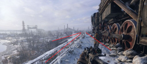
These lines originated from painting - it's a composition technique where lines on the canvas draw the viewer's attention to a specific point. Similarly, designers use environmental elements to create arrows that look natural but attract attention and indicate the direction for further progression. In games, these are often roads, pipes, cables, and many other objects that players perceive as natural but are deliberately positioned and tuned this way. It may seem distorted due to perspective, but both the wagons on the left and the train on the right are intentionally slightly turned towards the path to form an arrow. This is the first thing a player sees when descending from the Aurora.
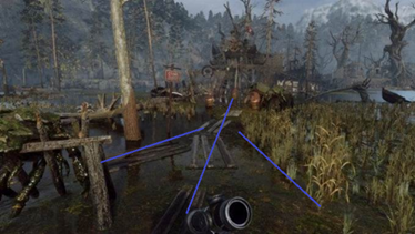
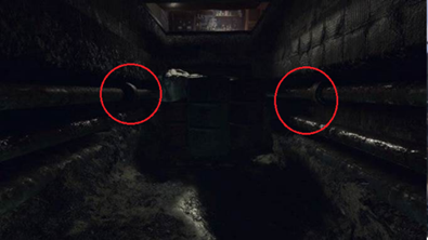
Any environmental elements can be combined to serve as clues, even pipes and cables. Notice that the bulges on the pipes are only on the side of the correct exit. You may not explicitly mark this, but our brains notice such placement patterns, and if they are used in the right places, you won't even notice how you're going in the direction the designer intended. However, if they are placed randomly, there will be no effect, just like training a neural network on poisoned data sets; you only get results when the training set is properly composed.
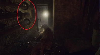
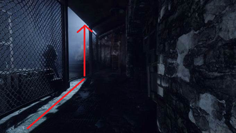
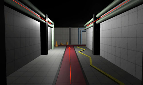
For beginning level designers are usually shown this picture, which explains the principle of Leading Lines in simple terms. By extending these lines in the desired direction, you can attract the player's attention to the right and increase the likelihood that they will go there. The pipes on the walls and the central line set the main direction of view along the corridor, but the pipes on the left end, while the pipes on the right turn the corner, directing the gaze. Additionally, the contrasting line (in our case, the yellow wire) draws attention to the turn.
Pinching
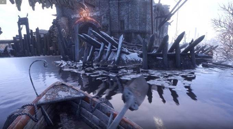
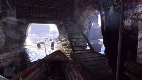
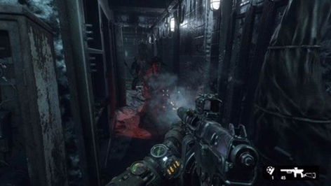
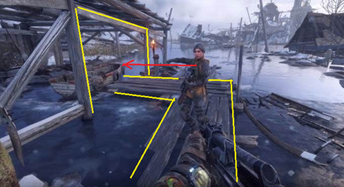
The essence of this method is to direct the player to a specific location in the level using environmental cues. This is usually achieved by restricting free movement through strategically placed objects, forcing the player to move in only one direction. People don't like being forcibly led through the story, so obvious pinching is applied with caution, otherwise, it quickly becomes tiresome. Designers always try to come up with natural and explainable limitations, such as with the boat here; there's no other way to reach the monastery except by boat, but this transition is presented very subtly.
On the other hand, the entire Yamantau level is presented as one large corridor-like structure, where the player is given only a few minutes to move left or right. However, this is presented very skillfully from a narrative perspective, and the sensation of an open world from the previous level has not been forgotten, so this diversity works to the game's advantage. According to my colleagues, Yamantau was cut by a third to prevent the corridor-like nature from becoming tiresome.
Framing & Composition
Another technique borrowed from photography into games is framing around an object (landmark, major enemy, important character, cave entrance, etc.), which directs the player's attention to that object. This technique works particularly well when guiding players to beautiful views, transitioning the level's narrative, or introducing important characters. After the game leads the player to a specific location, the frame around the central object adds significance to it. This is best demonstrated in scenes involving Anna - in most cutscenes featuring her, the composition's focus is shifted specifically to her.
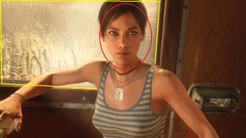
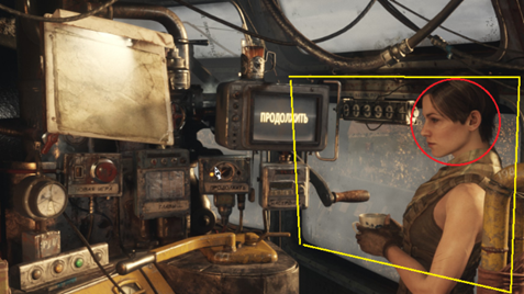
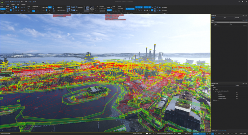
Perhaps it's time to wrap it up here. I hope it was interesting! If you didn't know, the game has an SDK where you can find most of the materials discussed here and try them out for yourself. You can check it out at (https://www.metrothegame.com/en-us/).
Here are a couple of book recommendations for your leisure time. I hope you find them useful.
"Level Up! The Guide to Great Video Game Design" by Scott Rogers
"101 Things I Learned in Architecture School" by Matthew Frederick

