GameDev.net gamedev.net
🔒 Locked

Code editing colors.

Started by alien3456 Apr 9, 2005 at 10:55 PM 45 replies 5.2k views
Original Post
alien3456
alien3456
What colors do you use for your editing environment? I would think most people use default colors, but I like to use a black background because I don't like staring at a lightbulb for hours. "The Matrix", a theme that came with Dev-C++ is the best I've used so far. A bit too much green for my taste, so I changed the regular green text to a light gray. Also text, I use Lucida Console, size 10.

Hedos
Hedos
Custom colors Visual Studio.

Black background.
Yellow keywords.
Red pre-processor keywords.
Grey strings.
White text.

Courier New - Size 10

edit: Oh, I forgot, bright green comments of course!

[Edited by - Hedos on April 9, 2005 11:04:10 PM]
DrZoidberg
DrZoidberg
white background
black for plain text
bold and blue for keywords
green for comments
olive for pre-processor
red for numbers
maroon / purple for characters and strings
light grey for operators

i like to use courier new and nice big size 12, 10 hurts my eyes.

i think this is the default for mingw studio.
Woop woop woop woop!
Benjamin Heath
Benjamin Heath
Ya know how the human eye is more sensitive of green than blue and red? Well, I had a friend tell me that if you're dyslexic, some combination of black and green is often better than the standard black and white. Black print on white paper or a white background is supposedly harder on a dyslexic, and I imagine black print on lime background is a little sweeter for that.

Take that for what it's worth, of course.
Cold_Steel
Cold_Steel
I used white text on a white background. I love a challenge[wink].
Actually, I used the standard Visual Studio colors, except I changed strings to actually have a bluish green color.
______"Man is born free, and everywhere he is in chains" - J.J. Rousseau
cowsarenotevil
cowsarenotevil
White on pure black really hurts my eyes, for some reason. I much prefer something like this if I'm going to use a solid black background.
-~-The Cow of Darkness-~-
smart_idiot
smart_idiot
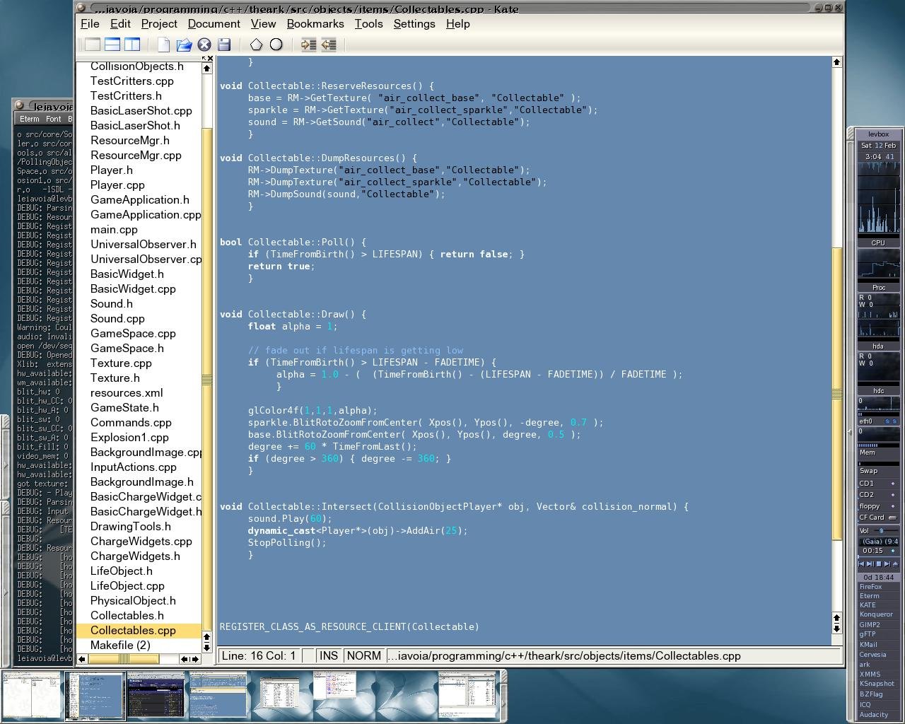
Is this where we post some hideous picture of our desktop?

Background: Black
Preprocessor: Green.
Comments: Green, italics.
Keywords: Light blue; bold.
Strings: Red, dark redish background.
Characters: Orange, dark redish background.
Operators: Yellow.
Identifiers: Gray.
Numbers: Cyan.

Edit: Nuts to showing off my beautiful wallpaper, makes it too big with PNG and too blurry with JPEG if I try to keep it at a reasonable size.

[Edited by - smart_idiot on April 9, 2005 11:30:11 PM]
Chess is played by three people. Two people play the game; the third provides moral support for the pawns. The object of the game is to kill your opponent by flinging captured pieces at his head. Since the only piece that can be killed is a pawn, the two armies agree to meet in a pawn-infested area (or even a pawn shop) and kill as many pawns as possible in the crossfire. If the game goes on for an hour, one player may legally attempt to gouge out the other
alnite
alnite
Ah, one of those IDE thread.

Image hosted by Photobucket.com

to simulate programming in DOS.
H_o_p_s
H_o_p_s
BRING BACK THE BLACK (or at least something darker)
Zahlman
Zahlman
gVim default settings:

Fixedsys, 9 pt (but I have my monitor resolution set low :P )

black text, white background
preprocessor = lavender
constants (string literals, numbers, true and false) = pink
comments = blue; some 'special' comments (XXX, TODO, FIXME etc.) get automatically highlighted with a light-yellow background, the same as is used for searched-for text.
keywords/operators = bold green and bold maroon (I'm not exactly sure how gVim clasifies them... type names, 'template', 'const', 'class' are green, but 'operator', 'sizeof', 'if/else', 'public:' are maroon...)
alien3456
alien3456
Well, I didn't intend for this to become one of those post your desktop threads... but I guess everyone loves pictures.


That's windows 2000. A little note about my windows colors; The default windows colors have a little bit more red than green and blue. I swapped the red for blue and it looks a little more soothing. I also don't use the title bar fade effect because I never did like it.

I just picked my favorite NeHe tutorial in a place with some colors to show.
kSquared
kSquared
Here's mine:

- k2 "Choose a job you love, and you'll never have to work a day in your life." — Confucius"Logic will get you from A to B. Imagination will get you everywhere." — Albert Einstein"Money is the most egalitarian force in society. It confers power on whoever holds it." — Roger Starr{General Programming Forum FAQ<
mattd
mattd


Just working on my spring physics simulator thingy.
alien3456
alien3456
Ah, you've got to be kidding me! That is horrifying.

kSquared, yours is very pleasant. I made this thread to get some ideas... and I've actually changed mine to look like yours
Rayno
Rayno
Image Hosted by ImageShack.us

Dark-on-Light pwns Light-on-Dark.
Ravuya
Ravuya
nagromo
nagromo
Here's my old one:


After reading this thread, though, I decided to try something new:


So far I like it a lot better.

Topic Locked

This topic has been locked by a moderator. New replies are not allowed.

Sign in to reply to this topic.