Original Post

Hello,
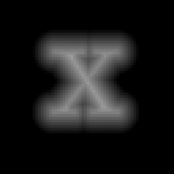
I'm wondering how Valve got their distance field font looking so good. I tried generating my font with other tools, my tool and photoshop but the results are almost never as perfect as they are in Valves paper.
So my question is: must you fine tune the alpha threshold and is fattening the font characters "correct" in order to get them to draw nicely?
The distance field font texture is 256x128 and every letter is around 20x20 pixels.
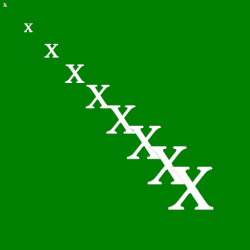
Here are two images:
- the top one has thinner font with more artiafacts
- the bottom one has fatter font with less artifacts