GameDev.net gamedev.net
Using GameDev.net for your class this semester?
Learn more →
🔒 Locked

Character art compared to background scene

Started by Mr Jet May 27, 2019 at 12:44 PM 13 replies 11.7k views
Original Post
Mr Jet
Mr Jet

Hey everyone, this is my first ever forum post in my life lol but I wanted to gain some thoughts on a topic that hinders my creative process on numerous occasions!

Finding a balance between my character designs and my background designs usually gets me in a predicament where I have to completely change one or the other or delete one. Ive been practising everyday and draw nearly 5 hours plus most days.

I feel I'm getting closer to my preference but would like some tips on how I could keep my background visually connected to my character?


if I make no sense, please move on lol but thanks!
tyree
tyree

this is a 2d question. only be concerned with one at a time. focus solely on the character or the background. you can put them together after each is done

NubDevice
NubDevice

I think we can do better than that.

@Mr Jet Instinctively I want to go to color palette, major shapes or proportions but there really isn't anything to start a conversation with yet. Perhaps we could have an image to dissect together?

Dev careful. Pixel on board.
Buckle up. Everything will be revealed.
Mr Jet
Mr Jet

Thanks for the replies! And yes, definitely is a 2d question which I'll state in future posts ?

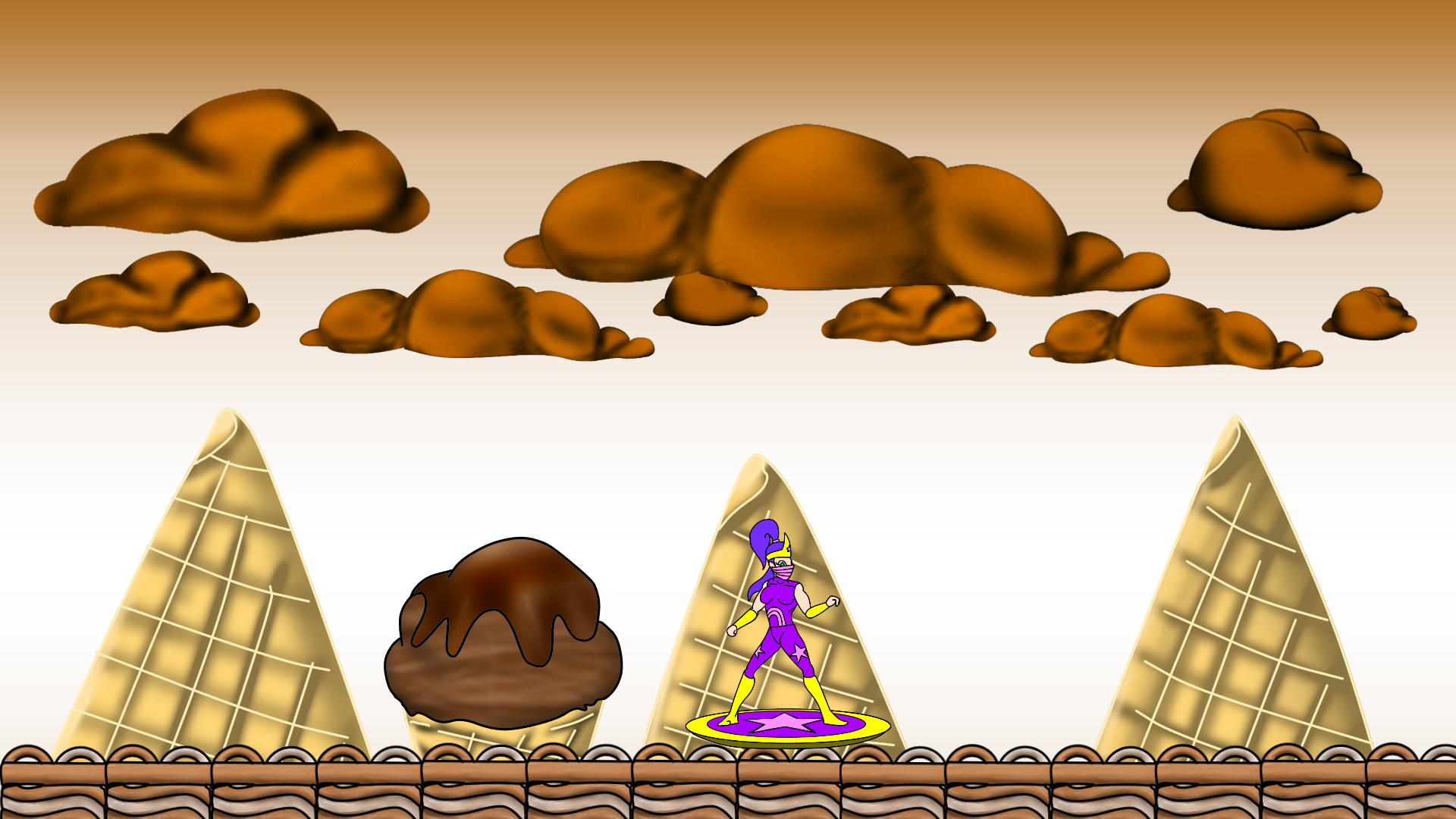
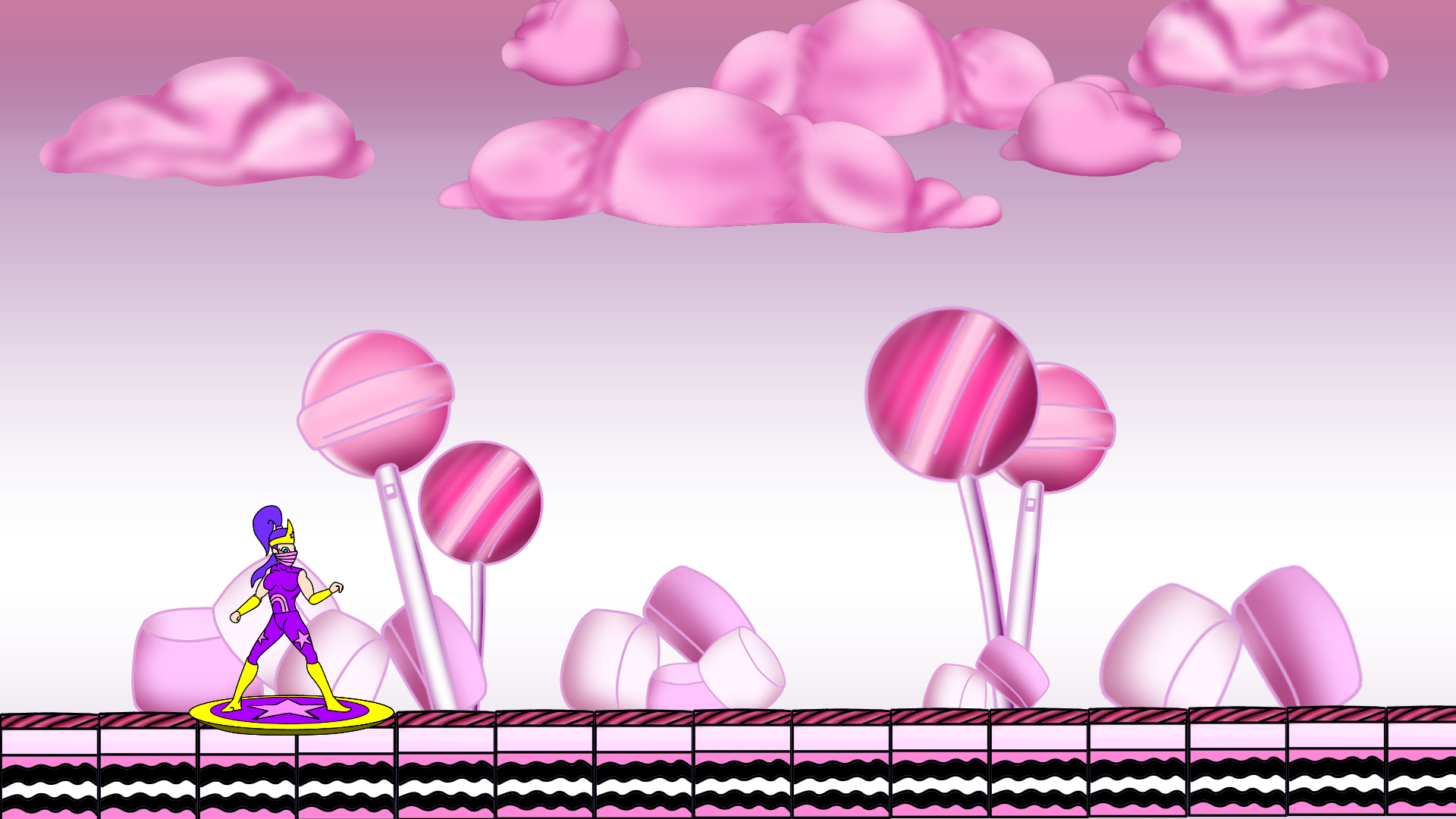
okay, so I'm currently creating my first platform type game ( First game ). I like the simplicity of my character styles but my background require more contrast and small things I know I'm missing but I can't figure it out.


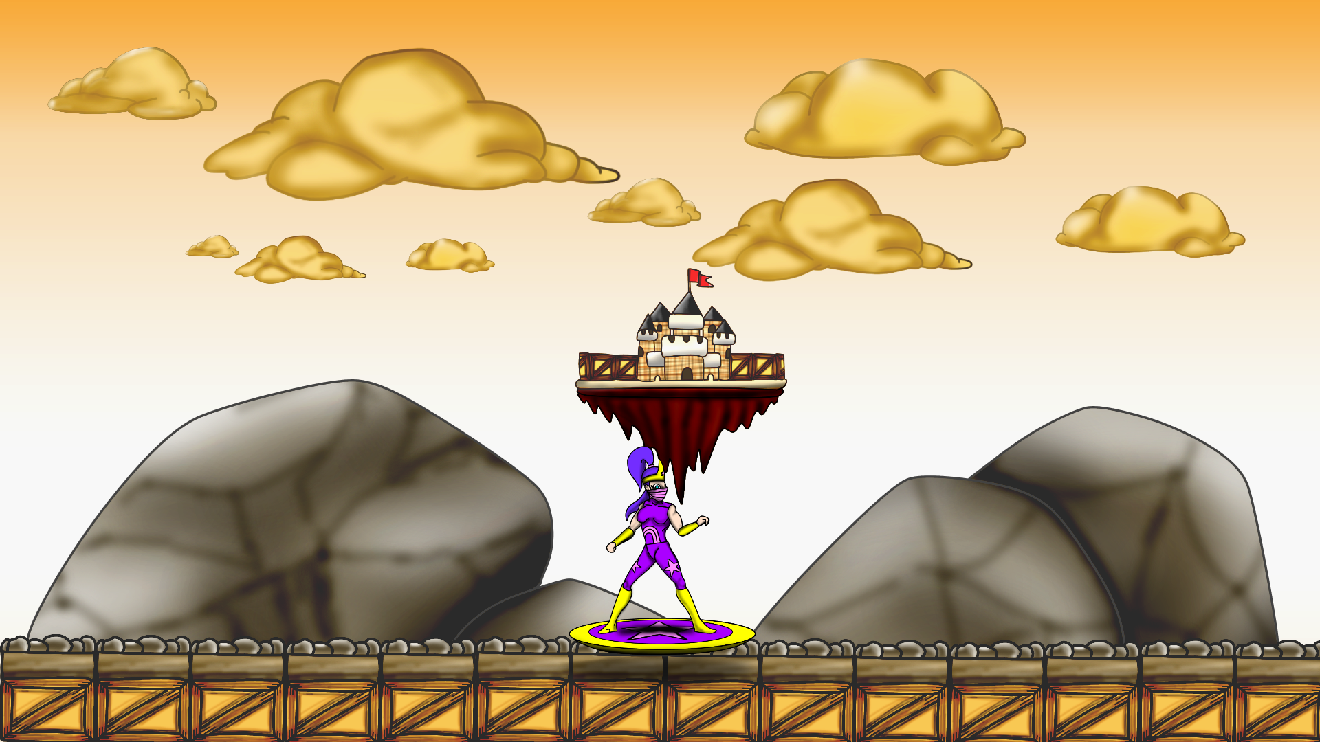
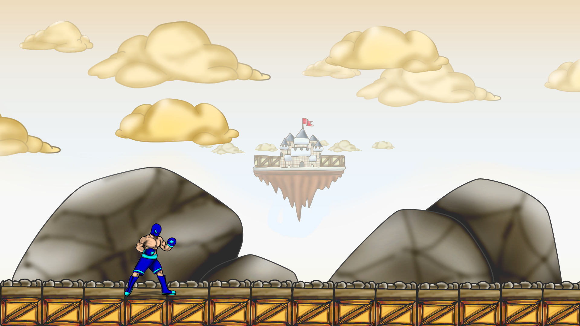
here is a pic of 2 stages and a character. Thoughts and pointers would be more than appreciated! I will send screen shot of actual game when I get back to my pc.

766BD24A-B4AB-4760-9052-DB28490E47F2.png

7A77D902-9F1B-4AF0-9B72-920E66CEED6D.png

tyree
tyree

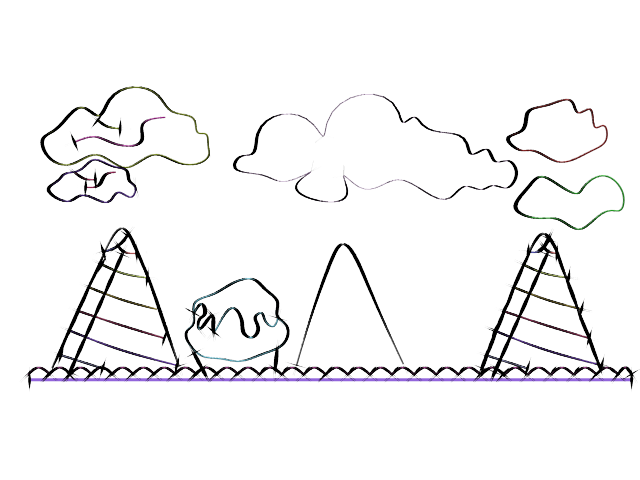
the theme of the background is clear. but does not appear to be hand drawn. seems to be 3d. in your 2d program paint/trace on top of the background to get something more fluid

NubDevice
NubDevice

As a learner, that's interesting. To me, I see the opposite. I see 100% hand drawn with a strong shadowing technique. Even so...I appreciate two images here. You've covered color, shape and proportion. Perfect. We can talk about that. I can see what you mean about the disconnect. I feel what might be missing is visual story and contrast. In both cases the backgrounds have giant hand held items but a tiny character. Works just fine, but why? What else can be added to complete the 'what' is going on here.

It's difficult for certain. I also tried viewing the images through some filters to see what popped out at me, but that was little help. Then, I started hunting and found http://artprompts.org/backgrounds-make-you-better/ which suggests there should be story in the background to strengthen the character art.

@tyree I am aware of some past writings. Perhaps, from this well of past, we might share something a little more than what I concluded as "hand draw on top to fix" No disrespect, please forgive the programmer in me. (I know)

Dev careful. Pixel on board.
Buckle up. Everything will be revealed.
Kryzon
Kryzon

You said you want to make your backgrounds visually connected to your character, but your images show that you need to work more on your fundamentals first.

You're using a lot of airbrush, and not in a good way. Surfaces are looking pillow shaded. Try making sure that you clearly have the right kind of shading transitions (sharp, soft and sharp-to-soft).

If you need inspiration on illustrated candy, you can search on Pinterest or this guy's girl's gallery which is amazing: https://www.shutterstock.com/g/natis76

Compare your ice cream cones with these, see how these artists handled the shading: example 1, example 2.

tyree
tyree

I told him to trace over it. because that could lead to him learning more. this is a trace of the image with subtle changes

cone.png

a light breeze
a light breeze

You have lots of smooth gradients in the background, but none at all in the foreground. This visually separates the foreground from the background.

In your first image, there is also a huge amount of color contrast between background and foreground. You might want to use a color filter on the foreground to bring them closer together.

You have no shadows at all - in the foreground, in the background, or between them. When I see an object floating in 3D space (as the foreground character appears to be), my eyes automatically search for shadows that I can use to locate the object in 3D. When there is no shadow, the object does not look like it is a part of the scene.

Another thing that could really pull the elements together is if they were all shaded as if the light was coming from a consistent direction. These are the two elements that are necessary for an altered photograph to fool the eye: consistent lighting and consistent shadows.

Mr Jet
Mr Jet

@Kryzon thanks for that, I completely understand what you mean about the sharp/soft shading and was actually looking over that the past couple days. I didn't use an air brush but I did smudge a darker colour over the top which ultimately rendered a similar effect. Definitely over using that shading technique can leave you with a blurry image none the less.

Fundamentals are definitely something I'm coming to terms with as I'm progressing.


@a light breeze thanks also! So, I understand my character has no elements of shading or shadows which would actually enhance the scene way more. My issue was probably the fact that I didn't care to add any shading or shadow. (I'm drilling myself now to stop being lazy!)

the other two things you mentioned are great ideas which I'll give a go! I like the thought of a light from a constant direction and adding foreground shading!


@tyree another thanks! I took your advice but didn't like having black lines around my background images almost like a stroke. I stole that technique from someone in my class and I liked it lol I'm just not pulling it off too great at the moment. I'll still play around with the idea though 'cause you never know !

Mr Jet
Mr Jet

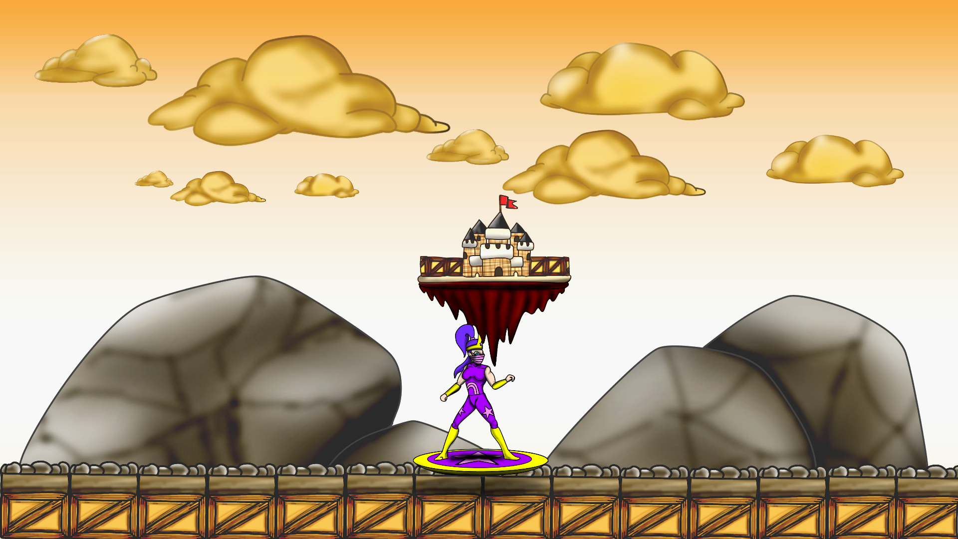
Tried some really quick air brushing on the character. Need to practice more with soft and sharp shading. I done another image to try different things but definitely need more practice still.

I realised you have to do the things you don't want to do, to achieve the results you want.

Time is art haha

1DB38CB0-2308-48A6-BE3C-C0C2D0EBBFA8.png

9BF3D2E5-6CFE-44D3-BB85-B1A7A845D02C.png

A_Mc
A_Mc

You might want to add a shader over the background to make it lighter to distiguish it from the foreground. Best in multiple layers. So the clouds are the brightest etc. Gives it a certain depth and the player knows by intuition which objects are where on the layers of the game.

Mr Jet
Mr Jet

@A_Mc I was thinking about how I could approach that! I had a test but don't know how transparent the filters should be or if i should be filtering the whole canvas?

5082DA91-072A-46D7-8DD4-60423B972788.png

CD78E4AB-A9D3-49AB-BEA6-9D91405DBD74.png

A_Mc
A_Mc

Go by the order of distance. Everything you can walk on or is in the front gets no filter at all. the rocks in the back get like 10-20% the clouds and castle 25-35% and so forth. Test it until you find the best solution but remember to give the rocks some filter too. They might mislead the player to jump on or other options. you need to give a clear intuitive view on the level, to the player.

Topic Locked

This topic has been locked by a moderator. New replies are not allowed.

Sign in to reply to this topic.