GameDev.net gamedev.net
🔒 Locked

Looking for Feedback on Gearomancer’s UI Screens

Started by Rivelle May 30 at 3:09 PM 10 replies 650+ views
Original Post
Rivelle
Rivelle

Hi everyone,

We are Ditag Games, and we are currently developing Gearomancer, an indie bullet hell action-roguelite game for PC / Steam.

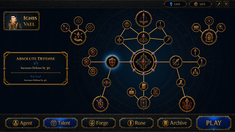
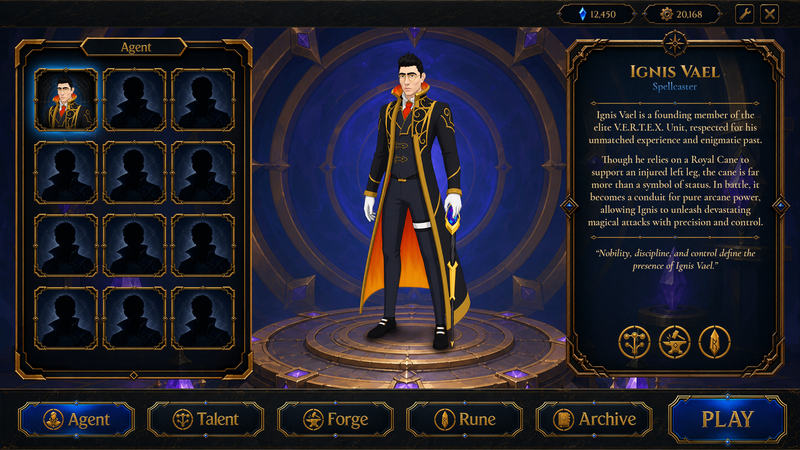
While working on the UI side of the game, we wanted to share two screens with you. One is the character / Agent screen, and the other is the talent tree screen.

Before Bullet Fest on June 8, we would like to get some outside feedback on these screens. After looking at the same screen for a long time, it can become harder to notice certain things, so feedback from both developers and players would be really valuable for us.

How do these screens look at first glance?

We are especially curious about your thoughts on these points:

  1. Does the character screen feel clear and understandable?

  2. Is the talent tree readable at first glance?

  3. Does the UI feel too busy, or does it look balanced?

  4. What do you think about the gold, blue, and dark color balance?

  5. Would these screenshots create a good first impression on a Steam page?

  6. What would you change if you were working on these screens?

We are open to any constructive feedback. Comments about readability, visual hierarchy, and first impressions would be especially helpful for us.

Thank you for taking the time to check it out.
RmbRT
RmbRT

Very clean execution, impressive! The font is great, the colours and sizing etc. are also good. The icons are very clean, too. The only thing I am noticing is that it still lacks that final oomph that ties it all together to take it to the next level. I think for that, a more grainy / textured background and other surfaces (such as the insides of buttons or the background of those icons on the skill tree) would help make it look less flat. Also, the talent button and the play button have the same visual style, despite “Talent” being highlighted to indicate that you are currently in the talent menu, while “Play” is highlighted to be the obvious action to take, directing the flow & attention. So I would recommend having a different visual cue to separate those two messages. One is essentially not trying to make you click it, and isn't actually clickable at all, because you're already there, and the other intends to make you click it.

So in short, I think what's lacking is that while your icons and UI elements are very clean, the overall scene composition lacks depth, and one way to add it is to add a kind of rough-looking surface to things such as buttons or the skill tree sigils. I would make the skill tree look like it's runes carved into a rock slate or something, instead of just symbols floating against a basically single-colour background. The Agent screen is fine, because it already has a proper background & environment it depicts. And then I'd just also try to elevate header & footer some more, intensify the stone texture a bit, and also make the buttons feel more like physical objects by also giving them a stronger surface texture.

Walk with God.
JoeJ
JoeJ

Looks good to me. But if you want critique, i notice a bit of 'the frame seems more important than the picture' problem.
Noticeable in the 'agent' tab on the left, where empty frames dominate the space, but the frames have so much detail the space refuses to feel as empty as it should.
And also noticeable in the skill tree, where frame decoration and details dominate over the icons shown inside. I need to constantly force myself to focus on the icons, which isn't ideal.

To fix it, some options would be:
Relight the frames with light coming from the top, so their bottom side becomes dark and they appear thinner.
Removing details, e.g. the ornaments in the bottom corners of the square frames in the agent tab. (Maybe there is overall too much symmetry in the design, reducing details on bottom sides might help in general.)
Filling Buttons with a background as done for 'talent' and 'play'.

I would eventually consider some changes like that, but first i would wait to see how it looks after you fill the menus with more items. It's pretty good as is and might be just fine then.

The skill tree needs some subtle background, i would say.

RmbRT
RmbRT

JoeJ said:
But if you want critique, i notice a bit of 'the frame seems more important than the picture' problem. Noticeable in the 'agent' tab on the left, where empty frames dominate the space, but the frames have so much detail the space refuses to feel as empty as it should.

Yes, I think simply fading the saturation of the empty slots would go a long way.

JoeJ said:
And also noticeable in the skill tree, where frame decoration and details dominate over the icons shown inside. I need to constantly force myself to focus on the icons, which isn't ideal.

Yeah, the icons themselves need a highlight, maybe a glow? Or playing with brightness or saturation differences could also work.

JoeJ said:
Removing details, e.g. the ornaments in the bottom corners of the square frames in the agent tab. (Maybe there is overall too much symmetry in the design, reducing details on bottom sides might help in general.)

I think if you just use desaturation / graying out, then you can keep the details. I think the symmetry and ornaments are fine. It's after all a game about magical rune crafting and magical architectural blueprints and all that. I think the ornaments are an important part of the style and should be preserved if possible. They are derived from the ornaments you see on book leather covers, the clamps that tie the leather in place or something, at the corners. I'm not an expert on book binding, though.

Walk with God.
JoeJ
JoeJ

RmbRT wrote:

I think if you just use desaturation / graying out, then you can keep the details.

Right direction of thinking i would say, but it isn't that easy in practice.
The frames use a gold tone, but gold requires a yellowish color, which looks like shit if you gradually desaturate, or make it darker, or transparent, etc. To make yellow darker, you mostly turn it into reddish first, but that's not realistic but stylized, and not always applicable. We can see they already tried to keep it darker and subtle. Going much further would make the gold ugly.

RmbRT wrote:

Yeah, the icons themselves need a highlight, maybe a glow?

Yeah, glitter and twinky stars for the girls, and reflections for me! I love it!

But sadly such high frequency details cause noise and distraction, so we can't use them as much as we might like.
So my proposal of 'light from above' maybe isn't all that practical.


RmbRT wrote:

I think the symmetry and ornaments are fine.

No, actually they are result of minimizing work by just rotating and mirroring one corner element. At least that's why i did such things when needed.
But pay attention to real decorated frames. They have horizontal symmetry, but never vertical symmetry. There always is some difference vertically. I think this holds true for all cultures across history, maybe with some rare exceptions.
I think the reason is nature: Humans and animals have symmetry only on one axis, actually the horizontal axis.
If we do it on two axis, it thus appears somewhat unnatural, which is why we want to avoid it.
Another related design concept is the 'optical center', which is centered exactly only horizontally, but should be a bit higher vertically.

Imo, my proposal about symmetry is actually the best one.
Creating a much more subtle version of bottom corners would add a lot by doing more with less, adding variety and relax focus.

RmbRT
RmbRT

JoeJ said:
But pay attention to real decorated frames. They have horizontal symmetry, but never vertical symmetry. There always is some difference vertically. I think this holds true for all cultures across history, maybe with some rare exceptions.

ah sorry I thought you were proposting to remove all ornaments.

JoeJ said:
The frames use a gold tone, but gold requires a yellowish color, which looks like shit if you gradually desaturate, or make it darker, or transparent, etc. To make yellow darker, you mostly turn it into reddish first, but that's not realistic but stylized, and not always applicable. We can see they already tried to keep it darker and subtle. Going much further would make the gold ugly.

Relative colour is the key here. All colours are perceived relative to their context, not in terms of absolute value. This video demonstrates this to great effect:

Walk with God.
taby
taby

I agree, It looks fantastic, like a AAA game would look.


JoeJ
JoeJ

RmbRT wrote:

Relative colour is the key here. All colours are perceived relative to their context, not in terms of absolute value. This video demonstrates this to great effect:

Well, at this point i feel a bit bad for going offtopic, but damn it - i want to talk about color. And i would not wonder if your more innocent perspective might help me a bit out...

I had watched the video for some seconds, and now i always think back to it, actually how the guy mixes colors using some hsb color picker to replicate some landscape image. The way he does it is the same that i do. Thinking about hue, saturation, and brightness. Usually in that order. So i set my color pickers to this mode if i want to mix colors.

But maybe it's worth to mention, this is not the only way to think about colors. E.g. if i want to make a gold effect on some frames or fonts like in OP, i'm rather using RGB sliders (or CMYK for print), because this makes it easier to maximize saturation. And it does not even matter which color is on the background. As long as it's a dark enough color, the golden letters will always look good on it. So the 'realtive color' concept can become very important if your goal is to make something that pops, draws attention, or intents to tell a clear massage. Realtive color is more important if your goal is subtlety or atmosphere.

Anyway, coming back the the color wheel we use on computers.
I wonder: Is this the same way painters think about color mixing? Especially classic painters which did not yet have computers, additive RGB mixing, color pickers following a mathematical model.
Idk. But i'm sure i have not learned much about the topic in art school. Really not. So i guess people did not think much about it. They just used it, came up with some rules an what looks good or bad, or gives the desired mood, etc. But they did not need to think about a way to describe any color with a 3 value math formula. Maybe scientists did this, but no classic painters i guess.

That just said for context. Now to my problem: Any way to describe colors using 3 values sucks. Which is why we need to switch color pickers from one mode to another, so we can use the method which at least somewhat works for the current problem. No matter which picker you use, it's always hard to get the color you want. Moving the mouse just one pixel makes too much of a difference, the other colors you see around it are always distracting, and the discontinuities visible in the spectrum feel artificial.

I'm not happy with color pickers. Thus i think there might be a better mental model to think about color, leading to a better color picker. So far my attempts have failed, but i can tell you some of the problems:

Our model of hue, saturation and brightness fails already on the first term.
The model implies that hue does not affect brightness, since both have their own independent parameters. X does not affect Y or Z, right?
But that's not the case. Yellow is lighter than blue, period. So our best mental model about color mixing is conceptually wrong.

Another problem: We assume we could change hue gradually without discontinuities.
But again that's not the case. If we show a spectrum of rainbow colors, our channels go linearly from 0 to 1, then they stay at a constant 1 while the value of another color changes, then they go down from 1 to 0 to stay at 0.
This is not a smooth curve. And we can not simply smooth it in some way. The discontinuity is required so the change of the other color gives us the desired next color in the rainbow.

Also, the brightness slider isn't helpful at all. Yellow is the best example. If you just make it darker it becomes dirty and ugly. To avoid this, we can go to a nearby but darker hue, like red or green. In practice you always pick some compromise, but industry standard color pickers don't help you with that. It's cumbersome and could be improved.

Finally, saturation has a similar problem - we might go towards a gray which also has some subtle color tint matching our overall image.
You can see the guy in the video needs quite some tweaking to achieve just that. He has a good way to think about colors, but his tools don't help him much.

If i succeeded, you will now think about a better color picker til the end of days, like i do. ;D
(It's fascinating how even the seemingly simplest things become rabbit holes of problems, if you look close enough)

RmbRT
RmbRT

JoeJ said:
I wonder: Is this the same way painters think about color mixing? Especially classic painters which did not yet have computers, additive RGB mixing, color pickers following a mathematical model.

Paints have a subtractive blending effect. A paint absorbs all colours except the one it reflects (its visible colour). So mixing red and green gives brown, rather than yellow. Of course, it's not purely subtractive, it's more of a weighted blend of both subtractive properties, or something.

Digital painters probably use HSV/HSB or some related colour space, and I think when they paint, the paint programs also simulate the subtractive blending mode, rather than additive or a simple lerp of RGB values. For example a gradient from green to red should not have yellow or gray midtones, but rather travel through brown.

This is actually the expected and normal behaviour. The only time it's different is when you're blending lights, rather than paints. These need to use RGB additive blending. So you actually need a separate system for colour operations on surfaces/materials, and colour operations on lights.

I'm actually currently trying to figure out how exactly to design my engine's material & light system for the 2D platformer I'm working on. I definitely want to have a light system (not sure about casting shadows, I'll have to see whether it needs it or not and whether I can come up with something efficient), and I want to have normal maps on sprites to react to the light properly. Atmosphere & polish will be extremely vital for that game. And rather than using simple additive lighting, I want to use a colour wheel with hue shifts for shadows, rather than just removing light. Kind of like in this video:

I want to play a lot of light & shadow, but I don't want shadowy scenes to simply bleed into blackness. Instead, I want to use a shadow colour, and hue shift from the light colour to the shadow colour when something is in shadow. Maybe also with a brightness curve that also gets interpolated.

I'm not sure whether calculating light & shadow using HSV/HSL/HSB or similar is just an awfully roundabout equivalent to RGB lighting or not, but by going that way, I can at least ensure that I end up using the same technique a painter would be using, which will definitely give the game the painterly look.

Materials in the engine will consist of just the neutral colour (HSV), a normal map, and one for shininess (for stuff like metals vs. stone), whereas lights consist of a basic hue and saturation (basically colour vs whiteness), and intensity (basically HSV with V=100%, plus intensity). As intensity grows, everything turns to white, so an extremely bright red light would be white and fade to red around the edges where the intensity falls off. But for example an unlit area would not be black, but simply retain a baseline brightness, but get hueshifted towards the shadow colour, like in your “yellow” example. Which also allows me to have very “dark”-feeling scenes that are still highly visible.

The plan is to then apply light according to direction, distance & surface normal, using some kind of light function, which will then do some kind of hue-shifting / hue-blending and brightness adjustment etc., which I haven't figured out yet exactly.

I think this has the potential to give our game a very unique look that is pleasant and immersive.

JoeJ said:
Another problem: We assume we could change hue gradually without discontinuities. But again that's not the case. If we show a spectrum of rainbow colors, our channels go linearly from 0 to 1, then they stay at a constant 1 while the value of another color changes, then they go down from 1 to 0 to stay at 0. This is not a smooth curve. And we can not simply smooth it in some way. The discontinuity is required so the change of the other color gives us the desired next color in the rainbow.

Above is an image from Wikipedia's HSL and HSV article. Here you can see that hue simply is a sawtooth/lerp blend of the fundamental colours in linear RGB.

JoeJ said:
But that's not the case. Yellow is lighter than blue, period. So our best mental model about color mixing is conceptually wrong.

You can take each vertical bar as one linear blend between two fundamental colours. However, green is perceptually much brighter than red and blue, as can be seen here (green curve is for scotopic / darkness vision, while the black curve is the curve for photoscopic / normal colour vision, X-axis is wavelength in nanometers):

The above image is taken from Wikipedia's Luminosity efficiency function article.

Commonly used factors to calculate the brightness of an RGB value are R·21.26% + G·71.52% + B·7.22%, though there are other models using 29.74:62.73:7.53 (Adobe) or 29.9:58.7:11.4 (NTSC).

So just blending linear RGB in that naive sawtooth pattern is wrong, which is also why the green section on that hue slider dominates way too much. You'd actually want to evenly space out the colours so that the rate of perceptual colour change is uniform. Which means for each unit of perceived luminosity you add in one channel, you need to remove one unit in another, rather than going by absolute values.

And if you want to have very dark scenes, you should actually be using the scotoscopic luminance curve instead of the normal photoscopic curve to grade your colours. And then on top of that, there are also different physiological conditions that shift that curve in some people, though I guess it's probably not feasible to include support for that in an indie title. In a scotoscopic scene, you would basically want to convert everything to some sort of grayscale (or monochromatic), but using the scotoscopic luminosity factors for computing your brightness values. For mixed scenes, it would be quite complicated, I guess.

JoeJ said:
Finally, saturation has a similar problem - we might go towards a gray which also has some subtle color tint matching our overall image.

And for saturation, you need to use the same kind of irregular gradient, where based on hue, you have a different curve, I think. Or maybe that is the one place where you can just lerp towards gray because the ratio of the colour channels stays the same. I think if the outer hue ring is properly spaced out to achieve uniform perceived luminosity, then brightness and saturation become easier. But then you would basically be limited by the least luminous colour (blue), and that would dictate how much luminosity the hue ring has. So I guess you would then actually have a HSV Value of way less than 100% for the green that is shown in the hue ring? More like 10% or something, and the pure red in the hue ring would achieve some 33% Value. So if you go slide up the Value slider, it would result in brighter colours than the hue ring shows. But such a hue ring would not have yellow as a hue. Pure yellow would be the bright version of a muddy yellow base hue or something. So either you can have uniform luminosity, but “hue” changes its meaning, or you go for an even more irregular colour wheel but you get to keep your bright yellow as a proper, pure hue. So a blue that is just as bright as RGB yellow, would actually be quite desaturated, and have a lot of white mixed in, same with red, it would actually be a bright pink.

So maybe, the final solution would be a radial colour wheel that maintains equal brightness at equal distance from the center, and another one that maintains equal saturation at equal distance from the center. Both wheels would have evenly spaced out hues that have a constant perceptual rate of colour change. Just like how sRGB is about the perceptual rate of brightness change. So maybe, an sRGB-like curve also has to be used for the gradients in the hue transitions? I have no clue, that's another thing I'll have to dive into, it seems.

JoeJ said:
You can see the guy in the video needs quite some tweaking to achieve just that. He has a good way to think about colors, but his tools don't help him much.

There are some more high-quality colour wheels and colour spaces out there. But they're not in widespread use. I'm currently trying to solve exactly this problem because I need it for our sprite editor and to build the lighting system of the engine (haha, try doing that with a U-engine and then tell me how building your own tech is a waste of time). And I need to have my own sprite editor anyway because I need to have these non-standard material layers like normal maps and shininess factors and others that I need to edit all on the same image, and I also need the editor itself to be able to render the in-engine lighting effects onto the sprite so that I can tweak the sprite properly. WYSIWYG style.

So far, I already built an immediate-mode UI framework on top of my OpenGL dialect I'm cooking up. Got stuck when trying to implement the colour picker, lol, and then spent the entire day researching colour spaces and all that. And spent the past few days thinking about them.

Anyway, great timing for your post, just in time for me to gather all my thoughts once more and put them all into a coherent essay.

Walk with God.
RmbRT
RmbRT

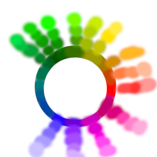
I think this is roughly what that colour wheel could look like (just whipped it up by hand in GIMP, definitely inaccurate): you have one hue ring that is basically limited to the brightness of fully saturated blue, and then it extends outwards towards the brightness of fully saturated green, and then it would extend outwards even further towards white. The center would be black, I guess? And then you also get a a slider that lets you slide a colour towards grayscale / desaturation. So basically, the angle selects the hue, the radius selects the brightness (even if at the cost of saturation), and the additional slider would control grayness / additional desaturation while maintaining the brightness.

The inverse would have an outer limit ring that has the perceptually spaced hues, and at 100% HSV value & saturation. The radius would then control grayness, fading to gray in the middle. And then you have a slider controlling the value. I don't think you can have the equidistant perceptual hue ring at full saturation & value and simultaneously have perceptual brightness be the radius. You'd end up with some wobbly egg shape instead. Or you would have a non-uniform radius-to-brightness metric depending on hue/angle.

Conversely, you could have a wobbly egg shape overlaid over the depicted colour wheel, and that would denote the 100% saturation isoline.

Ok, I think now I got it. I guess what you want is to have:

  • a wheel with equidistant perceptual hue, and uniform radial brightness, and isolines for saturation, as well as a grayscale slider,
  • a wheel with equidistant perceptual hue, and uniform radial saturation, and isolines for brightness, as well as a brightness slider,
  • A triangle or rectangle view that lets you see how perceptually distant adjustments in saturation or brightness are

You would choose between both based on the situation. The wheels are for picking a colour, and the triangle/rectangle view would be for adjusting / stepping a colour. And I'm not sure you would ever want to use the conventional, non-equidistant hue spectrum at all.

And then a proper program would let you set reference markers on the colour wheel, like marking a certain saturation value as baseline saturation, or marking a certain brightness value as shadow or highlight, etc., so that you can more easily pick or step your values in the colour picker. The hue wheel itself should also be usable like a slider, so that you can just do an angular step while maintaining the current radius.

Walk with God.

Topic Locked

This topic has been locked by a moderator. New replies are not allowed.

Sign in to reply to this topic.