GameDev.net gamedev.net
🔒 Locked

Poll: which portrait is more scarry?

Started by Raduprv Apr 10, 2005 at 10:41 PM 53 replies 8.5k views
Original Post
Raduprv
Raduprv
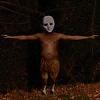
My wife started to remake the portrait (and skin) of our Wraith (in EL). She says that it looked bad, and unprofessional and such. So she made a new one, but I just don't like it, it looks less scarry and less, well, 'wraithy'. The left is the original one, the right is the new one. What do you think? Which one looks more scarry/'wraithy'?
H_o_p_s
H_o_p_s
I like the left one.
BRING BACK THE BLACK (or at least something darker)
nerd_boy
nerd_boy
I find the original one scarier, possibly due to lack of feature clarification(i.e., blobby).
cowsarenotevil
cowsarenotevil
Difficult. I think I like the left one. Something about not being too detailed or too human make it convincing. The one on the right looks a bit forlorn or determined. The one on the left looks just "empty," which I think is more convincing.
-~-The Cow of Darkness-~-
Prozak
Prozak
The Left one, for the following reasons:

It has no eyes. That de-humanizes it. In their place it has that yellow tint, which is very sick-looking. The whole outline of the drawing is blurry, like in a dream, and it gives it that "mysterious" look, where our mind jumps in and fills in the blanks.

The cheek bones, and the whole facial structure also point out to someone quite old, in their seventies, the mouth has no lips, or dry old-aged lips, and the skin seems very unelastic.

The right picture is much more defined, and as such, much less misterious. The facial structure doesnt look as "deseased", it just looks like a bored teenager in a cheap halloween costume.

My two cents, of course [wink]
cowsarenotevil
cowsarenotevil
Looking again, I think the one on the right is pretty good too. I really don't know which one is better. They look like different characters, not better/worse versions of the same one.
-~-The Cow of Darkness-~-
jbadams
jbadams
I also think the left is a more scary/creepy picture. The one on the right is clearly superior in terms of artistic skill, but it just doesn't have as much of a 'wraithy' feel. I think you should use the one on the right for something else as well though, it's quite good, and also looks like someone you wouldn't want to run into.
- Jason Astle-Adams
Raduprv
Raduprv
Quote:
Original post by Kazgoroth
I also think the left is a more scary/creepy picture. The one on the right is clearly superior in terms of artistic skill, but it just doesn't have as much of a 'wraithy' feel. I think you should use the one on the right for something else as well though, it's quite good, and also looks like someone you wouldn't want to run into.


Exactly. I told her to keep the right one for some other NPC, and left the wraith as it is (for the same reasons Prozak mentioned).
Avatar God
Avatar God
The one on the left is both scary *and* scarry.
gsgraham.comSo, no, zebras are not causing hurricanes.
smart_idiot
smart_idiot
The right one of course. You should know better than to disagree with your wife.
Chess is played by three people. Two people play the game; the third provides moral support for the pawns. The object of the game is to kill your opponent by flinging captured pieces at his head. Since the only piece that can be killed is a pawn, the two armies agree to meet in a pawn-infested area (or even a pawn shop) and kill as many pawns as possible in the crossfire. If the game goes on for an hour, one player may legally attempt to gouge out the other
Xtremehobo
Xtremehobo
definatly the left
pixelwrench.com | [email="matt[nospam]@pixelwrench[nospam]com"]email[/email] lethalhamster: gamedev keeps taking my money, but im too lazy to not let them
Cypher19
Cypher19
I'm gonna go with everyone else and say the left. You'd probably find something like that in a nightmare, and we all know how much those scare.

Right one would be good for some NPC or something.
yapposai
yapposai
suggestion:

color the eyes of the right pic all black with
tiny red dots ala terminator. you'll get a creepy
pic. :P

Image Hosted by ImageShack.us

edit: meh, jpg destroyed the red glow.
---------------Magic is real, unless declared integer.- the collected sayings of Wiz Zumwalt
boolean
boolean
Any better?


I wanted to try and make her look more sad, but her mouth kept up ending funny.

[edit - the lines underneath the eyes were a bit to harsh, so I smoothed them out a touch
]
Fahrenheit451
Fahrenheit451
Left: More wraith looking I guess
Right: Bride of Frankenstein, or just a bad hair day?

Left one gets my vote.
Sander
Sander
Take the right one, remove the black pupils from the eyes, remove the features (nose, mouth) and only put a hint of shadow that there's some bump or something where the nose should be. The left one is definately scarier, but the right one looks more detailed (higher resulotion?). Combine the both.

Topic Locked

This topic has been locked by a moderator. New replies are not allowed.

Sign in to reply to this topic.