Developing a game and need your feedback

Started by
2 comments, last by Kupferrot 1 year, 8 months ago

Hello everyone,

i am developing a game as a hobby and would appreciate it if you could give me some feedback. All feedback is welcome, including what you think about the game idea, gameplay, artstyle or UI. Thanks in advance.

The goal of this game is to create your own team and strategy to defeat enemies and to survive as long as possible. There are different races, including classic ones like elves, demons and dwarves, with their own stats and abilities.

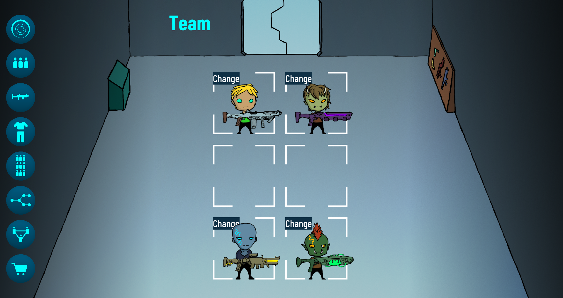
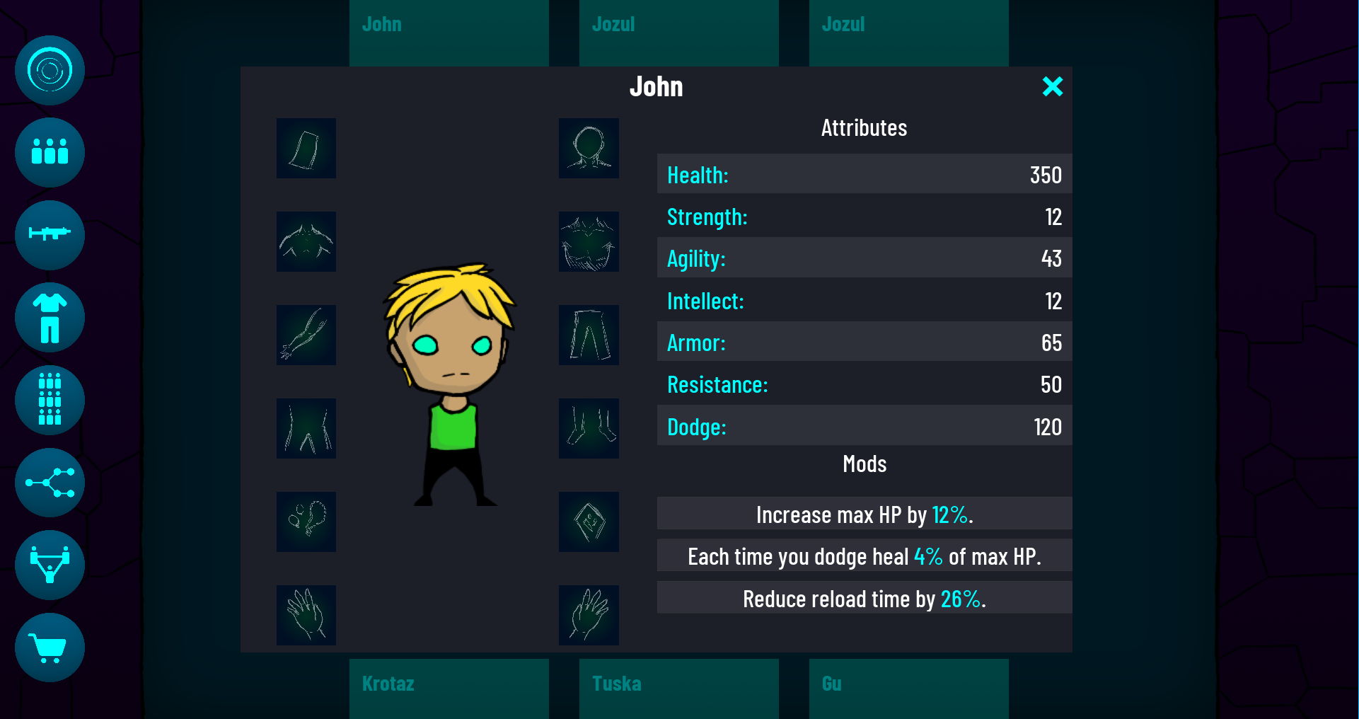
You can equip your characters with all kind of weapons and armor, including shields and dual pistols. Characters have different attributes and traits (mods) which are random at the beginning. It’s possible to give them more specific mods to adjust them to your strategy (max 6 mods).

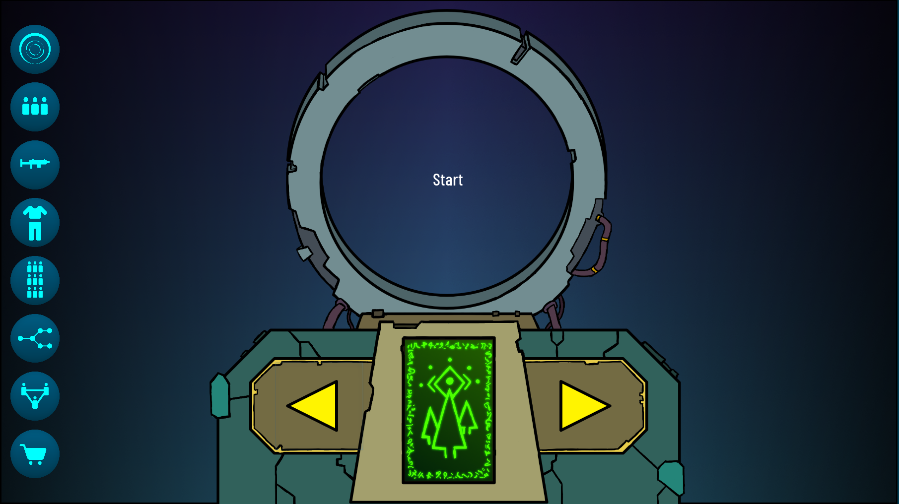
You can discover and travel to other worlds with a gate and fight enemies there. Enemies you defeat can drop random items or currency. Different worlds can give you different items and different characters like demons in a fire-like world.

The longer you survive, the stronger the enemies become and the better the loot gets.

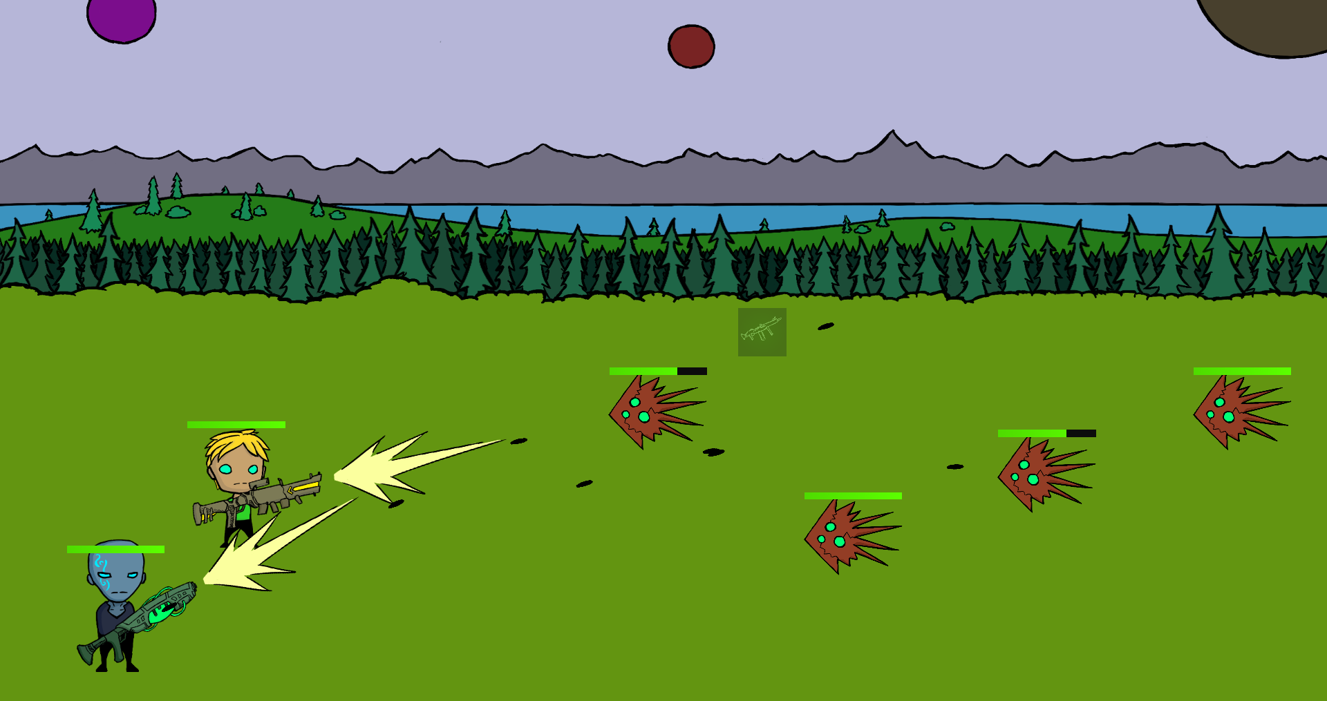
The items you get have different stats and mods with different abilities. You can also modify your items like your characters and adjust them to your strategy.

There are different damage types with different effects like fire damage which sets the enemies on flames (deals extra damage over time) and frost damage which slows them.

You can earn EXP and assign skill points in a skilltree which affects your whole team and play style.

Advertisement

Commenting on art…

The contours of the line art often end up having the wrong width, due to scaling.
In general, foreground and characters should have thicker lines, background and distant / unimportant stuff should have thinner lines.
You often have the opposite of that ideal. The easy fix seems to redraw the backgrounds such as the room, trees, etc, with thin outlines.

You also sometimes use some lines hatching to draw shading, but i would not do this at all. The hatching patterns end up too small on screen. A simple darker color would do better.
The second image shows scribbled / doodled drawings in white over dark blueish/greenish squares. Similar issue. The scribbling is too small and too undefined compared to the other art, and conflicts especially with the very abstract / flat GUI design.

I would orient the guns in the first image angled, like in the combat scene. Them being horizontally aligned, it does not look like the characters would hold them in their hands.
Maybe you need to add hands. There are equipment slots for them, which adds to the impression they are missing. I can see why you'd rather like to avoid work on hands, but it sure would help to show more life.

First of all the Gateway reminds me of stargate and I like that very much.

I am not a designer, but maybe some kind of shadow below the characters and enemies would add something to the scene. The grassland feels a bit empty otherwise.

The UI seems basic but very self-explaining which is good in my opinion because a player would probably be able to navigate and find what they are looking for pretty quick. The button images give me a clear impression of what to expect when I would click on them.

None

This topic is closed to new replies.

Advertisement