
Original Post

I'm creating a creature with a limited color palette, but I'm not sure if I'm going too heavy with the anti-aliasing or if the shading/outlines are inconsistent. Any feedback or critiques are greatly appreciated.
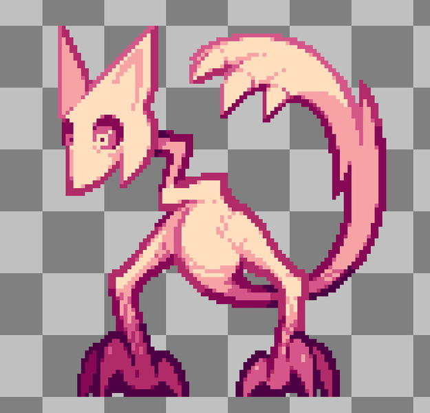
I'm creating a creature with a limited color palette, but I'm not sure if I'm going too heavy with the anti-aliasing or if the shading/outlines are inconsistent. Any feedback or critiques are greatly appreciated.
Hard to say without a broad set of art, or art style broadly with concepts and style guidelines.
There are features to note. Is the difference between the feet intentional? It certainly has a style. It has a strong silhouette, that is often good. But a single image isn't enough to see if it makes a compelling style.
@frob Hi, thank you for taking the time to reply.
I probably should have rephrased the question better. I was wondering more about the general pixel art techniques rather than the specific style itself if that makes sense. I guess I'm going for a more cartoony art style while trying not to make it completely flat. Am I going too heavy with the anti-aliasing, contrast, and/or shading?
As for the feet, I was attempting to add some depth by darkening the foot/arm in the back, but I'm not sure that comes across due to the flat perspective.
TheLuckyDonut said:
but I'm not sure if I'm going too heavy with the anti-aliasing or if the shading/outlines are inconsistent.
Looks all good to me.
The only concern i have is using a single pixel for pupils in the eyes.
Your outlines are thicker, two pixels wide. So usually you do not want to have any details smaller than that.
If i zoom out the page as much as possible to show the image at practical scale, the tiny pupils start to pop out.
Try to remove the pupils but using the whole 3x3 block surrounding them for a dark iris instead, requiring the brighten up the sclera around it as well which is currently dark.
Then compare at various scales to decide what's better.
TheLuckyDonut said:
As for the feet, I was attempting to add some depth by darkening the foot/arm in the back, but I'm not sure that comes across due to the flat perspective.
Flat perspective should not matter here, as perspective vs. ortho projection does not affect lighting.
I would rather think of it as an ambient occlusion effect, which works even if you know nothing about the lighting given by the environment. You just assume there is floor below the character causing occlusion.
It's nice and promising imo, but ofc. it adds more work with animation.
E.g., if the character jumps, there should be less darkening for the feet in air because increasing distance to the occluding floor.
The design of the creature is very good, but it could be drawn better:
I would also note that while the creature has rounded shapes, it has no dithered shading. Original pixel art used dithering to create gradients because old CRTs blur adjacent pixel colours, creating in-between colour values that aren't possible otherwise due to the limited colour palette they were constrained to on the old devices.
@JoeJ This is all very helpful feedback and advice! Thank you!
You vary the hue based on brightness, which is the hallmark of an observant artist. Good luck with your work.
This topic has been locked by a moderator. New replies are not allowed.
With your permission, GameDev.net uses analytics cookies to understand how people use the platform. You can accept analytics or continue with necessary cookies only. Learn more




